What Is Interactive Design and Why It Matters
Interactive design is the design of behavior, feedback, and decision pathways between users and products or services, not just visual styling. In the UK, it matters because top-quartile design companies outperform industry benchmarks by 2x in revenue growth, and fixing a UX problem during development costs 10x more than fixing it in design and 100x more after launch, so the way an interface responds can protect both budget and revenue. A checkout button that confirms instantly, a form that shows a clear error, or a child's story app that reacts to a swipe all feel simple on the surface. Underneath, each one is a set of decisions about what the system should do next, what the user should see, and how quickly they can recover if something goes wrong.
Interactive Design for Today's Businesses
A customer taps “pay now” and waits. If the confirmation arrives instantly, the experience feels smooth, even reassuring. If the page lags, the user hesitates, retries, or abandons the task, and the business loses a sale before anyone has had time to notice. That's why interactive design has moved from specialist craft to business capability. It sits where user confidence, commercial conversion, and operational efficiency meet. In practice, it covers the small moments that make software feel responsive, from a loading state to a successful submission, and those moments shape whether people trust the product enough to continue.
The invisible part of the experience
Most readers first meet interactive design through something obvious, like a button animation or a menu that expands cleanly. Those are only the visible traces. The core work is deciding how the product should behave when a person taps, pauses, scrolls, mistakes an input, or needs help. That distinction matters for businesses because interaction quality affects the full journey, not just the look of the screen. It also matters for teams selling apps, learning tools, XR experiences, or animated content, because the interaction layer is often what turns a passive asset into something people use.
A good interaction feels small in the moment and significant in the outcome.
For a plain-language resource on how interaction quality helps teams drive engagement through UX design, the useful point is simple, better feedback gives people more confidence to continue.
Why clients should care
Businesses often talk about design as if it were the finish. Interactive design is closer to the operating system for the finish. If the journey is confusing, slow, or hard to recover from, the polished visuals won't save it. That is why the best interactive work usually starts before visual styling is finalised. It begins with behaviour, response, and decision flow, then builds outward into screens, motion, and content. For companies commissioning digital products, games, learning tools, or XR experiences, that means the question is not “Does it look right?” It is “Does it behave in a way people can complete, trust, and return to?”
Defining Interactive Design Clearly
Interactive design is easiest to understand if you treat it like a conversation. A user says something through a tap, click, swipe, voice command, or form submission. The system replies with a change in state, a bit of feedback, or a new path forward. If that exchange is clear, the product feels intuitive. If it is vague, people feel lost.
The moment of exchange
Several design sources describe IxD as the discipline that focuses on the behavior of the interface, the responses, feedback, and state changes that happen when someone interacts with a product. That distinction is important because it separates interactive design from decoration. The point is not to make the screen prettier, it is to make the exchange understandable. A simple example is a password reset form. The visual layout matters, but the interaction matters more. Does the user know the button was pressed? Do they see an error message they can act on? Can they recover without starting again? Those are interaction decisions, not branding decisions.
Interactive design is the design of the system's reply.
That reply can happen in software, a service workflow, or a hybrid physical-digital experience. It may be a subtle transition, a progress state, a vibration, a voice response, or a menu that opens only when a keyboard user reaches it. The medium changes, but the principle stays the same.
Why the definition gets blurred
People often use “UX”, “UI”, and “interactive design” as if they mean the same thing. They overlap, but they're not identical. UX covers the wider journey, while interactive design concentrates on the moment of interaction, the specific action and the immediate response. That narrower focus is useful when briefing a team. It tells designers, developers, animators, and producers what must happen at the point of use, not just what the page should contain. It also helps clients spot weak work faster. If a prototype has nice colours but no clear feedback, the problem isn't taste. It's interaction. For a fuller primer on how teams think about interactive systems, the Interaction Design Framework discusses the discipline in the context of goals, feedback, and user-centred process.
A practical mental model
Use this test when reviewing work:
- •User action, what does the person do?
- •System response, what happens next?
- •Feedback, how does the user know it worked?
- •Recovery, what happens if it fails?
If a design can't answer those four questions, it isn't finished. It may look complete, but it won't yet behave like a trustworthy product.
Core Principles and Design Process
Good interactive design rests on a few fundamentals. It needs to be understandable, responsive, recoverable, and inclusive. If one of those breaks, the experience can still look polished, but it becomes harder to use and harder to defend commercially.
Principles that shape the work
The first principle is clarity. People should know what they can do, what just happened, and what to do next. The second is feedback. Every meaningful action needs a visible or audible response so the user doesn't have to guess. The third is recoverability. Users make mistakes, so the system needs a way back, whether that's an undo state, an editable field, or a clear error message. The fourth is accessibility, which in the UK isn't optional. The Equality Act 2010 requires service providers to make reasonable adjustments for disabled users, so interactions that depend on precise pointer use, poor contrast, or keyboard dead ends carry both usability and compliance risk. For a practical discussion of constraints and workarounds, the prototyping limitations guide is a useful companion when teams need to test interactions before committing to build.
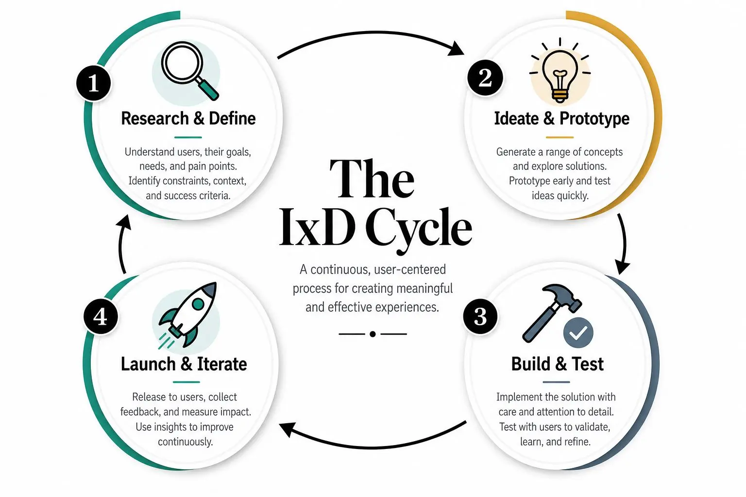
The process is cyclical, not linear
Professional studios rarely move in a straight line. The work usually starts with a brief, then moves into sketches or wireframes, then prototype testing, then refinement. In real projects, those stages loop back on themselves because the team learns something new each time users interact with a draft. That's why interaction design is often strongest when it's treated as a sequence of decisions rather than a single deliverable. A prototype can show timing, a test can reveal confusion, and a revised flow can remove a step that seemed harmless in the spec but feels heavy in practice.
What to ask for in a project review
When you're commissioning work, ask whether the design covers:
- •Keyboard access, can every key flow be completed without a mouse?
- •Clear focus states, can users see where they are?
- •Error handling, can mistakes be corrected without losing progress?
- •State changes, does the interface show what has happened?
- •Decision support, does the user know why a choice matters?
Those questions cut through style debates. They force the team to show how the product behaves, not just how it appears. In accessibility-led work, that difference is the line between a nice concept and a deployable service.
Interactive Design Across XR Animation and Apps
Interactive design shows up anywhere a person has to act and the system has to reply. That includes apps, learning products, animation experiences, mixed reality, and physical-digital installations. The surface may change, but the designer is still shaping behaviour, feedback, and decision pathways.
From animated stories to immersive systems
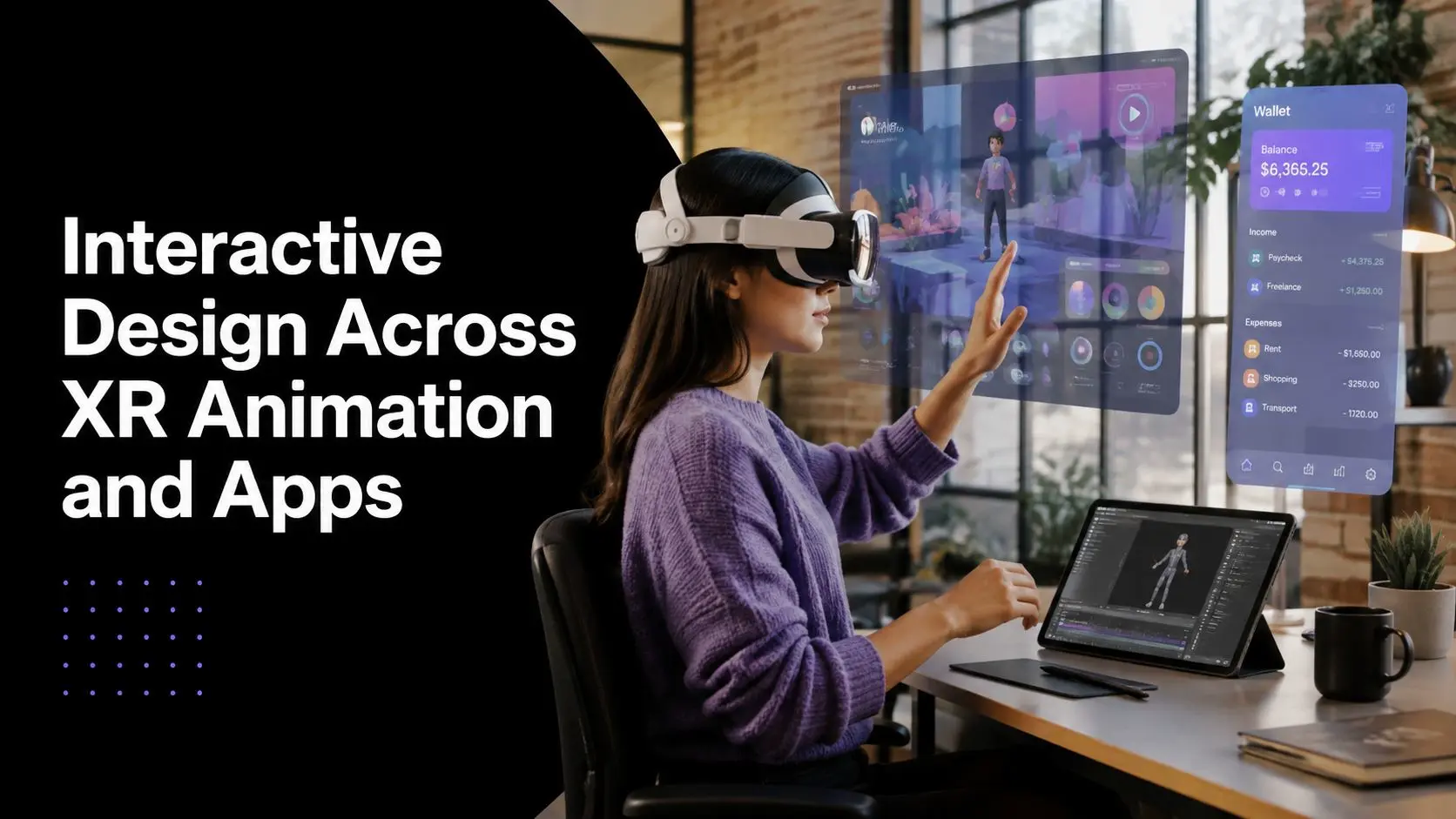
In children's animation, interaction design might shape how a viewer explores a story, chooses a character, or reacts to a prompt. In XR, it might control how someone reaches a menu, moves through a scene, or gets feedback from a spatial interface. In learning products, it often appears as guided steps, quick checks for understanding, or branching paths that respond to user choices. Studio Liddell's cross-media work is a good example of how those layers overlap in practice. A brand experience may start as a broadcast-style piece, then become an app, then a mixed reality event game, with the interaction design keeping the behaviour coherent across formats. The value is not only in production range, but in keeping the user's next step obvious wherever the experience lives.
Why this matters beyond screens
Several authoritative definitions of interaction design include products, services, systems, and physical-digital experiences, not just websites or apps. That matters because many commercial projects now cross those boundaries. A retail display, a VR training module, and a learning app all need the same basic discipline, a clear action, a reliable response, and a path forward the user can follow. For a related example of how AR thinking translates into product experience, Studio Liddell's guide to AR app development shows how immersive interfaces depend on interaction choices as much as visual effects. The lesson is consistent, good XR or app work isn't just about rendering, it's about making the system understandable in motion.
A producer's view of the commercial value
When a business chooses a full-service studio, it's usually trying to reduce friction between disciplines. Motion, UI, story, and technical implementation all need to agree on how the user moves. If they don't, the result is usually a pretty interface that nobody can use comfortably. That's where interactive design becomes a production issue as much as a design one. It influences how assets are built, how workflows are structured, and how the end experience feels across devices. For marketing teams, educators, and XR buyers, the strongest projects are the ones where the interaction plan is established before the visuals become fixed.
Business Benefits and Measurable Impact
Why do some interactive projects support sales, training, and retention, while others look polished but underperform? The difference is usually not visual style alone, it is whether the interaction reduces hesitation at the point where people need to act. Interactive design pays off in the places budgets usually feel most vulnerable, conversion, rework, and time lost to avoidable changes. In the UK, that argument is stronger because design quality is tied to measurable commercial outcomes, not just brand taste or screen finish.
What the numbers say
Analysts and industry studies keep returning to the same pattern. Well-run design teams are linked with stronger business growth, while late fixes to interaction problems are consistently more expensive than resolving them in the design phase. Performance matters too, because even small delays can interrupt the moment a user is ready to move forward.
| Metric | Value |
|---|---|
| Top-quartile design company revenue growth vs benchmarks | 2x |
| Cost to fix a UX problem during development vs design | 10x |
| Cost to fix a UX problem after launch vs design | 100x |
| Conversion reduction for each additional second of load time | 7% |
That table points to a practical rule. Weak interaction design creates hidden costs through rework, user drop-off, and slower decisions. Strong interaction design protects the budget by reducing those losses before they become expensive fixes.
Why responsiveness is a revenue issue
A fast, clear interface does more than feel pleasant. It lowers friction at the exact point where a user decides whether to continue, complete a form, or return later. If a form hesitates, if navigation feels confusing, or if the system gives no feedback, users pause. In commercial settings, that pause often becomes a lost conversion. The same logic applies to more complex experiences such as apps, event games, or XR installations. If the user cannot tell what is happening, or cannot recover after a mistake, the experience starts to feel unreliable. Reliability is part of the commercial promise, not a technical detail. Studio Liddell's AR ROI and engagement overview shows how immersive content is often judged by efficiency as well as creative quality. That matters for buyers who need to justify investment in terms a finance team can recognise.
How decision-makers should use the evidence
Use these figures to support early prototyping, usability testing, and iterative design. They give stakeholders a clear reason to shape behaviour before the visuals are locked in. Fixing interaction later usually means paying for redesign under pressure, when schedules are tighter and risks are higher. For clients, the clearest framing is simple. Interaction design protects revenue by reducing friction at the moments people decide whether to continue. In a UK commercial context, that makes it a delivery and compliance issue as much as a creative one, which is why it belongs in projects across XR, animation, apps, and learning.
Best Practices for Commissioning Projects
A good commission starts with behaviour, not aesthetics. If you know what users need to do, the studio can shape the interaction around that goal. If you start with style alone, you risk buying a polished surface with weak logic underneath.
Begin with accessibility and user paths
In the UK, accessibility has to be part of the brief from the start. The Equality Act 2010 makes reasonable adjustments part of service provision, so keyboard access, clear focus states, and usable error recovery are not optional extras. They're part of the product definition. That means your brief should describe the actual actions people need to complete. A sign-up flow, a learning checkpoint, a VR interaction, or a motion-led explainer all need different behaviour rules. If the team only receives moodboards, they'll have to guess.
Ask for the path, not just the polish.
What to request from a studio
A strong commission usually includes:
- •Behaviour goals, what must the user be able to do?
- •Prototype stages, can the interaction be tested before full build?
- •Diverse user testing, does the team check the flow with different needs and devices?
- •Pipeline realism, are the animations, XR tools, or app features feasible within budget and schedule?
- •Recovery design, can users correct mistakes without starting over?
Those criteria keep the project grounded. They also make it easier to compare suppliers because you're judging how they think, not just how they present. For a practical procurement reference, this guide to commissioning animation work in London is helpful for spotting the difference between a tidy pitch and a production-ready process.
How to judge credibility
Look for evidence that the studio can work across disciplines. Broadcast experience matters when timing and clarity matter. Unity and Unreal expertise matters when the work includes real-time interaction. A team that can explain how design choices affect build complexity is usually safer than one that talks only about visuals. That's especially important for projects that combine motion, apps, learning, or XR. The commission should describe the interaction outcome first, then the creative treatment, then the delivery path. That order keeps the work focused on what users need.
Next Steps to Start Your Interactive Project
The easiest way to begin is to audit the touchpoints you already have. Look for the places where people hesitate, misclick, abandon, or need help. Those are the points where interaction design will have the biggest commercial and usability effect.
A simple starting path
First, write down the behaviours your product or experience needs to support. Second, sketch the sequence of user actions and system responses. Third, turn that into a prototype the team can test before committing to full production. That sequence works whether you're planning an app, a learning tool, an XR experience, or an animated digital product. If you already work with motion or 3D teams, the next step is to map those creative assets to the user journey. Not every beautiful idea belongs in the final flow. The strongest work is usually the version that helps users understand what's happening fastest.
Why a full-service partner helps
Interactive projects go smoother when design, motion, and technical production stay aligned. That's where a studio with animation, apps, and XR capability under one roof can reduce handoff friction. Studio Liddell fits that model with production experience across 3D/2D animation, apps, and immersive work since 2019, which makes it a practical option when the brief crosses formats. A good partner will help you decide what should be interactive, what should be animated, and what should stay simple. That distinction saves time and protects the budget. It also makes the final experience easier to use.
Make the first move
Choose one high-friction journey and redesign that before scaling out. It will give you a clearer business case than a generic strategy deck, and it will show whether the team can turn intent into behaviour. If the prototype feels obvious to use, you're on the right track. --- If you're planning an app, XR experience, or animated digital product, Studio Liddell can help shape the interaction, production, and delivery path around the user journey. Start with a short brief or a prototype sprint, and you'll get a clearer view of what the experience needs to do before you commit to full build.