What Is Color Correction: A Guide for Producers & Brands
You're in the final review of a launch film, a TV spot, a product animation, or an XR piece. The edit works. The messaging is right. The timing is sharp. But one shot feels slightly green, the next is too warm, and a hero product suddenly looks different from the approved brand palette. Nobody on the call says “the colour pipeline failed”. They just say it looks a bit off. That “off” feeling is usually colour inconsistency. For producers and brand teams, that matters more than most tutorials admit. Colour correction isn't just a finishing-room technicality. It affects how credible the work feels, how consistent a brand appears, and whether the final piece holds together across a campaign, a series, or a multi-platform rollout. In UK media contexts, that consistency also has a measurable audience effect. 68% of UK viewers report better emotional engagement with videos that have consistent colour tones, and colour inconsistency reduces viewer retention by 22%, according to this colour correction overview. If you commission content regularly, this sits alongside every other production decision that shapes quality, from creative development to delivery specs. That's why it belongs in the same conversation as broader video content production planning for UK businesses.
The Unseen Step That Makes or Breaks Your Video
A client usually notices colour correction by noticing its absence. A presenter's skin tone changes between angles. A branded red shifts from one scene to the next. A CGI environment looks polished in one sequence and strangely flat in another. In a children's series, a commercial, or a museum installation, those mismatches chip away at trust because the viewer stops following the story and starts noticing the manufacture. That's why colour correction is one of the least glamorous but most important parts of post. It's the work that makes the whole programme feel intentional.
Why producers feel the problem before they can name it
Most stakeholders won't ask whether the luma levels are sitting properly or whether the white balance drifted between setups. They'll say:
- •“This shot feels colder” even if the lighting setup was meant to match.
- •“The product doesn't look premium here” when contrast or exposure is inconsistent.
- •“Why does this scene suddenly look digital?” when rendered elements and live-action plates aren't balanced together.
Those reactions are valid. Colour correction has a direct effect on narrative clarity and brand confidence.
Strong correction rarely draws attention to itself. Weak correction makes every cut feel harder.
In high-end work, this stage isn't about making footage flashy. It's about removing distractions. If the image changes for no story reason, the audience reads that as a mistake.
Where it shows up most clearly
The bigger and more complex the production, the more visible the problem becomes:
| Production type | What colour inconsistency disrupts |
|---|---|
| TV commercials | Brand fidelity and premium feel |
| Series work | Continuity between scenes and episodes |
| Product films | Accurate material, packaging, and finish |
| XR and VR | Immersion and visual comfort |
| Animation | Cohesion across layers, shots, and episodes |
For producers, the practical takeaway is simple. If the final piece needs to look broadcast-ready, campaign-ready, or platform-ready, colour correction isn't optional. It's the step that turns a set of shots into one coherent visual experience.
What Is Colour Correction Exactly
Colour correction is the technical process of fixing image problems so footage or rendered shots look natural, balanced, and consistent before any creative styling is applied. It's the first serious colour pass in post-production, and its job is to create a neutral baseline.
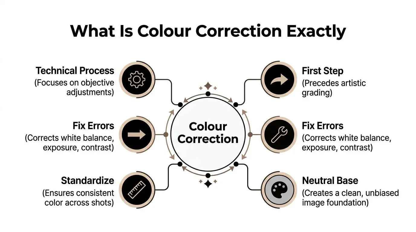
The simplest way to think about it is this. If grading is a choice, correction is a fix. Correction deals with what's objectively wrong or inconsistent. That includes exposure, white balance, contrast, and tonal placement across the frame. According to Raindance's explanation of colour correction in films, professional correction targets absolute black at 0, 20 IRE and absolute white at 80, 100 IRE, using the Parade (RGB) for white balance and the Waveform (Luma) for exposure.
What gets corrected
A proper correction pass usually addresses a short list of fundamentals:
- •Exposure balance. Bringing shots that are too dark or too bright back into a usable range.
- •White balance. Removing unwanted blue, green, or orange casts so neutrals read as neutrals.
- •Contrast structure. Setting clean separation between shadows, midtones, and highlights.
- •Shot consistency. Matching adjacent shots so a scene feels continuous rather than stitched together.
- •Technical normalisation. Making sure the image sits on a dependable base before further finishing.
If a product shot looks slightly yellow under one setup and slightly magenta in the reverse angle, correction resolves that before anyone starts discussing mood or cinematic style.
Why “natural” is harder than it sounds
Natural doesn't mean untouched. It means the image feels believable and stable to the human eye. That often requires deliberate intervention. Cameras, render engines, mixed lighting, different artists, and compressed review files all introduce bias. A colourist removes that bias so the project stops fighting itself visually.
Practical rule: If the audience notices the colour from shot to shot when they shouldn't, the footage isn't corrected yet.
For brand and producer teams, this is also the answer to the search query what is color correction. It's not an aesthetic extra. It's a technical balancing pass that makes the image trustworthy. Once that base exists, the creative team can decide whether the final look should feel warm, crisp, dramatic, muted, glossy, or stylised. Without that neutral base, every later decision becomes less reliable.
Colour Correction vs Colour Grading
These terms get mixed together constantly, but they don't mean the same thing. Colour correction fixes and standardises the image. Colour grading shapes the final style. One is technical. The other is expressive. They happen in sequence for a reason.
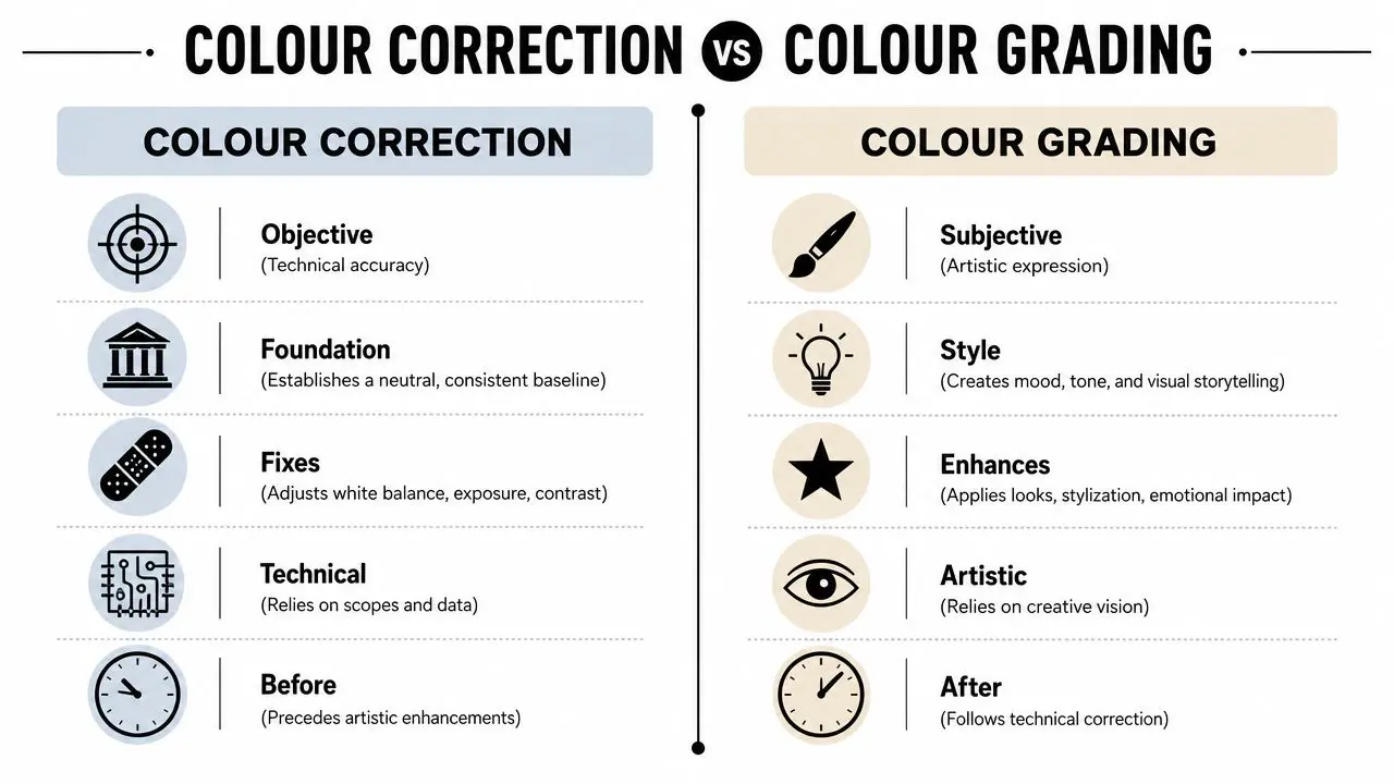
The house-building analogy is still the cleanest one. Correction is the foundation, the level floors, and the working structure. Grading is the interior design. If the structure is unstable, the styling won't save it.
Side-by-side in practical terms
| Colour correction | Colour grading |
|---|---|
| Fixes exposure, white balance, and contrast | Creates mood, identity, and atmosphere |
| Aims for neutrality and consistency | Aims for style and emotional tone |
| Uses scopes to solve technical issues | Uses creative judgement to shape the look |
| Happens first | Happens after correction |
| Should feel invisible | May feel distinctive |
A well-corrected image often doesn't call attention to itself. A well-graded image might absolutely be noticeable, because that's where the creative signature lives.
What works and what doesn't
What works is correcting first, then grading. What doesn't work is trying to apply a “look” to unstable footage and hoping the style will hide the problems. That usually creates three predictable issues:
- •Skin tones become harder to control
- •Brand colours drift
- •Scene continuity gets worse, not better
If you want a useful primer on the creative side, these video color grading concepts are a good companion resource because they frame grading as a storytelling layer rather than a repair tool.
Correction answers “Is this image technically right?” Grading answers “How should this image feel?”
That distinction matters a lot in commercial production. A campaign may need a recognisable visual character, but it still has to preserve product colour, legal legibility, and shot-to-shot continuity. Producers who separate those decisions early avoid a lot of expensive revisions later.
Why clients should care about the difference
When clients ask for “more cinematic colour”, they're usually talking about grading. When they say “why does this scene not match the previous one?”, they're talking about correction, even if they don't use that word. The healthiest review process keeps those conversations separate. First make the material accurate. Then make it expressive. That order protects the story, the edit, and the brand.
The Technical Workflow and Essential Tools
From a producer's point of view, colour correction works best when it follows a disciplined workflow. It isn't random knob-turning at the end of post. It's a sequence of technical decisions that stabilise the image before delivery.
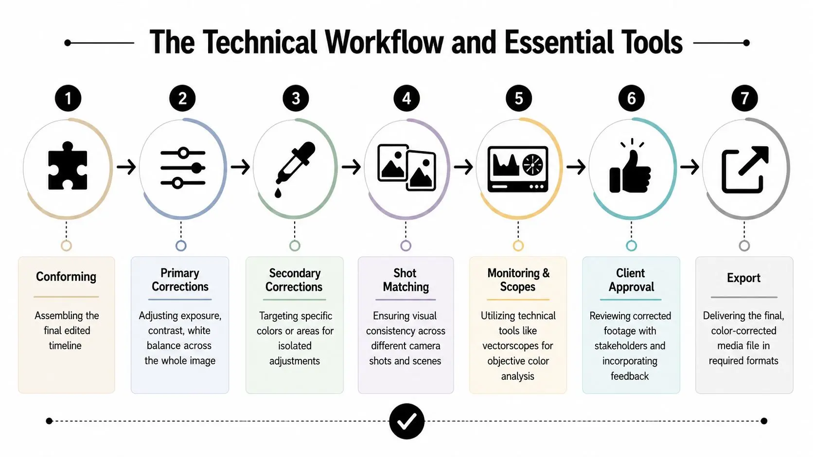
The core sequence in a professional session
A typical correction pass moves through a structure like this:
- Conform the final timeline
- Apply primary corrections
- Handle secondary corrections
- Match neighbouring shots
- Review on proper monitoring
- Client review and notes
- Export masters for delivery
The tools that matter most
At a high level, colourists rely on a small set of tools repeatedly.- •Waveform (Luma) shows brightness placement across the image.
- •Parade (RGB) reveals channel imbalance and helps correct white balance.
- •RGB curves allow tonal and colour control with precision.
- •Qualified monitoring confirms that the choices made in session will translate reliably.
According to the Wikipedia overview of colour grading workflows, professional pipelines for clients such as Sky Kids and BBC set ISO, white balance, and colour space at ingest for Raw footage, then adjust via RGB curves, Parade (RGB), and Waveform (Luma) before exporting in ProRes 422 HQ to preserve colour accuracy.
Why standards and prep matter
A lot of colour problems start before the colour session begins. Mixed camera settings, poor colour management, and inconsistent renders create avoidable clean-up work. For producers, these are the questions worth asking before post gets expensive:
- •Was the source managed properly from ingest or render export?
- •Were colour spaces defined early rather than guessed later?
- •Is the monitoring environment trustworthy for approval?
- •Are deliverables clear for broadcast, web, social, or installation playback?
If your team needs a practical reference for how calibration material works in testing and review, this guide to video test patterns is useful background reading. The software matters too, but software choice is secondary to workflow discipline. Plenty of teams can create technically poor colour in good software. The tools help only if the process is sound. For teams comparing finishing environments, this overview of best video editing software options is a helpful starting point.
A colour session goes faster when the production made fewer avoidable decisions upstream.
That's the trade-off. You can save time in post by setting the project up properly, or you can spend that time later fixing preventable inconsistencies. Most premium workflows choose the first option.
Applying Colour Correction in Animation and XR
In animation and XR, colour correction isn't about repairing a camera image in the usual sense. It's about unifying a manufactured world.
That's a different challenge from live action. In a 3D pipeline, the foreground character, the environment, the atmosphere pass, the reflections, and the effects layers may all come from different departments and different software. Each can be technically correct on its own and still feel mismatched once composited. According to this guide to the 3D animation pipeline, colour correction is a distinct and mandatory post-production step after compositing and 2D VFX but before final output, used to give the unified layers a polished, broadcast-ready finish.
Why CGI still needs correction
A common misconception is that rendered imagery should already be perfect. In practice, it rarely arrives fully unified. Here's where inconsistency creeps in:
- •Lighting variation between sequences or episodes
- •Render differences from updated shaders, LUTs, or colour management settings
- •Compositing imbalance where shadows, glows, or atmospherics sit apart from the plate
- •Asset drift when hero objects or characters evolve across production
In a children's series, that can make a lead character look subtly different from scene to scene. In a product visualisation, it can alter how premium a material feels. In XR, it can break immersion because the user senses that elements don't belong in the same visual space.
The XR complication
XR adds another layer of difficulty because the work has to function in an experience, not just a flat frame. A training simulation, branded activation, or virtual environment often has to balance:
- •Clarity for interface elements and safety prompts
- •Comfort so contrast and luminance don't fatigue the user
- •Consistency across real-time and pre-rendered assets
- •Believability so the world feels coherent enough to trust
That's why colour correction also connects to wider real-time and on-set workflows. If your production spans rendered content, real-time engines, LED volumes, or mixed pipelines, this practical guide to what virtual production is for modern creatives gives useful context.
In animation, the correction pass is often where separate good decisions finally become one good image.
What producers should watch for
Animation and XR clients should pay close attention to three approval points:
| Approval point | What to check |
|---|---|
| Character consistency | Skin, fur, costume, or surface colour across scenes |
| Environment coherence | Whether backgrounds, effects, and hero assets feel lit together |
| Platform translation | Whether the image still reads properly on the final playback system |
For high-end CGI and immersive work, colour correction acts as the final visual arbitration layer. It decides whether every element belongs to the same world. That's why it sits so close to delivery. By that point, the question is no longer “was this asset built well?” It's “does the audience believe all of this belongs together?”
Common Pitfalls and The Future with AI
Most bad colour correction doesn't fail because the software lacked features. It fails because people push the image too hard, trust their monitor too much, or let automation make aesthetic decisions it can't understand. The classic mistakes are easy to spot once you know them. Shadows get crushed until detail disappears. Saturation gets pushed until product colours look synthetic. Skin starts drifting into orange, green, or magenta because someone chased “punch” instead of balance.
The recurring mistakes
These are the issues I see most often in review rounds:
- •Black levels pushed too low so dark areas look heavy and dead rather than controlled
- •Highlights driven too far so premium surfaces lose texture
- •Over-saturation that makes packaging, clothing, or environments feel cheap
- •Unnatural skin because global adjustments weren't followed by careful secondary work
- •Accessibility ignored when text, graphics, or UI elements lose legibility against the image
That last point matters more in branded and public-facing content than many teams realise. If your project includes captions, interfaces, or exhibit graphics, this guide on how to improve accessibility with color contrast is worth reviewing during design and finishing.
Where AI helps and where it doesn't
AI tools are useful. They can speed up first-pass balancing, automate some matching, and reduce repetitive setup work. That's real value, especially on large jobs with lots of source material. But the current reality is still hybrid. According to a 2025 UK Media Production Survey, 74% of UK creatives still perform manual colour correction after AI preprocessing, especially for skin tone accuracy and mood consistency, as noted by SLR Lounge's article on colour correction rules. That tracks with real-world finishing. AI is good at finding patterns. It's much weaker at judging whether a luxury product still feels luxurious, whether a child character still looks friendly under a changed palette, or whether a scene's emotional tone has shifted in a way the director never intended.
The future isn't AI or human colour work. It's AI for speed, with humans holding the standard.
The practical model going forward
The best use of AI in colour pipelines is narrow and supervised:
- •Good use. Initial balancing, sorting, repetitive matching assistance
- •Bad use. Final approval on skin, brand colours, hero products, or emotionally sensitive scenes
For producers, that means asking a better question. Not “does this studio use AI?” but “where in the workflow does AI help, and where does human judgement take over?” That answer tells you far more about likely quality than the software list ever will.
Partnering for Perfect Colour What to Expect
A strong colour process starts before the final render queue. If you're commissioning premium content, expect the conversation about colour to begin early, not after the edit is locked and everyone is tired. Bring references. Bring brand guidelines. Flag any colours that cannot drift, especially packaging, UI elements, uniforms, or licensed assets. If the piece needs to feel grounded, playful, dramatic, clinical, or premium, say that directly. Those aren't vague preferences. They shape real technical choices.
What a good collaboration looks like
The smoothest colour approvals usually have three things in place:
- •Clear intent so the colourist knows what the image must preserve
- •A proper review stage where stakeholders can judge the work before final output
- •Defined deliverables for every platform the project has to serve
Clients should also expect a conversation about where the content will live. Broadcast, social, web, installation, and headset playback don't behave identically, and colour decisions need to survive that journey.
Useful questions to ask your post team
A producer doesn't need to talk like a colourist, but these questions are worth asking:
- •How are you protecting brand-critical colours?
- •How will you review and approve corrected shots?
- •What are the master delivery specs for each platform?
- •Are you correcting for consistency first, then grading for style?
If the answers are clear, the process is probably in good shape. If the answers are vague, the risk usually appears later in revisions. The best colour work feels effortless to the audience because the team did the hard thinking upstream. That's what clients should expect. Not magic. A disciplined process, a calibrated eye, and final images that support the story instead of distracting from it. --- If you need a production partner that understands how colour, finishing, animation, and immersive delivery fit together in one pipeline, Studio Liddell can help scope the work properly from the start. For complex brand films, animation, XR experiences, and broadcast-facing content, the right colour process protects both narrative quality and brand consistency.