What Is Parallax Scrolling and How Studios Use It
Parallax scrolling is a layered motion technique where background content moves more slowly than foreground content, and that difference creates the illusion of depth on a flat screen. A 2015 usability study found mean task-completion times of 145.83 seconds for parallax pages versus 137.33 seconds for non-parallax pages, so the effect changes how people use a page, not just how it looks. [^1] That matters if you're choosing whether to invest in it, because parallax isn't just a visual flourish. In a production setting, it sits at the intersection of storytelling, performance, accessibility, and technical cost, which is exactly where design decisions tend to get expensive if nobody asks the right questions early.
The Depth Illusion Behind Parallax Scrolling
A user lands on a page, starts scrolling, and sees mountains drift lazily behind bold text while the headline moves at full pace. That small mismatch in speed is the entire trick. Parallax scrolling uses that mismatch to create depth, so the page feels layered instead of flat.
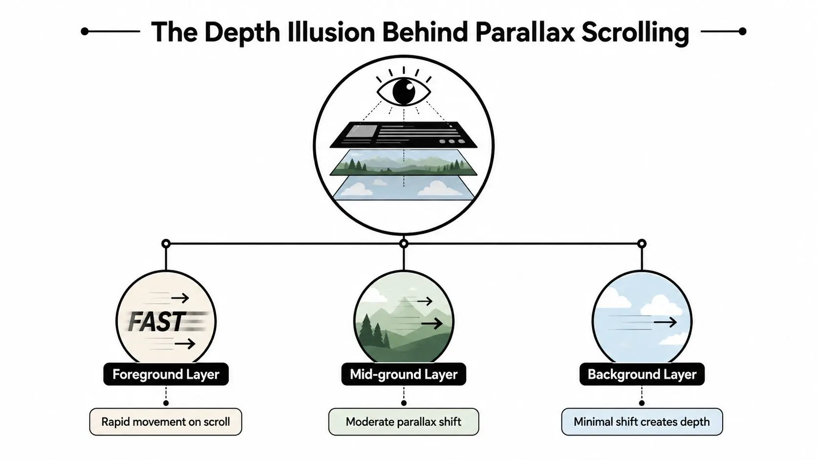
The idea didn't begin on the web. Its earliest widely cited lineage comes from the 1930s multiplane camera used in animation, where artists placed artwork at different distances from the lens to simulate depth. That historical foundation matters because British animation and games production later adopted the same layer-based visual logic for storytelling and interactive media. [^1]
Why the effect feels so natural
Humans already read depth through motion. Things that feel close to us seem to move faster than things far away, so when a webpage mirrors that behaviour, the brain fills in the rest. That's why parallax can feel cinematic even when the screen is still technically two-dimensional. It's not magic, it's a design choice that borrows from animation history and translates it into scroll-driven storytelling. A useful way to think about it is as a production technique, not a decorative overlay. If the layer movement supports the message, it can make a page feel more composed and intentional. If it doesn't, it just adds movement for its own sake.
Practical rule: if the viewer can't tell what changed or why it changed, the parallax probably isn't doing useful work.
How Parallax Layers Create the Illusion of Depth
Think about looking out of a train window. The fence posts close to the tracks whip past, while the hills in the distance barely seem to move. Parallax scrolling copies that same relationship between near and far objects.
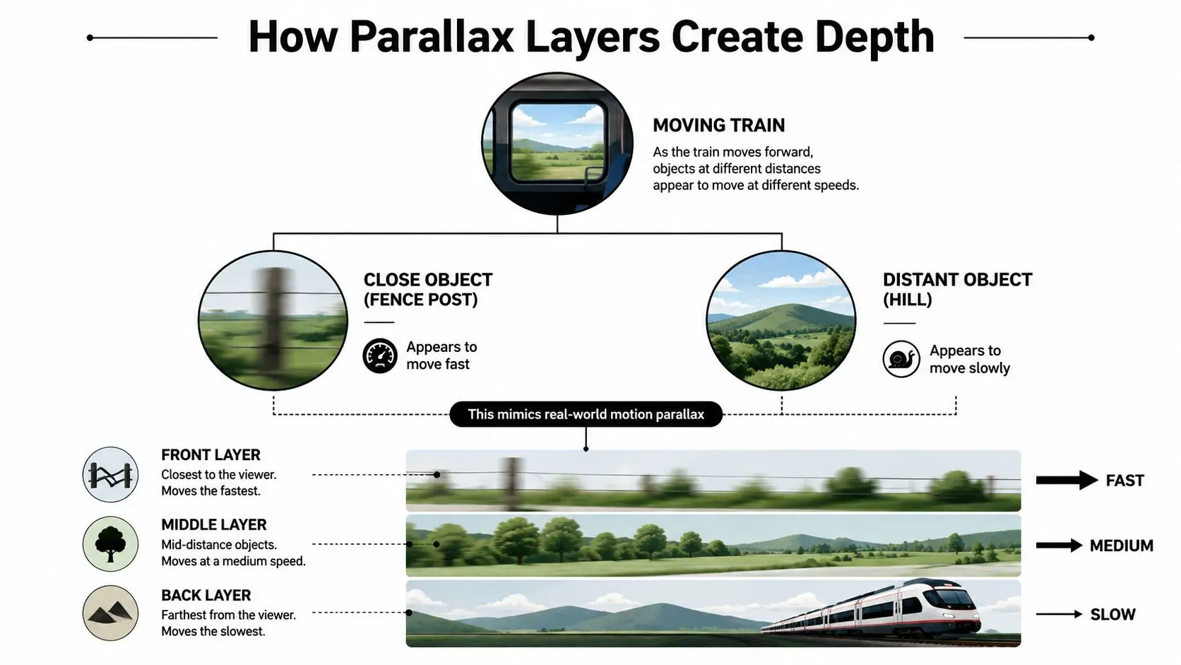
The digital version starts with stacked layers, usually foreground, mid-ground, and background. Each layer gets its own scroll velocity, so the browser updates their position at different rates as the user moves through the page. On the surface, that feels like depth. Underneath, it's just calculated movement.
What the browser is actually doing
The foreground usually moves at or near normal scroll speed. Text, buttons, and characters stay easy to read because they're meant to feel close to the user. Mid-ground and background layers slow down progressively, which creates separation without making the composition feel disconnected. In practice, the page's scroll position drives those updates through event listeners or scroll-driven animation logic. Each layer's transform values are recalculated from that position, then rendered back to the screen. That's why a parallax scene can feel alive even though nothing is “standing still” in the traditional sense. For a developer or motion lead, the key question is not whether the scene moves. It's which layer leads the story, and which layers exist purely to support it. If you're briefing a team, a useful question is simple, where should the eye land first, and what should lag behind that moment by just enough to create contrast? For a studio, that answer decides whether the sequence feels considered or messy. See how that thinking maps onto wider design and motion work in Studio Liddell's design and motion approach.
CSS Versus JavaScript Implementation Approaches
There isn't one “right” way to build parallax. The choice usually comes down to how much control the scene needs, how much performance budget you've got, and who's going to maintain it later.
CSS for lighter effects
CSS-based parallax often uses perspective and translateZ to create depth. Because those properties can be GPU-accelerated, this route can stay relatively light on the browser, especially for simple background shifts. It suits cleaner compositions where the motion is subtle and the layout doesn't need many independent moving pieces. The trade-off is control. Once the scene gets more complex, pure CSS starts to feel restrictive, especially when timing, sequencing, or narrative transitions matter.
JavaScript for precise control
JavaScript-driven parallax usually listens to scroll events and updates layers with code, often alongside `requestAnimationFrame`. That gives you granular control over multiple elements, different velocities, and more complex storytelling beats. The price is overhead. More calculations mean more chances for jank on lower-end devices, especially if the scene leans on heavy images or too many layered transforms. It's the better option when motion is part of the product story, but it needs discipline.
Hybrid setups for real projects
A hybrid approach is often the most practical. CSS handles simple layer movement or background shifts, while JavaScript orchestrates the more narrative parts of the experience. That keeps the easy bits lean and reserves code-heavy logic for moments that need it. For teams deciding between them, the question is whether the page needs a gentle sense of depth or a choreographed sequence. If it's the latter, JavaScript earns its place. If not, CSS is usually enough. Reviewing the implementation side with a creative production lens helps, and Studio Liddell's web and mobile development guidance is a useful companion if your team is weighing motion against build complexity.
Measuring the User Experience Impact of Parallax
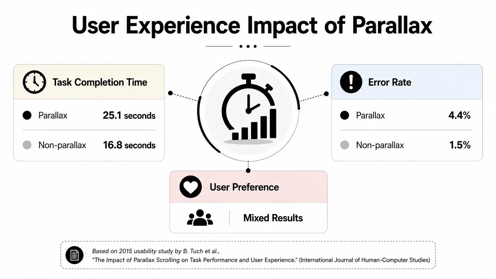
Parallax can look elegant and still make a page harder to use. The 2015 usability study linked in the brief found mean task-completion times of 145.83 seconds for parallax pages versus 137.33 seconds for non-parallax pages, and a mean usability score of 3.67 for the parallax pages. [^1] Those figures don't make parallax “bad”, they show that it changes how people behave.
What the numbers are really telling you
A longer task time can mean immersion, or it can mean friction. The difference depends on the job the page is meant to do. If the goal is brand storytelling, a little extra dwell time may support the experience. If the goal is a transaction, extra time is usually a warning sign. That's why parallax has become more common in richer digital storytelling contexts. It became much more visible after 2011, when HTML5 and CSS3 made it easier to build and helped it spread from game-inspired visuals into mainstream sites. [^2] In the UK, that timeline aligns with richer digital storytelling across agencies, broadcasters, and educational content producers. [^2] The same study cited above also shows why subjective praise isn't enough. Users may like the feel of a page and still take longer to complete a task on it. That tension is the entire decision.
If the motion makes the message clearer, it can help. If it makes the user work harder to find the message, it's costing you.
For decision-makers, the safest reading is practical. Measure parallax against the page's purpose, not against whether it looks modern.
Performance Costs and Accessibility Trade-Offs
Parallax looks especially attractive in a pitch deck, then gets much harder to justify once mobile performance enters the conversation. UK audiences use mobile heavily, and motion-heavy pages can become fragile when they're pushed through slower connections or less powerful devices. The issue isn't the idea of depth itself, it's the cost of delivering it smoothly. Heavy scroll-driven animation, oversized layered imagery, and JavaScript calculations can all strain Core Web Vitals. That matters because the page has to stay responsive while the user is scrolling, tapping, and reading. If motion steals resources from the rest of the interface, the experience starts working against itself.
Accessibility needs to be designed in
Motion can also be a problem for users with vestibular disorders or motion sensitivity. Layered scrolling can trigger discomfort if the effect is strong, constant, or unexpected. Screen reader users can face a different issue, where layered content disrupts logical reading order if the markup isn't structured carefully. That's why prefers-reduced-motion shouldn't be an afterthought. If the effect is central to the design, a reduced-motion fallback should still preserve the page's meaning and usability. A lighter CSS transform-based effect is often safer than elaborate JavaScript motion, especially when the audience includes mobile users or accessibility-sensitive users. A useful outside reference for motion-heavy virtual environments is reduce motion sickness in virtual tours, because the same basic design principle applies, keep motion purposeful and give users control. The practical test is blunt. If the animation doesn't survive a slower device, a reduced-motion setting, and a screen reader pass, it isn't ready for production.
Parallax Principles Across Animation Games and XR
Parallax isn't just a web effect. It's a depth-making principle that shows up in 2D animation, games, and immersive work, because all three depend on the same visual logic. Layers that move at different speeds create a stronger sense of space than one flat plane ever can. In 2D animation, that logic helps title sequences and explainers feel cinematic without needing full 3D. Background artwork can drift more slowly than foreground characters or type, so the frame reads as layered and composed. That's one reason the technique has lasted so long in production pipelines. In games, especially side-scrollers and platformers, parallax backgrounds do a huge amount of work for very little technical overhead. A distant skyline, a foreground platform, and a moving character can tell the eye where to look without asking the renderer to build a fully simulated 3D world. In XR, the principle broadens again. Head-tracked camera movement in VR and AR creates depth through shifts in what feels close versus distant, so the viewer's position changes the relationship between layers. Studios working in Unity and Unreal use those same depth cues when they build real-time environments and spatial narratives. If you're thinking beyond web design, Studio Liddell's spatial design guide is a useful reference point for how layered space behaves in immersive UX. The throughline is simple. Whether the canvas is a landing page, a game level, or a virtual scene, parallax helps the audience read hierarchy, distance, and focus.
When to Use Parallax and When to Skip It
Parallax earns its place when the depth effect supports the message. A narrative landing page, a brand story, a portfolio, or an immersive product reveal can all benefit from a sense of layered progression. In those cases, the motion isn't decoration, it's part of how the story unfolds. It's a poorer fit when the page exists to complete a task quickly. Transactional flows, content-heavy publications, and mobile-first utility sites usually need clarity more than atmosphere. If the user's job is to compare, submit, search, or read quickly, motion can become a distraction.
A briefing checklist that keeps projects honest
- •Narrative fit: Does the depth effect reinforce the story, or is it just filling space?
- •Performance budget: Can the team keep the page fast without sacrificing the motion?
- •Audience profile: Are most users likely to be on devices that can render the effect smoothly?
- •Accessibility: Does the design still work with reduced motion and assistive tech?
- •Maintenance load: Will the team still be comfortable updating the scene six months later?
If the answer to any of those is weak, the simpler option is usually the stronger one. That's not a creative compromise, it's a production judgment. For the right brief, parallax can be a smart way to add depth and control attention. For the wrong one, it just adds weight. --- If you're planning a site or digital experience and you want a clear view on whether parallax is worth the build, Studio Liddell can review the brief, assess the motion approach, and shape the production route around performance and storytelling. Visit Studio Liddell to start the conversation and see how their team handles layered digital experiences from concept through delivery. [^1]: 2015 usability study summary for parallax scrolling [^2]: Parallax scrolling implementation timeline and usability notes