A Studio's Guide to Designing a Mobile App That Wins Users
Designing a mobile app isn't a linear shot from idea to launch. It’s a structured journey, starting with deep research and strategy, moving through UX wireframing and sharp UI design, and then into prototyping and testing before a developer even sees it. This process makes sure the final app doesn’t just _work_, but actually solves a real problem for real people.
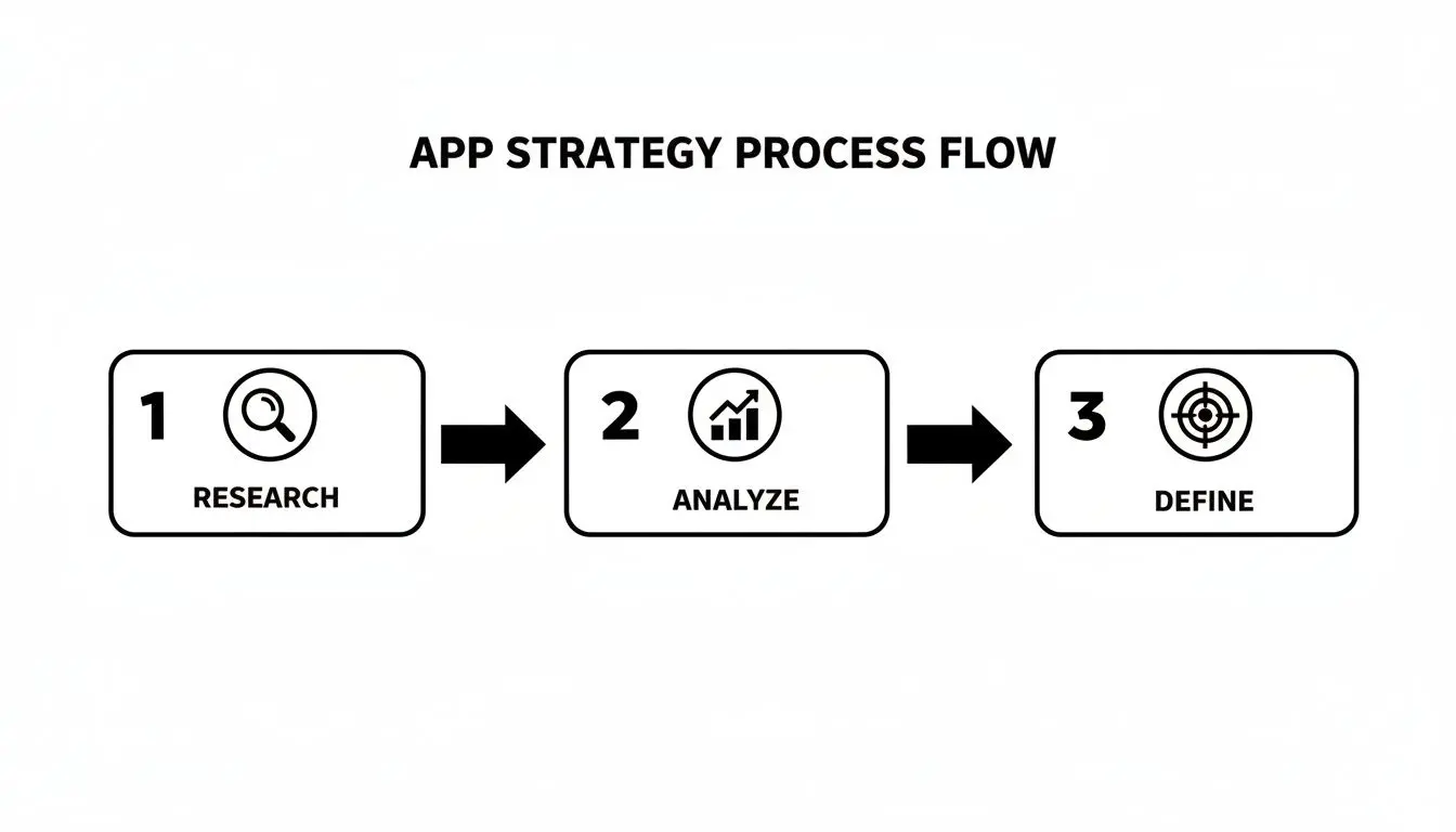
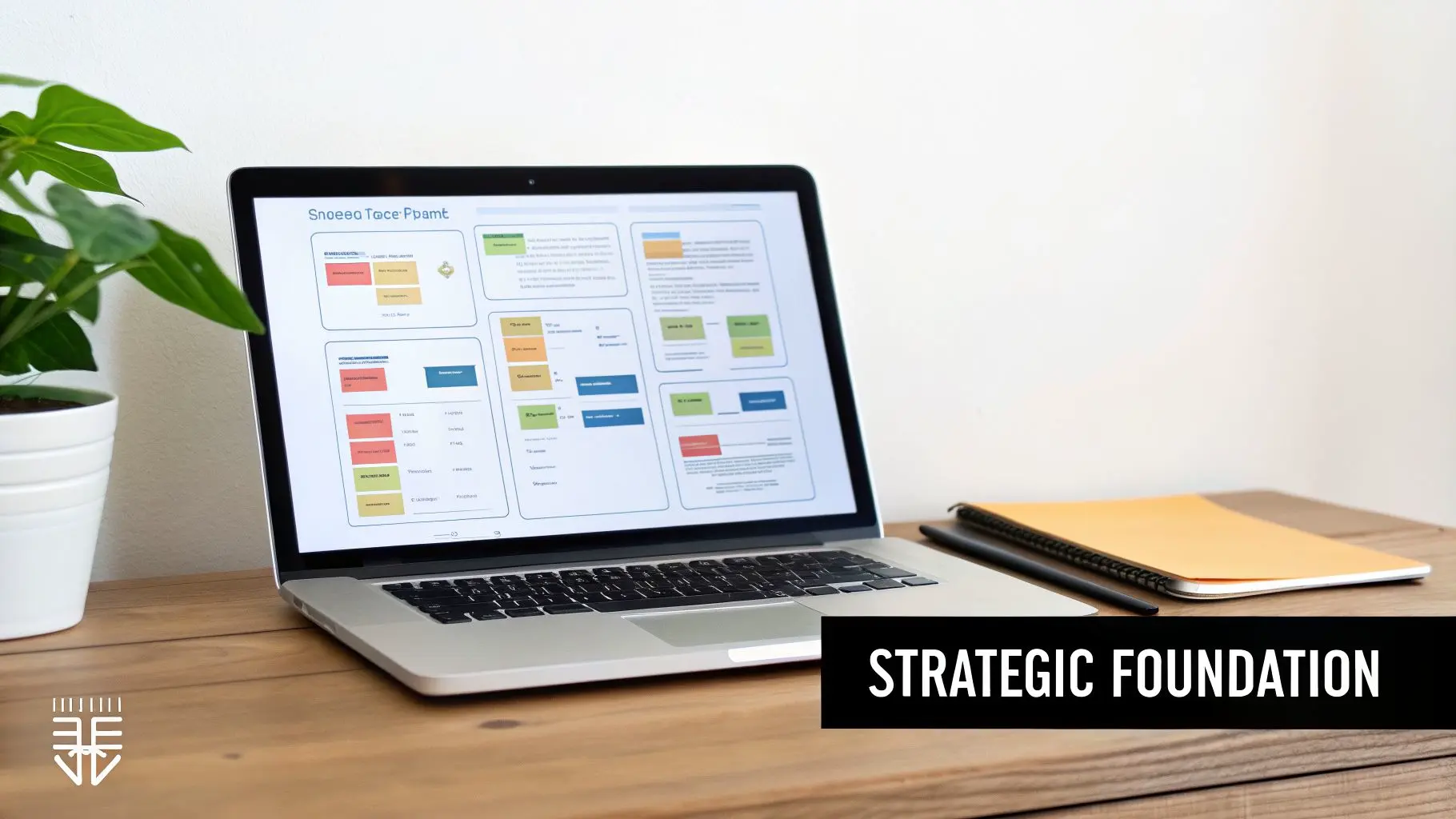
Building a Strategic Foundation for Your App
Every truly great app starts by answering a simple, crucial question: "Why?" Before you even think about colours or features, you need a solid strategic foundation. This discovery phase is all about turning a vague idea into a validated business case, saving you from expensive wrong turns later. Think of it as de-risking the entire project from day one. It all kicks off with user research. And no, this isn't about asking people what features they want. It’s about digging into their real-world needs, frustrations, and behaviours. We use techniques like one-on-one interviews, surveys, and focus groups to build a rich picture of the target audience. The aim is genuine empathy, to understand the context where your app will live, swapping our assumptions for hard data.
Uncovering Opportunities Through Analysis
Once you have a grip on your user, the spotlight turns to the competition. A thorough competitive analysis means identifying who’s out there, what they do well, and where their weaknesses lie. This isn't about pinching their ideas; it’s about finding the gaps in the market. What are other apps nailing? More importantly, where are they letting their users down? This insight flows directly into crafting a sharp, compelling value proposition. It’s a crystal-clear statement explaining the unique benefit your app delivers and how it solves a user's problem better than anyone else. This becomes your North Star, guiding every single design decision from here on out. This whole process, Research, Analyse, and Define, is the critical path to creating an app with a clear purpose.
This structured flow ensures every design choice is rooted in solid evidence, not guesswork. The insights you gain here aren’t just for a report that gathers dust; they actively shape the app's core features and feel.
Defining the Core Feature Set
The final piece of the foundation is translating all that strategy into a concrete plan. This means defining the core feature set, what you'll launch with in your minimum viable product (MVP). The trick is to ruthlessly prioritise features that directly tackle the main user problem and deliver on your value proposition. Launching with too many bells and whistles just creates confusion and inflates your budget.
A well-defined MVP isn't a cheap version of your final product. It’s the smartest, fastest way to get your app into the hands of real users and start learning from them. It’s about building the _right thing_ before you build the _thing right_.
This focused approach is vital, especially in a market as busy as the UK. In 2023, the UK mobile app market hit an impressive USD 14,205.3 million in revenue and is on track to reach USD 32,860.0 million by 2030. With smartphone penetration at 88%, UK consumers have high standards and little patience for apps that don't deliver. This massive market growth highlights why a watertight strategy is non-negotiable if you want to stand out. To dive deeper into this, check out our complete guide to app development journey in the UK. This initial planning phase gives you the roadmap that will guide the entire design and development process.
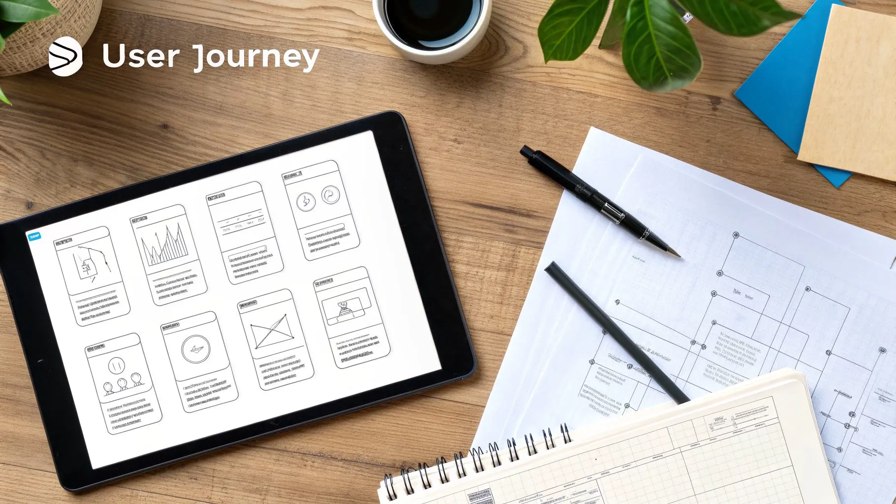
Mapping the User Journey and App Structure
Once your strategy is locked in, it’s time to start giving the app its shape. This is where we translate all that abstract research and those brilliant ideas into a tangible, logical structure. Forget about colours and fancy fonts for now; this stage is all about building the skeleton and making sure every single screen and interaction has a clear purpose. It all begins by putting a human face on your research with user personas. These aren't just dry demographic profiles. We're talking about creating detailed, fictional characters born from real user data. They get names, jobs, motivations, and pain points. For a fitness app, we might create "Active Alex," a 30-year-old professional who needs quick, high-intensity workouts, and "Beginner Brenda," a 55-year-old looking for gentle, guided routines. Every design decision from here on out gets filtered through their eyes.
Charting the Path With User Flows
Okay, so we know _who_ we’re designing for. Next up is mapping out _what_ they’ll actually do. We do this with user flow diagrams , simple visual charts that map every single step a user takes to get something done, from their first tap to the final confirmation. User flows are brilliant for spotting friction points before they become real problems. Say, booking a class takes seven steps. Laying it out visually makes that clunky process glaringly obvious. It forces you to ask the hard questions:
- •Is this step even necessary? Can we merge it with another one, or just get rid of it completely?
- •What does the user need to know _right now_? We need to avoid throwing a wall of irrelevant options at them.
- •What’s the most obvious next action? The path of least resistance should always be the default.
By meticulously mapping these journeys, we make sure the app’s navigation feels intuitive, not like a maze.
Building the Blueprint With Wireframes
With the user journeys clearly defined, we move on to creating low-fidelity wireframes. Think of these as the architectural blueprints for your app. They’re simple, black-and-white layouts that focus purely on structure, content hierarchy, and how things work. No colours, no fonts, no images , nothing to distract from the core layout. This stripped-back approach is deliberate. It forces everyone involved to focus on the user experience without getting hung up on aesthetic details. The questions here are about function, not form: "Is this button easy to find?" or "Does this screen give the user all the information they need?" If you're new to this crucial step, A Guide to Wireframing for Mobile Apps offers a great deep-dive into the techniques.
Wireframing isn't about making things pretty; it's about making things work. It's the fastest and most cost-effective way to test different layouts and iterate on the app's core structure before a single line of code is written.
This part of the process is super collaborative. We use tools like Figma or Sketch to quickly mock up these skeletal screens and share them with the team and stakeholders. It allows for incredibly fast feedback cycles where we can test out different layouts and nail down the most efficient solution for every task. This foundational work is what makes an app feel effortless to use.
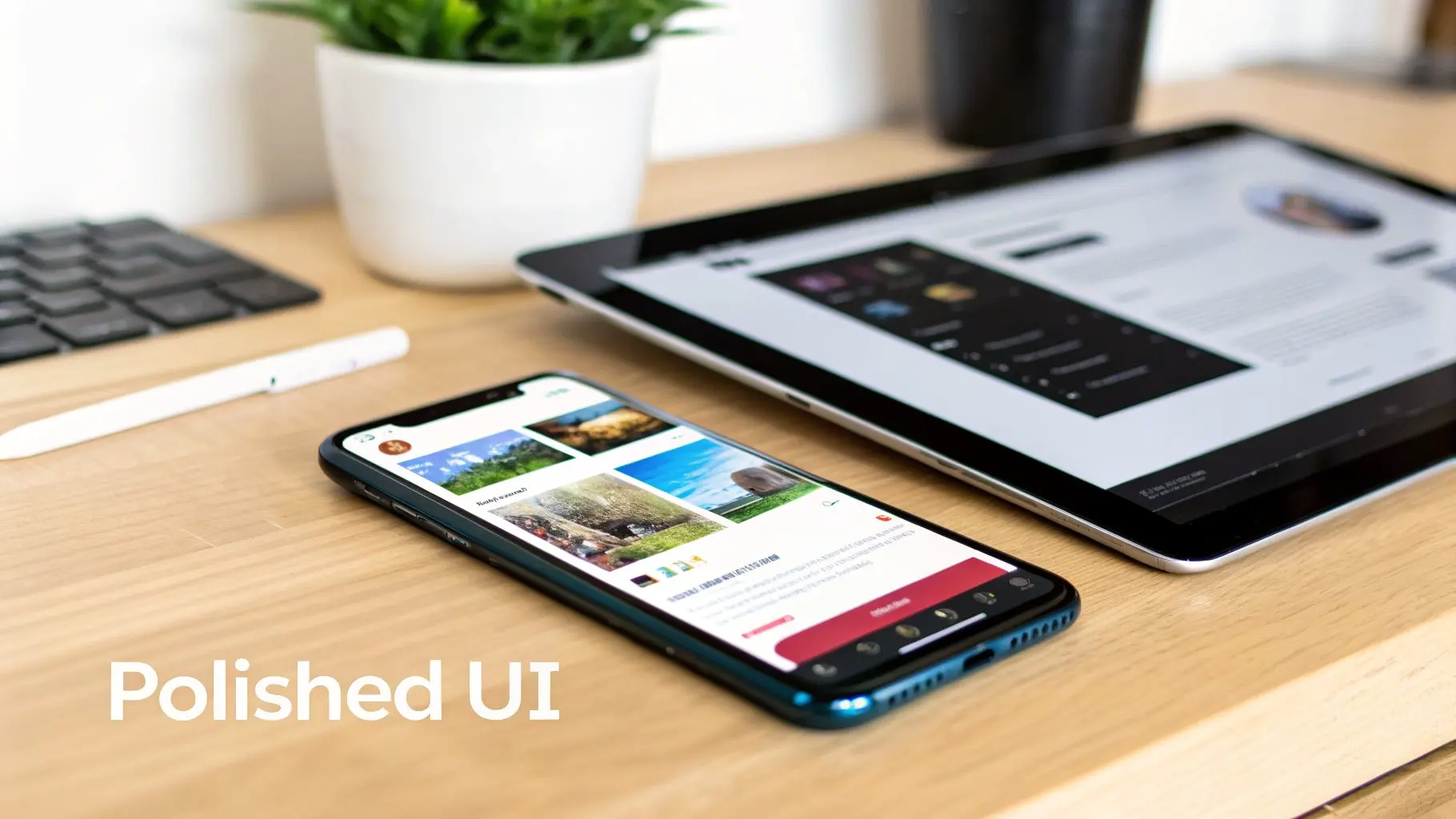
Bringing Your App to Life with Visuals and Motion
If wireframes are the skeleton, this is where we give the project its skin. After mapping out the core structure and flows, the next move in designing a mobile app is to inject personality and brand identity through high-fidelity User Interface (UI) design. It's the moment your app evolves from a functional blueprint into something visually stunning and genuinely engaging. But UI design is so much more than just picking a few nice colours. It’s about creating a consistent, coherent visual language that speaks to your brand’s values in every single pixel. This demands a systematic approach to make sure every screen feels like it belongs to the same family.
Building a Robust Design System
The key to achieving that kind of consistency, especially on larger projects, is to build out a comprehensive design system. Just think of it as the single source of truth for the app's entire visual DNA, a complete library of reusable components and crystal-clear guidelines that lock in brand integrity while making both design and development more efficient. A rock-solid design system will almost always include:
- •Colour Palette: Defining the primary, secondary, and accent colours, as well as specific shades for text, backgrounds, and interactive states like "disabled" or "error."
- •Typography Scale: Setting up a clear hierarchy for headings, body text, and smaller captions to ensure readability and visual order across the board.
- •Iconography: Crafting a custom set of icons that are visually consistent and instantly understandable within the app's world.
- •Component Library: A collection of pre-designed, reusable elements like buttons, input fields, navigation bars, and cards that can be pieced together to build new screens quickly and consistently.
Honestly, this system is invaluable. It dramatically speeds up the design workflow, gets rid of jarring inconsistencies, and makes the handoff to developers infinitely smoother because all the rules are already laid out. This kind of structured approach is fundamental to how we go about unlocking success with design for mobile apps. This meticulous attention to visual detail isn't just a "nice-to-have" anymore. The UK App Development industry is set to become a £32.3 billion market, with over 15,000 businesses all fighting for a user's attention. That growth has been fuelled by smartphone ownership skyrocketing from a mere 17% in 2008 to 88% today, forcing everyone into a mobile-first mindset. For us as designers, it means a unique, polished UI is absolutely essential to cut through the noise. You can dig into more trends shaping the UK's app industry on Ibisworld.com.
The Power of Motion and Micro-interactions
A static interface just feels dead. In modern app design, motion isn't some decorative flourish you add at the end, it’s a core part of the user experience. Coming from a background in animation, we know that even the most subtle movements can have an enormous impact on how an app _feels_ to use. Micro-interactions are those tiny, contained moments of feedback that occur when a user does something. Think of a button that physically depresses when tapped, a satisfying "swoosh" as an item is added to a cart, or a gentle bounce effect on a newly loaded list. These little details really matter.
Great motion design is invisible. It doesn't scream for attention. Instead, it works quietly in the background to make the user experience feel more responsive, intuitive, and human.
These subtle animations actually serve several critical jobs. They can guide a user's eye, confirm that an action was successful, or simply create a smoother, more elegant transition between different screens. A well-placed animation can turn a potentially confusing interaction into a delightful one, making the whole app feel more polished, responsive, and alive. It’s this level of craft that truly separates a good app from a great one.
Testing and Refining Your Design with Real Users
An app design, no matter how beautiful or well-researched, is just a collection of assumptions until it meets a real user. This is where the rubber meets the road, the stage where we separate what we _think_ works from what actually does through a cycle of prototyping and usability testing. It’s all about stress-testing your design in the wild before you commit to expensive development time. The process kicks off by building high-fidelity, interactive prototypes. Using tools like Figma or Adobe XD, we assemble clickable mock-ups that look and feel almost exactly like the finished article. These are far more than just static images; users can properly navigate through screens, tap on buttons, and get a feel for the app's core flows as if it were already live on their phone.
This kind of tangible experience is invaluable. It lets stakeholders genuinely feel the app's personality and usability, which always brings out richer feedback than static design files ever could. Crucially, it gets the design ready for its most important test: validation from real people.
Conducting Effective Usability Testing
With a solid prototype ready to go, we can move into structured usability testing sessions. This means recruiting a handful of people from your target audience and simply observing them as they try to complete specific tasks within the app. The real goal here is to spot points of friction, confusion, or even delight, all without leading the user. A typical usability session might include tasks like:
- •Onboarding: "Could you sign up for a new account and set your initial preferences?"
- •Core Functionality: "Try to find a beginner-level yoga class scheduled for tomorrow and book your spot."
- •Discovery: "See if you can locate the settings menu and change your notification preferences."
During these sessions, we act as silent observers, encouraging users to "think aloud" as they navigate the prototype. Every hesitation, every moment of confusion, and every sigh of frustration is a golden nugget of data. This is the qualitative feedback that elevates a good design to a great one.
Usability testing isn’t about asking users if they _like_ the design. It's about observing their behaviour to see if they can _use_ it successfully. Honest, unfiltered feedback at this stage saves a fortune in post-launch fixes.
This user-first approach is non-negotiable, especially in a competitive market like the UK, which saw a staggering 2.6 billion app downloads in recent reports. With over 15,000 UK app businesses vying for attention, a seamless user experience is often the deciding factor between an app that gets kept and one that's deleted after five minutes.
Analysing Feedback and Iterating
After a round of testing (we usually find 5-8 users is the sweet spot), we collate all the observations. The job is to identify recurring patterns and pain points, maybe a confusing icon, a hard-to-find button, or a clunky user flow. We then prioritise these findings based on severity. How badly does this issue break the core experience? From there, the design team gets to work, iterating on the prototype to solve the problems we’ve uncovered. This could be as simple as changing the wording on a button or as involved as completely rethinking an entire user flow. Once the changes are in, a new round of testing begins to validate our solutions. This test, analyse, iterate cycle repeats until we’re confident the design is intuitive, efficient, and ready for development. For a deeper dive into measuring user engagement, check out our guide to mobile app tracking. To keep improving your app's design and user experience after it launches, it’s vital to use effective mobile app analytics tools. This methodical, data-informed process of refinement is the single most effective way to reduce risk, ensuring you build something people not only need but also genuinely love to use.
Ensuring a Smooth Handoff to Developers
The moment a design leaves our studio and lands with the development team is critical. It’s where vision meets execution. A messy handoff leads to guesswork, frustration, and a final product that drifts from the original design intent. Our whole process is geared towards making this transition as seamless as possible. We don’t just throw a bunch of files over the fence. We package everything up so developers have exactly what they need, right where they expect to find it. Think of it as a comprehensive toolkit for building the app. This package typically includes:
- •Detailed specification documents with redlines and measurements.
- •A complete style guide covering typography, the colour palette, and spacing rules.
- •High-fidelity interactive prototypes that demonstrate core user flows.
- •All assets exported in the correct formats (SVG, PNG, etc.) with a clear naming convention.
Preparing a Comprehensive Handoff Package
It all starts with organisation. We export every screen with pixel-perfect dimensions and cleanly organised layers. We then use design tokens to capture the foundational elements like colours, fonts, and component states, making them easy for developers to reference and implement as variables in their code. A well-prepared package should always include:
We also attach a simple README file that explains the folder structure and the logic behind our file naming. This small step significantly reduces confusion and helps the development team get up to speed much faster.
A solid QA process can catch over 90% of visual mismatches before your app ever goes live.
Our style guide isn't a static document; it’s a living guide that evolves alongside the development process. We proactively add annotations and clarifications as we go, ensuring designers and developers are always on the same page. This is especially important for defining responsive breakpoints and providing separate files for dark and light mode themes.
Deciding on Your Platform Approach
Early on, a major decision is whether to build natively for iOS and Android or use a cross-platform framework. This choice has a huge impact on the design process, user experience, and long-term maintenance. Native apps offer the best performance and access to device features, but require separate codebases. Cross-platform tools like React Native or Flutter speed up development with a shared codebase but can sometimes feel less integrated. Here’s a quick breakdown to help you weigh the options:
Platform Design Considerations for Native vs Cross-Platform
| Consideration | Native (iOS/Android) | Cross-Platform (e.g., React Native, Flutter) |
|---|---|---|
| UI/UX Authenticity | Feels completely at home on the OS, using familiar platform-specific patterns. | A consistent look across platforms, but might require extra work to feel truly native. |
| Performance | Highly optimised for the specific operating system, delivering smooth, fast performance. | Generally good, but complex animations or intensive tasks may need native modules for optimisation. |
| Access to Device Features | Direct and immediate access to the latest OS features like cameras, sensors, and ARKit/ARCore. | Often relies on third-party plugins, which can lag behind new OS updates. |
| Development Speed | Slower and more resource-intensive, as you're building and maintaining two separate apps. | Much faster initial development since you're working from a single, shared codebase. |
| Long-Term Maintenance | Requires separate teams and updates for each platform, potentially doubling the effort. | Simpler to maintain, as one update can be pushed to both iOS and Android simultaneously. |
Ultimately, the right choice depends entirely on your app's complexity, budget, and long-term goals. For performance-critical apps or those heavily reliant on native features, native is often the way to go. For simpler apps where speed-to-market is a priority, cross-platform can be an excellent choice.
Bridging the Gap Between Design and Development
True collaboration happens when our tools speak the same language. We sync our Figma components directly to code repositories using shared libraries. This creates a single source of truth for design tokens, so when a designer updates a colour or font, it’s automatically reflected in the code. We also use plugins to link Figma comments directly to project management tools like Jira or GitHub issues. This simple integration cuts down review cycles and stops designers and developers from working in silos. For visual QA, integrating a tool like Storybook is fantastic for spotting unintended visual changes at the component level. This tight integration means that crucial specs for accessibility and performance live right alongside the visual assets. We document things like contrast ratios and target framerates for key animations, giving developers clear benchmarks to hit. This proactive approach prevents so many headaches and ensures the final product is both beautiful and robust.
Finalising Your App Store Assets
Your app store presence is your digital shopfront. Getting it right is non-negotiable. We create a dedicated launch folder that contains all the polished, approved assets needed for a successful submission. This includes:
- •Promotional images (1080x1920) with clear, concise overlay captions.
- •The app icon (1024x1024) exported in all the required densities for different devices.
- •Short, looped videos showcasing the app’s key interactions and value.
We also work on crafting the app description, focusing on clear benefits and incorporating keywords that will help with designing a mobile app that gets discovered.
Clean, accurate, and compelling store assets have been shown to lift conversion rates by as much as 25%.
The final piece of the puzzle is a signed-off press kit, ready for any PR or social media campaigns. And once the app is live, the work doesn't stop. We connect analytics dashboards back into our feedback loops, allowing us to monitor performance, track user behaviour, and iterate on the design. This continuous cycle of improvement is what keeps an app feeling fresh, relevant, and aligned with what users truly need.
Common Questions About Designing a Mobile App
Diving into the world of app design can bring up a lot of questions, especially if you're a first-time founder or new to the process. To clear things up, we've put together answers to the most common queries we get from clients right at the start of their journey.
How Much Does It Cost to Design a Mobile App in the UK?
That’s usually the first thing people ask, and the honest answer is: it really depends. The cost is tied directly to how complex the app is, how many unique screens it needs, and the depth of its features. A pretty straightforward app with a simple interface and just the core functions might land in the £15,000 - £30,000 range for the design phase alone. But if you’re thinking about a more complex app, one with custom animations, multiple user journeys, and a full-blown design system, you’re looking at something more in the £40,000 to £80,000+ bracket. For huge, enterprise-level apps with tons of features and integrations, the design budget can easily sail past £100,000. The best way to get a real number is to start with a discovery workshop where we can nail down the scope and goals together.
How Long Does the Mobile App Design Process Take?
Just like the cost, the timeline is all about the project's scope. One of the biggest mistakes we see is rushing the design phase. It always comes back to bite you with expensive changes down the line during development. For a moderately complex app, a well-structured design process usually takes somewhere between 3 to 6 months before a single line of code is written. Here’s a rough breakdown of how that time is spent:
- •Discovery & Strategy: This is where we do all the initial research and planning. It typically takes about 2-4 weeks.
- •UX & Wireframing: We then move on to mapping out the user flows and creating the structural blueprint. That’s another 3-6 weeks.
- •UI & Visual Design: Bringing the app to life with polished visuals and a design system can take 4-8 weeks.
- •Prototyping & Testing: Finally, building interactive prototypes and running usability tests adds a crucial 2-4 weeks for iteration and refinement.
Following this kind of methodical timeline ensures every decision is thought through and validated. The end result is a robust, intuitive design that’s ready for a smooth handover to the development team.
What Is the Difference Between UX and UI Design?
Ah, the classic question. It's so important to get this, because you absolutely need both to design a successful mobile app. They are deeply connected but focus on very different things.
UX (User Experience) Design is the invisible architecture of the app. It's the analytical, problem-solving side that’s all about the overall feel and flow. It answers the question: "Is this app easy, efficient, and even enjoyable to use?" A UX designer creates user personas, maps out customer journeys, and builds wireframes to make sure the app actually solves a real problem for people.
UI (User Interface) Design, on the other hand, is what you can see and touch. It's the craft of creating the look, feel, and interactivity, the colours, the fonts, the buttons, and the animations. UI designers are responsible for translating the brand's personality onto the screen and making the UX designer's blueprint beautiful and intuitive to interact with. Think of it like this: UX makes an app useful, while UI makes it beautiful and delightful. You simply can't have a great app without mastering both. A gorgeous app that's a nightmare to navigate will fail, just like a functional app with a clunky, ugly interface will be quickly forgotten.
At Studio Liddell, we bring years of creative and technical expertise to every project. If you're ready to turn your app idea into a beautifully designed, user-centric reality, we're here to help. Book a production scoping call with our team today.