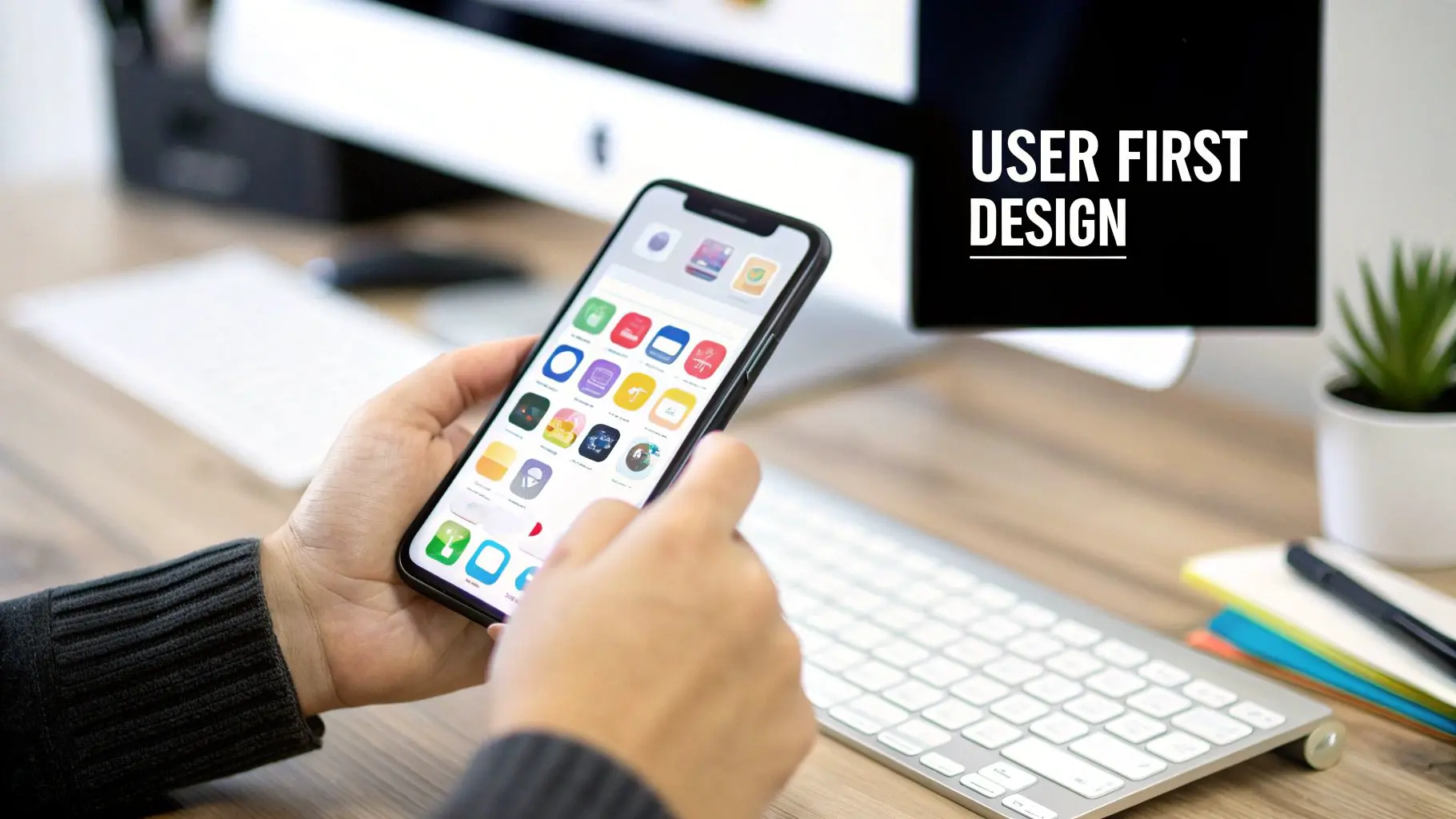
Unlocking Success with Design for Mobile Apps
In a digital marketplace overflowing with options, your mobile app's design isn't just a nice-to-have, it's the very core of its success. Think of it this way: a beautiful shopfront is useless if customers get lost inside or can't figure out how to pay. Your app's design is its entire customer experience, directly influencing everything from the first download to long-term loyalty and revenue.
Why Your App Design Is a Critical Investment
The stakes for getting mobile app design right have never been higher. That polished, intuitive interface is what separates an app that becomes part of a daily routine from one that’s deleted minutes after installation. A clunky user experience is one of the top reasons people abandon apps, making your initial design choices a fundamental investment in your product's future.
The Financial Impact of Great Design
The link between thoughtful design and commercial success is crystal clear. In the UK, the mobile application market was valued at an impressive USD 13,930.12 million and is on track to explode to USD 63,854.23 million by 2035. Consider this: UK consumers already spend 4 to 5 hours a day on their phones, with over 75% of that time spent inside apps. The opportunity is massive, and it highlights just how vital a great user experience (UX) and user interface (UI) are for capturing attention and building a loyal following.
An app's design is its silent ambassador. It communicates competence, trustworthiness, and value before a user even completes their first action. Investing in thoughtful design is investing in a powerful and lasting first impression.
Before we dive deeper, let's establish the core principles that underpin every successful app design. These tenets are the foundation upon which intuitive and engaging experiences are built.
Table: Core Tenets of User-Centric App Design
| Principle | Core Goal | Impact on User |
|---|---|---|
| Clarity | Make the app's purpose and navigation immediately obvious. | Reduces confusion and frustration, allowing users to achieve goals quickly. |
| Consistency | Use predictable patterns and elements throughout the app. | Creates a familiar and reliable experience, lowering the learning curve. |
| Efficiency | Minimise the number of steps required to complete tasks. | Makes the app feel fast and responsive, respecting the user's time. |
| Feedback | Acknowledge user actions with visual or haptic cues. | Provides reassurance that the app is working and their input was received. |
| Forgiveness | Allow users to easily undo actions and correct mistakes. | Builds user confidence and encourages exploration without fear of error. |
These principles guide us in creating interfaces that feel like a natural extension of the user's own intent, rather than a puzzle they need to solve.
More Than Just Aesthetics
Great mobile app design goes far beyond picking trendy colours and fonts. It's about architecting a seamless, logical journey for the user from start to finish. A well-designed app feels like it anticipates your needs, making complex tasks feel effortless and building an emotional connection that keeps you coming back. To make sure your investment in design delivers the best possible results, it's worth it to explore solutions tailored for mobile apps that align with your business goals. Ultimately, putting the user first isn’t just good practice; it’s a powerful business strategy for building a loyal customer base and a rock-solid brand.
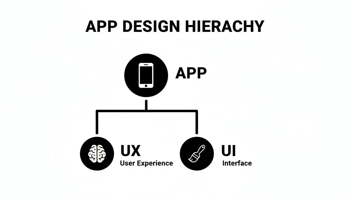
Understanding UX and UI: The Soul and Skin of Your App
When you hear people talk about design for mobile apps, the terms User Experience (UX) and User Interface (UI) almost always come up in the same breath. While they're joined at the hip, they are two completely different disciplines that have to work together perfectly to make an app successful. A good way to think about it is building a house. UX is the architectural blueprint, the structural integrity, the flow between rooms, and how the space feels to live in. UI, on the other hand, is the interior design: the paint colours, the furniture, the light fixtures. User Experience (UX) is the invisible part of your app. It’s all about the logic, the flow, and that gut feeling someone gets when they use it. A great UX designer is obsessed with the user's journey. They're constantly asking, "What is the user really trying to do here?" and "How can we make getting from A to B so easy they don't even have to think about it?" This entire process is rooted in empathy and clever problem-solving. It involves mapping out the app's entire structure to make sure every single tap and swipe feels completely natural. When an app has good UX, you barely even notice it, things just work, exactly as you expect them to.
The Role of User Experience
At its core, UX is focused on the big picture, the user’s overall journey and how they interact with the app. Its main goals are pretty straightforward:
- •Intuitive Navigation: Making sure users can find what they need without a second thought. A complex banking app feels simple when a one-tap transfer is right there on the home screen, instead of buried under five confusing menus.
- •Logical Flow: Building the app in a way that anticipates what a user will want to do next, guiding them smoothly from one task to another.
- •Problem Solving: Getting straight to the point. Whether someone is booking a ticket, checking the weather, or messaging a friend, the app needs to solve their core problem without any fuss.
Now for the other side of the coin. User Interface (UI) is what you can actually see and touch. It’s the skin and personality of the app, all the buttons, the fonts, the colour scheme, and the slick animations. While UX builds the skeleton, UI is what brings it to life and gives it a visual spark.
A beautiful UI on top of a flawed UX is like putting a stunning coat of paint on a crumbling building. It might look good at first glance, but it won't be long before users notice the foundational cracks.
UI design is all about translating the app's structure into an experience that’s both attractive and easy to interact with. It’s where your brand's identity really shines through in a visual language.
Making the Interface Work
Great UI design is much more than just making things look pretty; it's about clear communication. A well-designed interface makes the functional parts of the UX not just accessible, but genuinely enjoyable to use. The key ingredients are:
- •Visual Hierarchy: Using size, colour, and positioning to draw the user's eye to the most important elements on the screen.
- •Consistency: Applying the same design language across every screen creates a familiar and predictable environment, which helps users feel comfortable.
- •Feedback: Giving visual clues to confirm a user's action, like a button that changes colour when you tap it. Simple, but incredibly important.
Ultimately, UX and UI are two sides of the same coin. You need a logical, intuitive journey (UX) presented through a clear, engaging interface (UI) to create an app that people actually love using. If you're looking to polish your app's visual side, exploring some proven UI design tips can truly elevate your app's appeal. Real success happens when that invisible structure and the visible surface align perfectly, creating an experience that's both cohesive and delightful.
Designing for iOS vs Android: How to Speak Both Languages
Thinking iOS and Android are the same is a surefire way to build an app that feels slightly off to everyone. On the surface, they might seem like two sides of the same coin, but dive a little deeper and you’ll find two completely different design philosophies, navigation patterns, and user expectations. Slapping one design onto both platforms is a classic mistake that results in a clunky, non-native experience. To really get it right, you need to be fluent in both design languages. Apple’s Human Interface Guidelines are all about a clean, light aesthetic where the content takes centre stage. On the other hand, Google’s Material Design is bold and tactile, using shadows, layers, and motion to give the interface a physical, real-world feel. Ignoring these fundamentals is like trying to serve a Sunday roast on a pizza base, all the right ingredients might be there, but the whole experience just feels wrong.
Navigating the Platform Divide
The most obvious differences pop up in core navigation. iOS apps almost always feature a main tab bar fixed to the bottom of the screen, giving you constant access to the app's most important sections. While Android has started to adopt this bottom navigation bar more frequently, its heritage is tied to the "hamburger" menu (that three-line icon that opens a slide-out drawer). Crucially, Android also has a universal, system-level "back" button, which completely changes how users move through an app's flow. You'll also spot key differences in button styles and where they live on the screen. On an iPhone, you’ll often find primary actions tucked away in the top-right corner of the navigation bar. Android users, however, are used to seeing a big, bold Floating Action Button (FAB) hovering in the bottom-right corner, practically begging to be tapped. This diagram helps visualise how app design splits into two core paths: the underlying structure (UX) and the visual polish (UI), both of which need to respect these platform-specific rules.
As you can see, a great app needs just as much attention paid to its logical flow as its visual presentation, and those elements are rarely identical across both operating systems. To make these distinctions clearer, here’s a quick-glance table breaking down the core differences.
iOS vs Android Key Design Differences
| Design Element | iOS (Human Interface Guidelines) | Android (Material Design) |
|---|---|---|
| Navigation | Primarily uses a bottom tab bar for top-level navigation. "Back" is usually in the top-left of the screen. | Traditionally used a "hamburger" navigation drawer, but now commonly uses a bottom navigation bar. Has a system-wide "Back" button. |
| Buttons | Text-based buttons are common, often placed in the top navigation bar or toolbars. Minimalist and clean. | Often uses colourful, contained buttons with shadows. Prominent Floating Action Buttons (FABs) for primary actions. |
| Typography | San Francisco (SF) is the system font. Emphasises clarity, legibility, and a clean hierarchy. | Roboto and now Google Sans are the system fonts. Typography is bold, expressive, and part of the visual hierarchy. |
| Alerts/Dialogues | Centred, modal pop-ups with actions stacked vertically ("Destroy" action is typically red). | Pop-ups can be modal or non-modal. Actions are typically aligned to the right, often horizontally. |
| Icons | Filled outlines with a consistent, light stroke weight. Simple and symbolic. | Often filled, solid shapes. Can be more playful and illustrative, following Material Design principles. |
| Touch Gestures | The "swipe from left edge" gesture to go back is a core, learned behaviour. | The system-wide back button (or gesture) handles backward navigation, making in-app back gestures less common. |
Following these guidelines isn't just about aesthetics; it's about building an app that feels intuitive and respects the user's muscle memory.
Why Native Design Matters in the UK Market
In a crowded market, getting these details right is what makes an app stand out. British developers are a major force, with 6,202 active publishers on the Google Play Store alone. And when you look at the market split, with Android holding 50.1% and iOS 49.3% of the UK market share, it’s clear that you can’t afford to alienate half of your potential audience with a poorly adapted design. You can learn more about the UK app market from 42matters.com.
An app that feels native to a user's device builds immediate trust and reduces cognitive load. When users don't have to hunt for a back button or guess how to access a menu, they can focus on what your app actually does.
At the end of the day, mastering the nuances of each platform shows that you respect your users and the way they've learned to interact with their devices. This attention to detail is what separates a merely functional app from one that people genuinely love to use. It’s the secret ingredient to earning those five-star reviews and becoming a go-to app on someone's home screen.
Building an Inclusive and Performant App
A stunning mobile app design is a great start, but it's only half the story. The apps that truly win people over, the ones that become part of their daily routine, feel effortless. Why? Because they’re fast, reliable, and built for everyone. Performance and inclusivity are the twin engines that drive long-term user satisfaction and loyalty. Think about it: slow load times and laggy interfaces are the silent killers of user engagement. We live in a world of instant gratification, and even a couple of seconds of delay can be enough to make someone ditch an app for good. A truly performant app feels responsive and fluid. It respects the user's time and makes every tap and swipe feel seamless.
Designing for Speed and Efficiency
Making an app fast isn't just a developer's job after the fact; it has to start right from the design phase. Every single visual element, from high-resolution images to complex animations, adds to the app's overall weight and can impact its speed. Designers need to think lean from the very beginning. Beyond the code, the media inside an app plays a massive role in its performance. Simply knowing how to choose the right image formats can slash your app's loading times and make it feel far more responsive. For a deeper technical look, resources on optimizing image formats for performance offer some fantastic insights.
An app’s performance is a core part of its user experience. A beautiful interface that lags is like a luxury car that won't start, the aesthetic appeal is completely undermined by its functional failure.
Here’s how designers can directly contribute to a faster app:
- •Compress Assets: Use tools to shrink the file size of images and graphics without any noticeable drop in quality.
- •Simplify Animations: Choose clean, efficient animations over resource-heavy ones that might chug on older devices.
- •Prioritise Content: Design layouts that load the most essential information first. This gives the user something to interact with while other elements load quietly in the background.
Championing Accessibility and Inclusive Design
A genuinely great app is one that everyone can use, regardless of their physical or cognitive abilities. This is where inclusive design comes in, often guided by the Web Content Accessibility Guidelines (WCAG). The goal is to create experiences that work for the widest possible audience. This means thinking about users with visual impairments, motor difficulties, hearing loss, and even cognitive differences. It boils down to practical design choices, like ensuring there's enough colour contrast between text and its background, or making buttons and other interactive elements large enough to be tapped easily. It also involves providing text alternatives for images so screen readers can describe them to a user. Designing inclusively isn't just about ticking a compliance box; it's a brilliant strategic decision. It immediately expands your potential user base and, more often than not, leads to a better, more intuitive product for all users. After all, an app that is easy for someone with a disability to navigate is bound to be even easier for everyone else. Of course, this all needs to be supported by a solid technical foundation, as an app's backend can make or break its success by ensuring reliability for every single user.
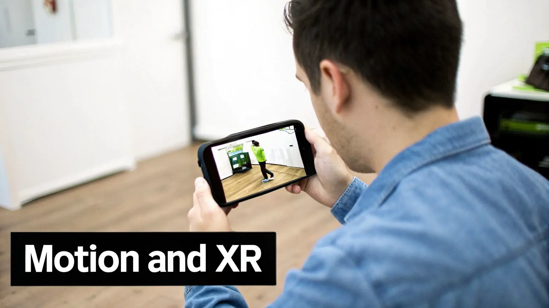
Crafting Next-Generation App Experiences with Animation and XR
Let's be honest, static screens are a thing of the past. To really capture someone's attention today, an app needs to feel alive, dynamic, responsive, and truly immersive. This is where thoughtful animation and the exciting world of extended reality (XR) come in, completely changing the game for user engagement. Well-designed animations aren't just for show; they're a vital part of the conversation between the user and the app. They guide the eye, give clear feedback when an action is taken, and can make an otherwise routine task feel surprisingly satisfying. These little details, often called micro-interactions, make a world of difference. Think about the simple 'pull to refresh' gesture. That smooth, elastic animation confirming your action makes the brief wait feel natural and intentional. This is what modern mobile app design is all about: using motion to build an experience that’s intuitive and enjoyable.
The Power of Purposeful Animation
Great animation always has a purpose. It should never get in the way or slow the user down. Instead, its job is to make every interaction clearer and more pleasant.
- •Providing Feedback: When a button subtly changes shape as you tap it, you get instant confirmation that the app registered your touch.
- •Guiding Attention: A gentle bounce or fade-in can draw focus to a new notification without being jarring or intrusive.
- •Creating Character: Unique animations can give your app a distinct personality, making it memorable and helping it stand out from the crowd.
Entering the World of XR and 3D
To build apps that are genuinely in a league of their own, designers are now turning to the immersive power of 3D and XR, a field that includes both Augmented Reality (AR) and Virtual Reality (VR). Once the exclusive domain of gaming, these technologies are now delivering incredible value in everyday mobile apps.
By bringing 3D and AR into the mix, an app can bridge the gap between the digital and physical worlds. You're no longer just offering users a tool; you're giving them a truly memorable experience. This is the next frontier.
AR is a fantastic example. Imagine a furniture app that lets you use your phone's camera to see exactly how a new sofa would look in your living room, perfectly scaled to fit the space. This isn’t a sci-fi dream; it's a powerful sales tool, driven by technologies like ARKit and ARCore and, of course, brilliant design. This shift is happening everywhere; the UK grocery app market, for instance, is projected to see over 90% of orders placed on mobile by 2025, partly thanks to engaging features like AR product previews. Game engines like Unity and Unreal Engine are leading the charge, providing the tools needed to build these complex, interactive 3D worlds. By tapping into these technologies, designers can create apps with unparalleled utility and engagement. If you're looking to explore this space, it’s worth reading a guide to AR mobile app development to get a feel for the whole process. Getting to grips with these emerging technologies is going to be vital for creating real value in an increasingly crowded market.
Turning Your Vision into Reality: The Design-to-Development Workflow
An idea is only as good as its execution. This is where we map out the critical journey from a brilliant concept to functional code, ensuring your vision is translated into a pixel-perfect, high-quality final product. Following a structured, collaborative process is the best way to prevent costly mistakes and keep everyone on the same page. The first step is bringing static wireframes to life with interactive prototypes. Think of these as a working model of your app, they look and feel like the real thing but without any of the heavy backend code.
Prototyping with Precision
Tools like Figma and Adobe XD are the bedrock of modern mobile app design. They let designers build clickable, high-fidelity prototypes that perfectly simulate the complete user flow. People can tap buttons, navigate through menus, and get a genuine feel for the app's journey, giving everyone an invaluable preview long before a single line of code gets written.
Prototyping turns an abstract idea into something you can actually touch and feel. It’s the single most effective way to gather early, actionable feedback, saving countless hours of development time by catching UX issues before they get baked into the codebase.
This early feedback loop is what separates the good from the great. Once a prototype is ready, it’s time to put it in front of real users.
Refining Through User Testing
User testing isn’t about asking people if they like your design; it’s about watching how they actually use it. By observing real people trying to complete specific tasks, you can instantly spot areas of confusion, points of friction, or features that just don't click with a fresh pair of eyes. There are a few solid ways to do this:
- •Moderated Testing: A facilitator guides a user through the prototype, asking questions and digging into their thought process in real-time.
- •Unmoderated Testing: Users tackle tasks on their own while their screen and voice are recorded. This gives you raw, unfiltered feedback.
- •A/B Testing: You show two different versions of a design to separate user groups to see which one performs better against specific goals.
The gold you dig up from these sessions is then fed back into improving the prototype. It’s this cycle of testing and refining that truly elevates an app.
The Handoff: A Blueprint for Developers
With the design finalised and validated, the last piece of the puzzle is the design-to-development handoff. This is a classic point where projects can stumble if communication isn't crystal clear. A successful handoff is about much more than just emailing over a few static screens. Designers need to assemble a complete package for the developers, including:
- •A Complete Design System: A full library of reusable UI components like buttons, icons, and form fields, all with clear specifications.
- •Detailed Annotations: Notes that explain animations, screen transitions, and specific interaction behaviours that might not be obvious.
- •Exported Assets: Every graphical element, from icons to images, delivered in the right formats and resolutions for both iOS and Android.
This level of preparation serves as a clear blueprint for the development team. It ensures the final app not only looks but also functions exactly as designed, maintaining total consistency from one screen to the next.
Got a Few Questions About App Design?
Even the most detailed project plan can't predict every question that pops up. It's just part of the creative process. Here are some quick answers to the queries we hear most often from our clients.
What Is the Difference Between UX and UI Design?
Think of UX (User Experience) as the 'why' and 'how' of an app. It’s all about the overall feeling , the logic, the flow, how easy it is to use, and whether it genuinely solves a user's problem. UI (User Interface) is the 'what'. It’s the tangible, visual side of things: the buttons, the colours, the typography, and all the interactive elements you see and touch. To put it another way: UX is the architect’s blueprint for a house, ensuring it’s functional and liveable. UI is the interior designer who chooses the paint, furniture, and lighting to make it beautiful and welcoming.
How Much Does It Cost to Design a Mobile App in the UK?
This is a classic "how long is a piece of string?" question. The cost really does depend on the complexity. A simple app with a handful of core features might only be a few thousand pounds. On the other hand, a highly complex application with bespoke animations, intricate user flows, and deep backend integration can run into the tens of thousands or more. To get a realistic figure, you need a detailed scope of work. It’s the only way to get an accurate quote.
Why Is It Important to Design Separately for iOS and Android?
Each platform has its own DNA , a unique set of design guidelines, user expectations, and interaction patterns. An app designed strictly for iOS will feel clumsy and out of place on an Android device, and the same is true the other way around. It's like trying to use a TV remote to control your microwave. When you design for each platform's specific conventions, you create an intuitive, native experience. Users instantly feel at home, which leads to better reviews, higher satisfaction, and an app that people actually want to keep on their phones. At Studio Liddell, we bring award-winning design and technical expertise to every mobile project, from engaging kids' apps to immersive XR experiences. Book a production scoping call with our team to bring your vision to life.