Realistic 3D Rendering: A Production Guide for UK Studios
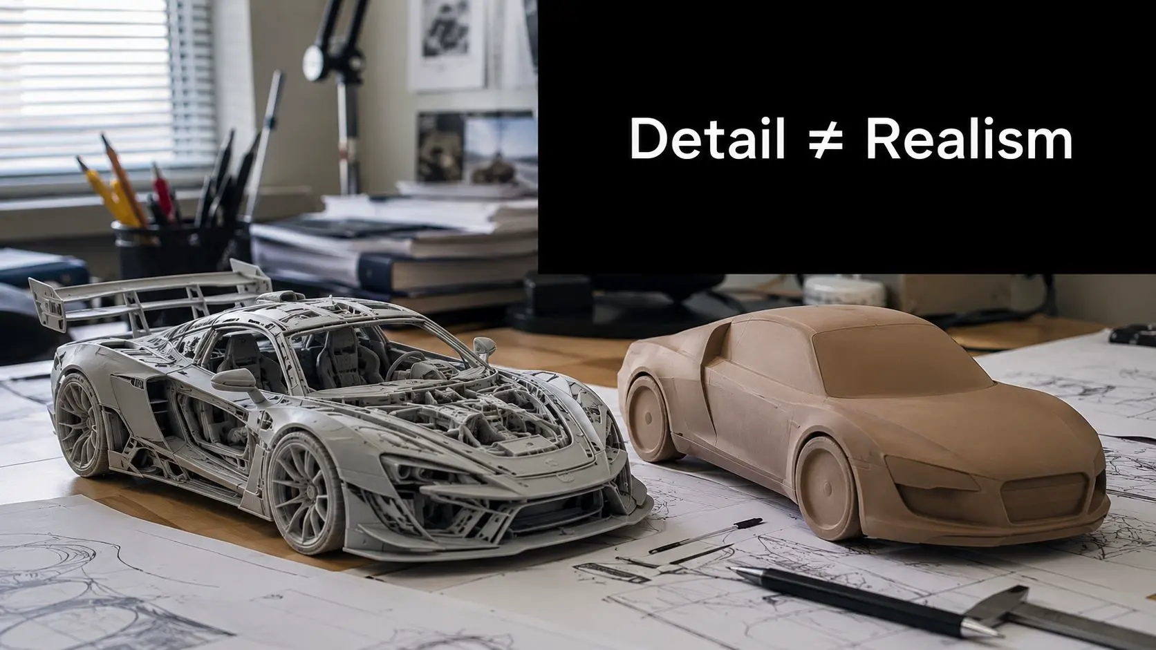
Most advice on realistic 3D rendering says the same thing, add more detail, sharpen the textures, push the samples. That's backwards. Viewers don't judge a render by counting polygons, they judge whether the light, materials, and composition feel plausible, and they forgive plenty of shortcuts when those cues are right. For a UK production team, that distinction matters because time is never unlimited. A render that spends hours polishing geometry nobody notices can lose to a simpler image that nails shadow shape, surface response, and local context. If you want a practical way to think about the craft, start with perception, not abundance, and keep a clear reference point like Studio Liddell's guide to 3D computer graphics close to hand when you're reviewing pipeline choices.
If you're comparing output styles rather than just chasing realism, a useful outside reference is compare AI Disney Pixar generators, because it highlights how style, not just fidelity, changes viewer expectations.
Why More Detail Does Not Mean More Realism
The biggest mistake in realistic 3D rendering is assuming that visual density equals believability. It doesn't. The history of rendering shows a long progression from wireframe-era methods through ray casting, Phong shading, texture mapping, and ray tracing, then into photorealistic engines that improved lighting, shadows, and material realism, which is why today's production pipelines can achieve high realism across architecture, broadcast, games, and immersive media (Limina Studios history of 3D rendering).
Realism is cue control
A 2025 review synthesised 41 peer-reviewed studies and found that six cue categories dominate realism judgements, which supports what production teams already feel in practice, the audience responds to plausibility and consistency more than to raw scene complexity (PubMed review on realism judgments). That means a modest room with believable light falloff and coherent materials will often outperform a packed environment where the reflections, scale, or shadow logic are off.
Practical rule: if a render still looks wrong after you add detail, the problem is probably not missing detail. It's usually a cue mismatch.
That's why production notes should ask for the cues that viewers read. In most client reviews, the fastest gains come from fixing the things the eye notices first, then stopping. One well-tuned surface can do more than ten extra props. The same logic applies to AI-assisted tools and style generators. If you're exploring style direction before production, the most useful question isn't “how detailed can this get?”, it's “what visual promise is this image making to the viewer?” That's where the actual work starts.
The Six Pillars of Photorealistic Rendering
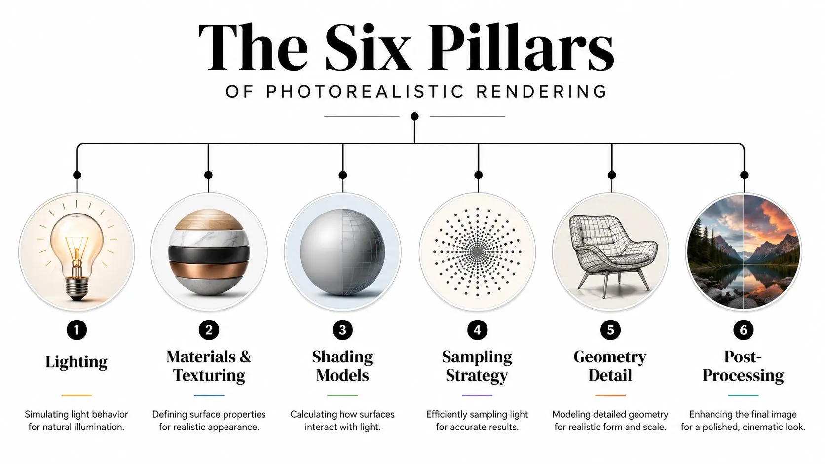
A believable render usually stands on six pillars, and each one does a different job. If one is weak, the image can still feel off even when the others are polished. The practical mistake is treating them like separate settings to tick off instead of a connected system that has to read as one scene.
Lighting and materials carry most of the weight
Lighting is the first pillar because it gives the viewer a reason to trust the scene. In practice, that means matching intensity, direction, colour, and softness to a real-world situation, then letting shadows behave consistently. Chaos' guidance on realistic architectural imagery also stresses observation of real light, shadow hardness, and composition, which is where production teams usually win or lose the shot (Chaos realistic rendering steps). Materials and texturing come next. PBR materials work because they tell the renderer how a surface should respond under changing conditions, not just how it looks in one frozen frame. A wood grain, fabric weave, or brushed metal finish only sells if the response stays coherent as the camera moves or the light changes. For teams comparing methods, the photorealism guide for games is useful because it shows how lighting and material choices do most of the heavy lifting before the rest of the image is even evaluated.
Shading sampling geometry and camera
Shading models decide how light interacts with the surface math, which is why a technically strong material can still fail if the shader response feels synthetic. Sampling strategy matters because noisy shadows or unstable highlights break the illusion very quickly. Geometry detail matters too, but mostly where edges, bevels, and silhouette behaviour catch the eye. Camera simulation and composition are the final two pillars. A physically believable focal length, height, and perspective help the viewer accept the space before they've even studied the assets. For a useful visual comparison of how avatar-style output changes with camera and lighting choices, Tutorial AI's real life avatar guide is a good reminder that framing and identity cues matter as much as surface detail. The internal logic of each pillar matters more than the amount of effort spent on it. That is why a good brief for realistic 3D rendering asks for lighting intent, material references, and camera language first. It does not start with a request for “more realism” in the abstract.
Rendering Engines and Modern Hybrid Pipelines
Modern production doesn't choose between realism and speed, it chooses where to spend the render budget. In UK workflows, the most practical setup is usually hybrid, rasterisation for the bulk of geometry, ray tracing for reflections, shadows, and global illumination. NVIDIA's real-time graphics research explains why this became practical as GPU power and dedicated hardware improved, and newer rendering research shows how learnable components such as neural radiance caching can improve both quality and efficiency (real-time graphics lecture notes).
Offline and real-time do different jobs
Offline path tracers like V-Ray, Arnold, and RenderMan are still the safest choice when final-frame quality matters most. Real-time engines like Unreal Engine and Unity are better when the team needs quick iteration, previews, and client sign-off. Most studios now blend the two rather than arguing over which one is “better”.
Final frames don't need every light path. They need the light paths the audience can actually see.
That's the logic behind the best hybrid pipelines. Rasterisation handles the broad scene load, then selective ray tracing refines the cues that viewers notice fastest. You get the perceptual gains without paying full-path-tracing costs on every frame.
Capture-driven realism is moving faster
For teams working from scans or real environments, 3D Gaussian Splatting is increasingly relevant because it represents scenes as millions of translucent ellipsoids and is built for fast rendering of highly realistic spaces. Chaos notes that 3DGS can integrate with V-Ray 7, which makes it useful for combining captured environments with CG assets, while learned renderers remain a major research direction because they add data-driven fidelity to the pipeline (Chaos 3D Gaussian Splatting article). There's also a practical preview advantage in recent neural rendering work. MIT reported a method that rendered scenes at more than 500 frames per second, used about 1.6 MB of storage instead of 146 MB for a baseline, and reconstructed a 360-degree light field from a single image (MIT light field rendering method). That matters because faster iteration usually means better creative decisions before the expensive stage.
What Perception Science Reveals About Visual Believability
Perception science is useful because it tells production teams what the viewer is reading. A 2014 perceptual evaluation of real-time photo-realism found that silhouettes, shadows, geometry, specular highlights, and simulated noise were important contributors to perceived realism in augmented 3D scenes, and under the best conditions a virtual object could not be distinguished from a real one in side-by-side comparison (2014 perceptual evaluation paper). That result is more useful than it sounds. It means realism is not an abstract aesthetic state, it's a set of testable cues that can be reviewed one by one.
A QA checklist that actually helps
When I'm reviewing shots, I look for five things before anyone talks about “making it pop”:
- •Material consistency: reflections, refractions, and shadows need to agree.
- •Light and shadow fidelity: contact shadows, softness, and colour should all match the scene logic.
- •Temporal coherence: camera movement and object motion need to feel physically plausible.
- •Micro-imperfection: dust, wear, and edge variation matter when the scene is close enough to inspect.
- •Contextual integration: the object must sit naturally in the environment.
That list lines up with what viewers notice and what they ignore. It also keeps teams from wasting time on tiny details that never survive a client review or a broadcast edit. If you're briefing artists or evaluating a vendor, ask where the realism risk is highest. In many cases, it's not the asset itself, it's the transition between the asset and the environment. That's where good lighting, sound shadow work, and careful noise control do the heavy lifting.
Balancing Render Quality Against Production Budgets
Every production team eventually hits the same trade-off, more realism costs more time, and the payoff isn't always linear. The smartest budget decisions usually come from prioritising the cues that carry the most perceptual weight, not from maxing out every setting. Proper HDRI lighting and physically based materials usually do more for believability than another round of geometry refinement, especially when the scene is already compositionally strong.
What to spend on first
A practical order of operations helps. Start with lighting references, then materials, then geometry only where the silhouette matters. If the shot is destined for fast approval cycles, use local hardware for early look-dev, then move heavy finalisation to a farm or cloud setup only when the creative direction is stable. AI-assisted denoising can be useful when it removes noise without introducing shimmer or blotching. Upscaling can also help if the delivery format is forgiving, but it shouldn't be used to hide weak lighting or underdeveloped materials. Those problems usually show up later in the edit anyway. A useful way to decide is to rank techniques by perceptual gain rather than technical bragging rights.
| Technique | Perceptual Impact | Production Cost | Best Use Case |
|---|---|---|---|
| HDRI lighting | High | Low to moderate | Product shots, interiors, architectural scenes |
| Physically based materials | High | Moderate | Any shot with close camera access |
| Better shadow control | High | Moderate | Broadcast graphics, hero assets, stills |
| Extra geometry detail | Medium | High | Close-up assets, hero props |
| Higher sample counts | Medium | High | Final frames with stubborn noise |
| AI denoising | Medium | Low to moderate | Iteration, preview, selected finals |
| Upscaling | Low to medium | Low | Delivery constraints, non-critical background shots |
Read the brief before you spend the budget
The best money-saving move is to catch realism problems early. A weak render in previz usually becomes an expensive render later, because the fixes are deeper than they first appear. That's why the first client review should focus on plausibility, not polish. When the project has a long shelf life, such as broadcast assets or campaign visuals, it often pays to spend more on lighting and material calibration than on brute-force render time. The output lasts longer, the revision cycle gets cleaner, and the team spends less time chasing problems that no one would have noticed at final delivery.
UK-Specific Realism Standards for Broadcast and Heritage
A render can be technically excellent and still feel wrong to a UK audience. That usually happens when the scene ignores local weather, daylight behaviour, heritage materials, or the visual character of the built environment. Generic photorealism gives you a polished image, but not always a believable British one.
Weather and daylight change the brief
Overcast daylight is a major realism test in the UK because it changes contrast, colour temperature, and shadow edge definition. If the scene is meant to sit in a documentary, institutional film, or heritage piece, the sky and ambient light should feel like they belong to the location, not just to a nice-looking render preset. A bright, hard-shadowed image can feel visually out of place even when the materials are accurate. Heritage work has its own standards. Stonework, brick, iron, timber, and weathering all need to reflect age and maintenance, not just surface colour. A restoration visual for a UK audience should also respect the surrounding context, because viewers read authenticity through the building's relationship to streets, environment, and season.
If the scene is supposed to feel local, the weather is part of the asset list.
Broadcast work is similar. A BBC-style factual visual, a regional tourism spot, and a branded explainer for a public institution each carry different expectations, even when the underlying 3D pipeline is the same. The render has to match the tone of the production and the appearance of the place, not just the texture pack. The best practice is to build a reference board from actual UK photography, then judge the render against that board under the intended delivery conditions. If the light, material weathering, or horizon feel imported from another market, the audience will sense it immediately.
When to Partner with a Specialist Production Studio
Some projects are manageable in-house. Others need a team that already knows how to keep realism stable across a large pipeline. The threshold is usually reached when quality control, timeline pressure, and technical complexity all arrive at once.
When the brief gets too wide for a small team
Multi-episode broadcast work is a common trigger because consistency matters shot after shot. XR work can create a different problem, since the render has to stay believable while also performing in real time. Technical visualisation is another case where accuracy and stakeholder trust depend on the image feeling both polished and defensible. If you're choosing between internal production and outside support, use a simple set of questions.
- •Is the shot count large enough that consistency becomes a management problem?
- •Does the scene need both real-time iteration and final-frame quality?
- •Will the audience judge the visuals against institutional, broadcast, or heritage expectations?
- •Can your team catch realism problems before they become expensive?
If the answer is “no” to one or two of those, you can usually keep it in-house. If several are “yes”, a specialist studio starts to make sense. For buyers who want a clearer procurement lens, Studio Liddell's buyer guide to choosing an animation studio is a useful way to sanity-check briefs, pipeline questions, and proposal quality. In practice, the best partner is the one that can show how lighting, materials, review stages, and delivery constraints are handled before the first shot is approved. --- If you need realistic 3D rendering for broadcast, branded content, heritage visuals, or XR, Studio Liddell can help shape the brief, build the pipeline, and deliver the final frames with the right balance of speed and finish. Visit Studio Liddell to discuss your project and see how their production team approaches lighting, rendering, and compositing for real-world delivery.