Native Mobile Advertising: Guide to Engaging Users
Most brands asking about native mobile advertising are really asking a sharper question. How do we stay visible on a small screen without irritating people, wasting budget, or relying on brittle attribution? That's the right question to ask now. Mobile attention is fragmented, interfaces are crowded, and users have become very good at filtering out anything that looks bolted on. A native unit can still earn attention, but only when the creative respects the environment it lives in. From a production point of view, that changes the brief. Native mobile advertising isn't just a media format. It's a design problem, a storytelling problem, and increasingly a measurement problem as well.
What Is Native Mobile Advertising Really
A user scrolls through a mobile feed at speed. Standard banners barely register. A clumsy pop-up gets closed on instinct. Then a sponsored card appears that looks like it belongs there, reads cleanly, and offers something relevant enough to deserve a second glance. That's the practical meaning of native mobile advertising. It isn't defined by being hidden. It's defined by being integrated. The ad matches the form, feel, and function of the surrounding app or mobile webpage, while still being clearly labelled as sponsored. Done properly, it feels like part of the experience rather than a break in it. In the UK, this matters because the audience is already living on mobile. Adults spent an average of 4 hours and 20 minutes per day online in 2023, with smartphones accounting for the largest share of that time, according to Ofcom data referenced here. If the smartphone is the main screen, then ad formats that work with mobile behaviour are no longer optional.
It solves a user experience problem
Traditional display often asks users to stop what they're doing and acknowledge the ad on the ad's terms. Native does the opposite. It enters the experience on the platform's terms. That distinction sounds subtle, but in production it changes everything:
- •Layout matters differently: A native unit has to sit naturally within a feed, content rail, listing page, or recommendation module.
- •Copy has less room to bluff: On mobile, vague messaging gets skipped instantly.
- •Visual hierarchy becomes critical: The user needs to understand the offer in a glance, not after effort.
Native works best when the ad asks for attention politely, not when it tries to seize it.
What native is not
It isn't camouflage for bad advertising. If a placement blends in visually but misleads editorially, users notice. If the landing experience breaks the promise of the unit, trust goes with it. A useful way to think about it is this short comparison:
| Approach | How it behaves on mobile | Typical user response |
|---|---|---|
| Banner-led display | Sits outside content flow | Ignored, dismissed, or tolerated |
| Interruptive overlay | Stops the session | Resented unless the value is immediate |
| Native mobile advertising | Sits inside the content pattern | Considered if relevant and well-made |
Why serious brands use it
Its core advantage isn't novelty. It's fit. Mobile users scroll in bursts, scan quickly, and make relevance decisions in seconds. Native units are built for that environment. They can carry brand work, product education, commerce messaging, or app growth creative, but they only perform well when they're conceived as part of the host experience. That's why I'd frame native as a UX strategy first, ad format second. Brands that understand that usually produce work that feels sharper, cleaner, and more believable on mobile.
Decoding Common Native Ad Formats
There isn't one native format. There are several, and each belongs to a different user moment. The mistake is to treat them as interchangeable inventory. Industry guidance defines mobile native ads as formats that blend into app or webpage content and notes that they tend to outperform traditional display because they're less intrusive, while also requiring clear sponsored labelling to preserve trust, as outlined by the Native Advertising Institute's glossary of mobile native advertising.
In-feed placements
These are the most commonly recognised units. They appear inside social feeds, publisher article feeds, app home screens, or commerce streams. The user mindset here is fast and selective. That means the creative needs an immediate hook, a clean visual focal point, and a headline that earns curiosity without sounding like clickbait. Best use cases include:
- •Brand storytelling: A concise visual narrative can sit naturally in a feed.
- •Product launches: If the first frame communicates the value quickly.
- •Content promotion: Especially when the destination is editorial, video, or a useful guide.
Recommendation widgets and sponsored stories
These usually appear at the end of articles, inside “recommended for you” modules, or within publisher content blocks. They're still native, but the behavioural context is different. The user has already committed attention to reading. That often makes these placements better for discovery, education, and mid-funnel content than for hard-sell messaging.
If the surrounding environment feels editorial, your ad has to carry editorial discipline. Better headline. Better image choice. Better promise.
Promoted listings and commerce-native units
These are common in marketplaces, shopping apps, and search-style interfaces. The ad behaves like a listing, not a display slot. That matters because the user is already in evaluation mode. They're comparing options, scanning product detail, and deciding whether to tap. Here, native success comes less from concept and more from clarity. A practical comparison helps:
| Format | Where it appears | User mindset | What usually works |
|---|---|---|---|
| In-feed | Social, app feeds, news streams | Browsing and scanning | Strong visual hook, short copy, clear CTA |
| Recommendation widget | Article pages, publisher modules | Reading and discovery | Useful framing, credible headline, relevant thumbnail |
| Promoted listing | Search, retail, marketplace pages | Comparing and choosing | Precise offer, sharp image, minimal friction |
Sponsored content blocks
Some native units are closer to mini content experiences. They may look like article cards, feature tiles, or branded modules embedded in a publisher or app interface. These can be powerful, but only if the content earns its place. Thin advertorial work tends to collapse quickly on mobile because users can tell when the value exchange is weak. The best native formats don't just match the surface aesthetics of the platform. They match the user's intent at that moment. That's the difference between native that feels perfectly integrated and native that merely looks dressed correctly.
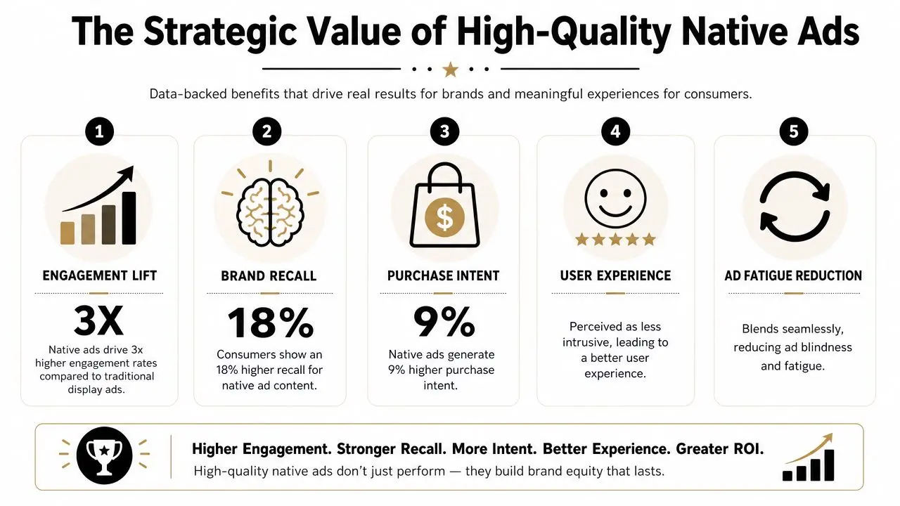
The Strategic Value of High-Quality Native Ads
There's a business reason native mobile advertising keeps attracting serious budget. It aligns with the way the UK advertising market has moved. Internet advertising accounted for 79.0% of total UK advertising spend in 2024, and UK internet ad revenue reached £35.5 billion in 2024, up 13.2% year on year, according to reporting referenced in this market overview. That isn't just growth in digital for its own sake. It reflects a structural shift toward mobile-first discovery and consumption.
Quality changes the economics
Cheap native creative usually costs more in the long run. It may fill the slot, but it won't hold attention, reinforce brand perception, or create a coherent path to action. High-quality native assets do three jobs at once:
- •They reduce friction: The user understands the message quickly.
- •They protect the brand: The ad feels considered, not opportunistic.
- •They improve post-click quality: The expectation set in the unit is more likely to match the destination.
This is especially important for apps, subscription products, and content-led brands. Teams planning monetisation or acquisition flows often need to think beyond pure ad buying and into product experience as well. For that reason, an app monetization guide for SaaS apps can be useful reading alongside native planning, because it forces the same question native should force: what value is the user getting at each step?
Native carries a trust premium
Placement context matters. A native unit inside a respected app, an elegant commerce surface, or a credible publisher environment inherits some of that environment's tone. Not automatically, and not forever, but enough that poor creative can waste the opportunity and strong creative can deepen it. That's why native should never be treated as “a smaller social ad” or “a tidier banner”. It has more in common with content design. A good internal reference point is this piece on adverts with animation that drive real engagement, because it speaks to a broader truth. Motion, pacing, and visual craft don't just make work prettier. They make it legible, memorable, and easier to act on.
What high-quality native actually buys you
Not just clicks. Better conditions for performance.
A native placement gives you borrowed attention. Creative quality decides whether you deserve to keep it.
That's the strategic value. Native works best when a brand wants visibility without looking desperate for it. It's a format for companies that care how they appear, not just whether they appeared.
A Studio Guide to Producing Effective Native Creative
Most weak native campaigns fail long before launch. They fail in the brief, where the team decides to resize existing display assets and call it adaptation. That rarely works. Native needs its own production logic.

Start with the host environment
Before writing copy or designing frames, study the surface where the unit will run. Look at type scale, image density, card proportions, pacing, caption length, and how calls to action are visually introduced. A polished native ad doesn't mimic blindly. It translates the brand into the visual grammar of the platform. That often means asking uncomfortable but necessary questions:
- •Can the idea survive without heavy copy?
- •Is the first image readable at mobile speed?
- •Would this feel natural between two pieces of organic content?
Build the message for a glance
On mobile, the user doesn't give you much time. You need one dominant idea, one focal point, and one action. In production terms, that usually means:
- Lead with the clearest benefit. Not the full proposition. The clearest entry point.
- Reduce visual competition. If headline, product shot, logo, badge, and CTA all fight for attention, none of them wins.
- Write like a person, edit like a product designer. Every word has to earn its place.
Design for native rendering, not generic placement
Technical teams matter. On Android, Google's guidance for native ads makes the model explicit. The app loads an ad object and renders the assets inside its own view hierarchy, with developers encouraged to use the Google AdMob Android native ads documentation and its AdLoader approach. Google also notes that `loadAds()` is capped at five ads per request and that video native ads require hardware acceleration. That tells you something important. In-app native performance isn't only about targeting. It's about integration quality. If the layout feels stitched on, if spacing is awkward, or if video rendering is poor, the ad looks foreign immediately. Good teams work closely across creative and development so the asset behaves properly inside the interface.Treat motion carefully
Animation helps native when it clarifies. It hurts when it shouts. Use motion to:- •Direct the eye: Reveal hierarchy or product function.
- •Demonstrate utility: Show what happens after the tap.
- •Add polish: Small movement can make a static-looking unit feel alive.
Avoid motion that creates noise, especially on dense screens. Fast cuts, overdesigned transitions, and tiny animated details usually collapse on mobile.
Production rule: Native animation should support comprehension first and branding second.
If your team is developing content systems rather than isolated campaign assets, this guide to digital content creation services for engaging audiences is a helpful companion. The broader discipline is the same. Build assets for the way people consume content, not for how they look in a presentation deck.
Match the landing experience
The ad doesn't end at the tap. Native collapses fast when the destination breaks the tone or promise of the unit. A practical checklist:
| Creative element | What to check |
|---|---|
| Visual style | Does the landing page feel like the same campaign? |
| Message | Is the core promise repeated clearly on first screen? |
| CTA continuity | Does the action after tap match what the ad implied? |
| Load experience | Does the destination feel light, stable, and mobile-ready? |
The best native creative feels coherent from first impression to post-click experience. That's what separates integrated advertising from dressed-up interruption.
Optimising Campaigns in a Privacy-First World
Native mobile advertising has become more interesting as attribution has become less tidy. That may sound counterintuitive, but it's true. When third-party tracking becomes less dependable, teams have to rely less on perfect user-level visibility and more on relevance, consent, and creative quality. Native is well suited to that shift because it can work through context rather than surveillance. For UK brands, the issue isn't whether native can perform. It's how to prove value when privacy rules make measurement noisier. A practical view of that challenge appears in this discussion of how native ads perform under tougher privacy conditions, which argues for moving away from last-click thinking and towards lift across consented audiences and attention-based metrics.
Context becomes a stronger signal
If you can't depend on highly granular tracking, the placement itself has to do more work. That means matching the message to the moment. A financial product inside a relevant business read. A retail offer inside a commerce-style browsing flow. A utility-led app message inside an environment where the audience is already primed to care. Contextual fit isn't a fallback tactic now. It's central strategy. Many teams improve their native work when they stop asking, “How tightly can we target this person?” and start asking, “What mindset is this person in right here?”
Creative discipline becomes measurement discipline
Privacy pressure can be healthy if it forces better craft. When audiences are consented, partially modelled, or aggregated, low-grade creative becomes harder to defend. You can't hide behind noisy click reporting forever. You need assets that create observable engagement patterns and landing experiences that support real outcomes. Useful questions include:
- •Did the audience spend time with the unit?
- •Did the post-click behaviour suggest genuine interest?
- •Did branded and non-branded response shift over time?
- •Did a contextual placement outperform a generic one qualitatively, not just in CTR?
A related operational question comes up often in social planning too. Timing still matters, but not always in the simplistic way teams assume. This short analysis of whether scheduled posts get less views is relevant because it reinforces a similar lesson. Distribution mechanics matter, but content quality and contextual fit usually matter more.
Privacy constraints don't remove the need for performance. They force teams to define performance more honestly.
What to change in practice
A privacy-first native strategy usually benefits from three shifts:
- •Prioritise contextual planning: Choose placements for thematic and behavioural relevance.
- •Use consented data carefully: First-party signals still matter, but they shouldn't be the entire plan.
- •Measure in layers: Combine platform metrics, on-site behaviour, and broader outcome signals.
If your organisation is also handling app measurement, mobile attribution, or consent flows directly, a more technical companion read is this guide to mobile apps tracking. It helps frame the operational side of the same challenge.
Measuring Performance Beyond the Click
A click can tell you that something was interesting enough to tap. It can't tell you whether the native campaign was good. That's the central measurement error with native mobile advertising. Teams inherit display-era habits, optimise aggressively to CTR, and then wonder why the traffic feels thin or the brand effect is hard to spot. Native needs a broader scorecard because its advantage often appears in quality of attention, not just volume of clicks.
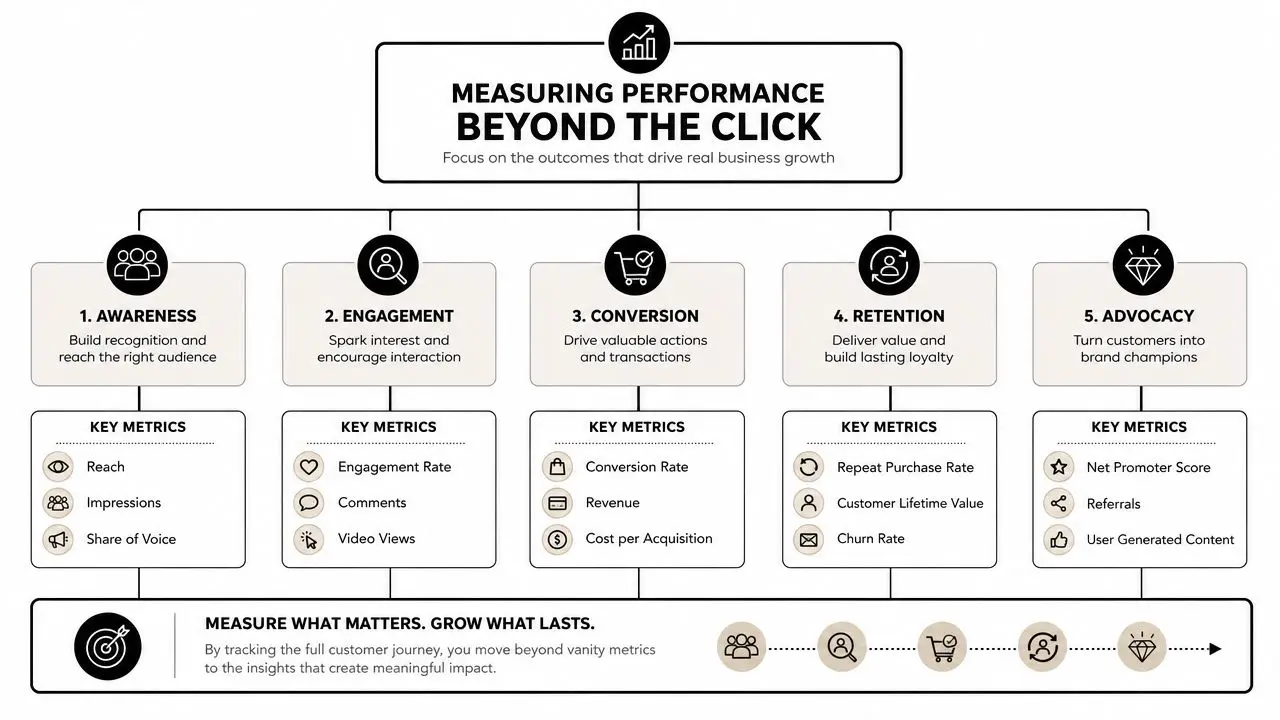
Use a layered KPI stack
A stronger framework looks at performance in stages.
| Stage | What to look at | Why it matters |
|---|---|---|
| Attention | Viewability, time in view, video completion, scroll behaviour | Shows whether the creative held notice |
| Engagement | Taps, expanded views, dwell time, engaged sessions | Separates curiosity from genuine interest |
| Conversion | Leads, purchases, sign-ups, qualified actions | Connects attention to business value |
| After-effect | Return visits, branded search movement, retention signals | Captures longer-tail impact |
This doesn't mean every campaign needs a complex measurement lab. It means the metric should match the job. A content-led native unit aimed at discovery should not be judged by the same immediate standard as a lower-funnel commerce placement. Likewise, a beautifully integrated in-app unit that improves user quality may be more valuable than a louder ad that drives accidental clicks.
Judge the traffic, not just the tap
One of the fastest ways to improve reporting is to compare click behaviour with post-click behaviour. If a unit produces plenty of taps but weak session quality, the problem may be the promise, the audience, or the destination. Look for patterns such as:
- •Strong click, weak engagement: The ad is enticing but the destination disappoints.
- •Moderate click, strong downstream action: The creative may be pre-qualifying well.
- •High completion, low action: The work is watchable but not persuasive enough.
- •Low click, strong brand response elsewhere: The campaign may be assisting demand rather than harvesting it directly.
Native should be measured like experience design
Practitioners need to grow in maturity. Native is often doing subtle work. It can improve perception, smooth discovery, or reduce friction in a buying journey before the hard conversion moment appears. If you need a useful outside perspective on broader ad effectiveness, this piece on how to optimize Google Ads performance is worth reviewing. Not because native and search are the same, but because the measurement logic applies widely. Good advertising evaluation rarely rests on a single metric.
The click is an event. Performance is a pattern.
A practical reporting model
For many teams, a simple reporting stack works well:
- Platform signals for reach, views, completions, and taps.
- On-site or in-app signals for engagement quality after the click.
- Business signals for leads, sales, subscriptions, or other meaningful outcomes.
- Periodic brand or lift analysis when the campaign's purpose goes beyond immediate conversion.
That structure makes native easier to defend internally. It also forces better creative decisions, because once you stop worshipping CTR, you start caring much more about whether the work is any good.
Frequently Asked Questions
Are native ads only for large brands
No. Smaller brands can use native mobile advertising effectively if they choose placements carefully and keep the creative focused. A tight message, strong mobile design, and a relevant landing experience matter more than scale alone.
Is native better in-app or on mobile web
They do different jobs. In-app native usually gives you tighter visual integration and smoother user journeys. Mobile web native can work well for contextual discovery, especially in publisher environments. The right choice depends on audience behaviour and destination.
How often should native creative be refreshed
Refresh when performance quality starts to soften, not just when the team gets bored. If the hook feels stale, the visual no longer stands out, or downstream engagement weakens, it's time to rotate the concept, the framing, or the asset mix.
If you're planning native mobile advertising and want the creative to feel as considered as the media strategy, Studio Liddell can help shape the assets, motion systems, and production approach behind campaigns that respect the user and still drive results.