Mobile App Animation: Types, Value and How It Gets Made
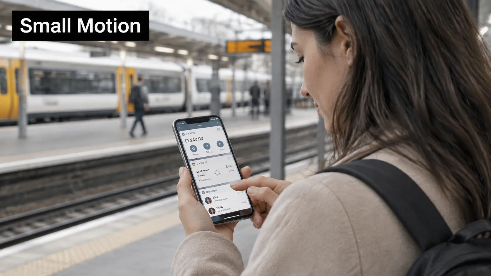
You're on the platform with a minute before the train. You open your bank, glance at a balance, switch to a journey app, then reply to a message. Each screen moves a little. A button presses in. A list slides into place. A small spinner says the next piece of data is on its way. That movement is mobile app animation. It isn't a trailer on a store listing, and it isn't a logo sting. It's motion inside the product that shows what just changed, what you can do next, and whether the app is still working. UK adults already live in that pattern. Ofcom's 2025 communications research, reported by ISPreview, finds that UK adults use an average of 41 smartphone apps each month, three more than in 2024, and spend approximately four and a half hours online each day, with smartphones accounting for most of that time. WhatsApp, Facebook and Google Maps are among the most commonly used smartphone apps, so the same small motions show up in chat, social feeds, maps and utilities. A small gain in clarity repeats across a very large number of taps.
What Mobile App Animation Actually Means
Say you're that commuter again. In the banking app the balance row fades in and a toggle settles into place. In the transport app the next departure slides up as you pull to refresh. In the messaging app the send button shrinks for a moment, then the bubble appears. Those are the core jobs of mobile app animation: changing a state, confirming an action, guiding attention, or showing where you are.
Draw the boundary before anyone starts designing motion. A brand film played from an app store listing is motion graphics. A 3D product viewer is animation with a rendering and file-size budget. Both sit at the edge of the term. The centre is interface motion the user meets while doing a task.
What counts as the core
The forms you'll ship look like this.
- •Microinteractions: a press, a toggle, or an input error that answers a single tap.
- •Screen transitions: a move that shows how one view relates to the next.
- •Loading states: spinners, progress, and skeleton layouts that hold a place while data arrives.
- •Onboarding sequences: short illustrated steps that teach a gesture or a benefit.
- •Lottie-style feedback: vector loops for a success tick, a mascot, or a branded empty state.
People get confused because all of these are called "animation" in a pitch deck. They don't cost the same, and they don't fail in the same way. A 200-millisecond press can be native code. A five-second character loop is an asset with a runtime. A product viewer is a scene you have to test on older phones.
If the motion doesn't tell the user something they need, it's decoration, and decoration has to justify its cost.
Apply that test to any screen before you argue about style. If removing the movement would leave the task just as clear, keep it only when brand recognition is the explicit job, and keep it short.
Animation Types Compared at a Glance
Match the motion to the job before you pick a tool. Duration here is what a motion designer usually specs, not a promise that every phone will hold that timing under load.
| Animation type | Typical job | Typical duration | Relative cost |
|---|---|---|---|
| Microinteraction | Confirm a tap, toggle or input error | 100, 300 ms | Low |
| Screen transition | Show how two views connect | 200, 400 ms | Low to medium |
| Skeleton screen | Hold layout while content loads | Until data arrives | Low |
| Lottie or JSON-driven | Illustrated feedback and onboarding | 1, 5 s loops | Medium |
| 3D or CGI | Product viewers, hero scenes, games | Continuous or scripted | High |
A heart that scales on a like is a microinteraction. A product photo that grows into its detail page is a screen transition, and a shared-element move keeps the item visually tied to where it came from. Grey blocks in the shape of a feed are a skeleton screen: the wait feels placed, because the user can see where text and images will land. A character that waves on a children's onboarding screen is usually Lottie or another JSON-driven file, exported from a design tool and played by a runtime. A shoe you rotate, or a game scene, is 3D or CGI, and it carries the highest cost in files, rendering and device testing.
When each row is the wrong choice
A microinteraction is the wrong choice when the user needs an explanation, not a twitch. A long transition is the wrong choice on a payment or ticket screen, where people are trying to finish. A skeleton is the wrong choice if you already have the content, because fake layout then looks like a stall. Lottie is the wrong choice for a control that must respond to every drag, unless the file is built as states rather than a single loop. 3D is the wrong choice when a still, or a short pre-rendered clip, would show the product just as clearly. Pre-rendered video is a fallback, not a separate interactive type. Use it when a heavy scene must still play on an older handset, and accept that the user can't fully control it. The cheapest motion that does the job is usually the right one. If you're unsure whether a scene even needs depth, a plain 2D versus 3D animation comparison is a better starting argument than a software demo.
Why Motion Earns Its Place in an App
Reliability outranks polish. In Amplitude's UK consumer app experience research, 85% of surveyed UK smartphone users preferred a basic-looking app without glitches to a sleek app with occasional problems. 58% said they would likely abandon a brand after experiencing app problems. 35% would leave within minutes of an app malfunction, and 10% within seconds.
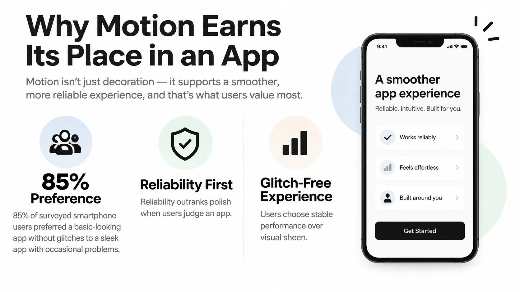
Motion has to live inside that constraint. Its UX value is specific. It reduces uncertainty while something loads, keeps people oriented between screens, teaches a gesture without a tutorial, and makes a wait feel placed when a skeleton holds the layout. Business value follows from those jobs: clearer onboarding, a recognisable move on a crowded home screen, and fewer support queries when a state change is obvious. DOM Studio's notes on accessible microinteractions for web apps are a useful companion here, because a confirmation that only exists as movement fails the moment someone can't see it.
Motion that should be cut
Judge every proposal against crashes, delay and whether the task finishes. Motion that helps the task earns its processing cost. Motion that only looks impressive should be simplified or removed when it delays the task, stutters on a mid-range phone, or hides an error.
A payment confirmation that animates for two seconds before the result is readable should shrink to a brief check mark, with the result already on screen. A skeleton that holds the layout during a slow balance fetch should stay.
Commerce, transport and public-service flows feel this first. Frustration there isn't a style preference. People abandon the task, and often the brand, while a designer is still admiring the curve.
Setting a Performance Budget for Animation
A single flagship-device test misleads you. A Brunel University study evaluated eight mobile apps using complex multi-element animation, side-menu opening and in-app navigation, and found significant differences in hardware utilisation among cross-platform technologies. It also reported substantial Android-versus-iOS differences in memory consumption, CPU use and rendered FPS for both native and cross-platform applications. The same scene can look identical and still cost a different phone a different amount. At 60 frames per second, each frame has about 16.7 milliseconds. At 120 Hz, it has about 8.3 milliseconds. If the animation recalculates layout on every one of those frames, a slower phone drops frames and the gesture feels late. That arithmetic is the budget, not a hope that "it felt smooth on the design laptop".
| Budget item | How to check |
|---|---|
| Microinteraction duration | Screen recording reviewed frame by frame |
| Frame budget per frame | Profiler during animation playback |
| Dropped frames during scroll | Profiler during a scripted scroll |
| Memory growth over a session | Memory profiler across a long session |
| Cold launch to usable screen | Timed launch on a lower-tier Android device |
How to profile a realistic session
Don't test the animation on an idle, warm phone with nothing else happening. Profile the heavy screens with a cold launch, network activity, scrolling and background media together. Record frame pacing, CPU and GPU load, memory growth and dropped frames. UK handsets aren't one device, so include a current iPhone and at least one lower-tier and one mid-tier Android phone. A lab rack isn't the only route. Smoke testing across physical phones catches the stutter a simulator never shows, because heat, memory pressure and real radios change the result. Then apply the build rules that usually recover the budget.
- •Animate transform and opacity. Those properties stay off the layout pass.
- •Don't rebuild geometry every frame. Large hierarchies that change shape are where frames disappear.
- •Reuse rasterised assets when the same illustration loops.
- •Prefer a sprite sequence or vector file over a real-time effect when the screen only needs a loop.
Choose real-time, sprites, vector or pre-rendered video from those measurements. If the profiler shows the scene missing its frame budget on the cheaper Android phone, the scene is too expensive, however nice the hero render looks.
Keeping Motion Accessible Without Losing Meaning
"Use less motion" is incomplete advice. Less motion can also mean less meaning, if the only cue that a payment worked was a moving tick. The harder question is how the animation behaves when someone reduces motion, loses focus, enlarges text, uses a keyboard, or hits an error. That isn't a finishing-stage checklist. A March 2025 accessibility statement for the GOV.UK app, covered by We Are Arch, reports that the iOS and Android versions were only partially compliant with WCAG 2.2 AA, including difficulties seeing focus when using an external keyboard. A prominent public app can still ship that gap. A product team can too, if motion review stops at a design crit.
Rules that keep the meaning
WCAG 2.2 gives you two concrete limits. Criterion 2.2.2 requires a way to pause, stop or hide moving content that lasts longer than five seconds. Criterion 2.3.1 limits flashing content to no more than three flashes in one second. Alongside those, respect the operating-system setting: Reduce Motion on iOS, Remove animations on Android.
- •Replace empty movement. If the move carries no information, use a cross-fade or an instant change.
- •Keep focus visible. Keyboard users need a persistent indicator, including while a transition runs.
- •Announce status in text. A spinner alone is silent to VoiceOver and TalkBack. Pair it with a text status and a progress label.
- •Don't put essentials only in motion. Colour, text or a stable icon has to carry the same message.
Motion can still clarify hierarchy, progress and cause and effect, as long as it's optional, interruptible, and paired with a cue that doesn't depend on sight or sound.
A loading spinner that becomes the words "Fetching your balance" plus a percentage is the pattern to copy. The sighted user still sees activity. The screen-reader user hears the state. Someone who has removed animations isn't left on a blank wait.
What to run before release
On every animated screen, test with VoiceOver, TalkBack, switch access and an external keyboard. Change the system text size and rotate the device. Confirm focus doesn't vanish mid-transition, and that a looping illustration can be paused. Accessibility checks for mobile apps are worth running as a rehearsal for that pass, so the first time you try a keyboard isn't the day before release.
How to Build Animation From Brief to Release
Treat production as a sequence of decisions, not a handoff from "design" to "dev" at the end. We've shipped game-engine work in Unity and Unreal when a 3D scene has to run inside a mobile app, and the same discipline applies to a native transition.
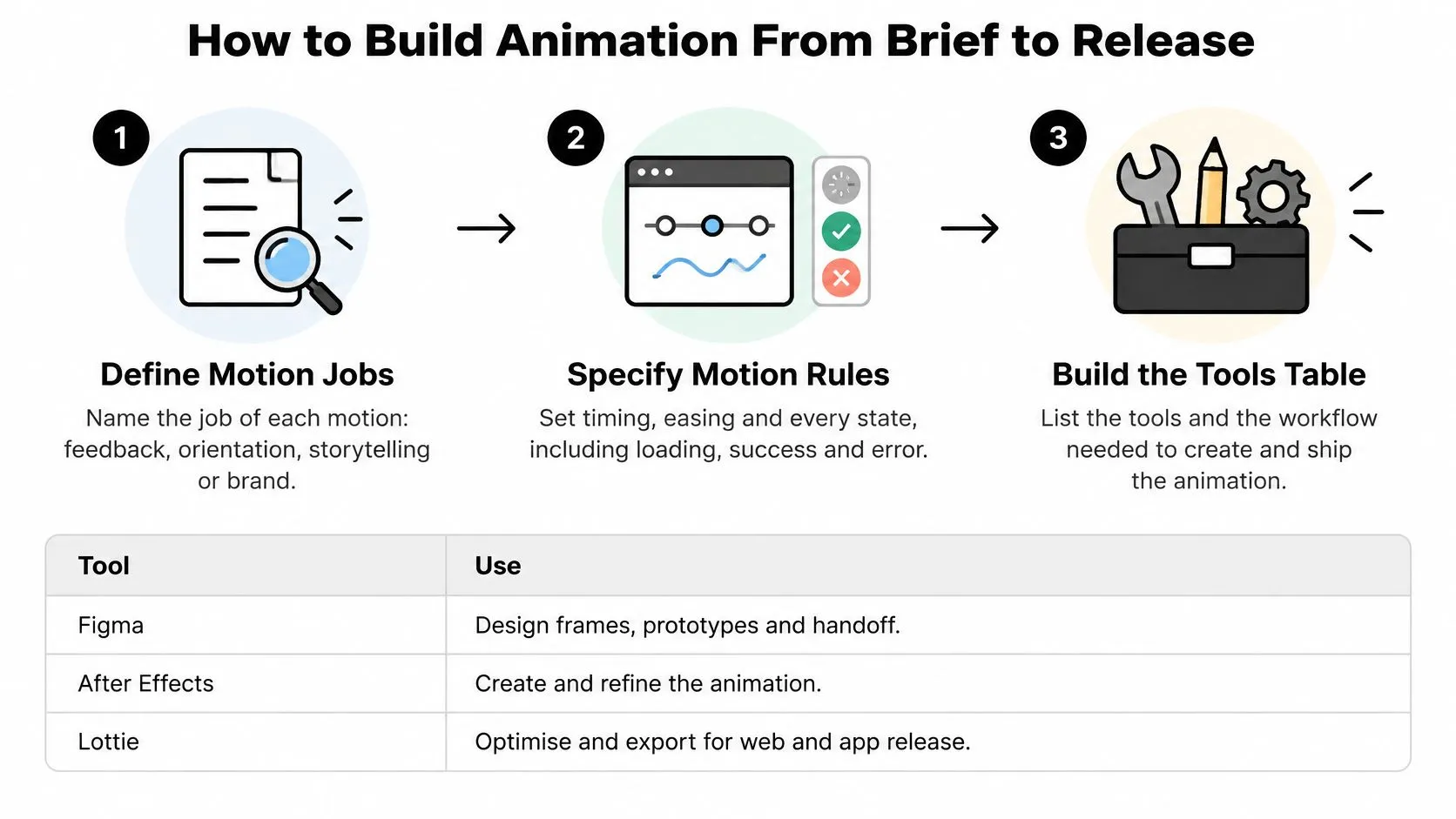
- Name the job of each motion. Feedback, orientation, storytelling or brand. If you can't name it, cut it. The slip is a mood board of "delight" with no task attached.
- Specify timing, easing and every state in the design file, including loading, error and offline. The slip is a happy-path prototype that has no failure frame.
- Prototype on real devices, including a lower-tier Android phone, and check it against the frame budget. The slip is a file that glides on a design laptop and stutters in a pocket.
- Choose the build route. Native APIs for transitions and microinteractions, Lottie or Rive for illustrated and state-driven motion, Unity or Unreal for 3D. The slip is picking a runtime because the reel looked good.
- Export and integrate, and check file size and frame time against the budget. The slip is a Lottie file that depends on an effect the player can't run, so the build drops the move.
- Run the assistive-technology pass on every animated screen before release. The slip is testing only the static screens and assuming motion "doesn't affect access".
- Ship with monitoring for crashes, latency and task completion, and keep a static fallback ready. The slip is judging the release from a design review alone.
Tools and what you actually receive
| Tool | Best for | Output | Watch for |
|---|---|---|---|
| Figma prototyping | Specifying transitions and timing | Prototype and design spec | Prototype motion is not shipped motion |
| After Effects with Lottie | Branded illustrated feedback | JSON file played by a Lottie runtime | Only a subset of effects export |
| Rive | Interactive, state-driven characters and controls | Runtime file for apps | Designers need to learn a new tool |
| SwiftUI and Core Animation | Native iOS transitions | Code | iOS only |
| Jetpack Compose animation APIs | Native Android transitions | Code | Android only |
| Unity or Unreal | 3D viewers and immersive scenes | Built app or embedded scene | Larger app size and heavier testing |
Studio Liddell Examples and Project Briefs
A character animation can make an app feel familiar, but it also uses time and attention. For the Cloudbabies TV series, Studio Liddell was asked to design and develop a Cloudbabies companion app. The useful design principle for a children's app is simple: characters should loop without taking over the task. If motion competes with a button or instruction, shorten it or cut it. Engine Shed is an interactive augmented reality map of Scotland that runs on iPad. It illustrates a different brief: movement should make cause and effect clear, so users can see how an action changes the map. In both cases, start with the user's task, then decide what motion earns its place.Briefs you can adapt
- •Children's IP onboarding. Goal: introduce characters without interrupting play. Deliverables: animated screens, character loops, and a defined loop length. Budget driver: the number of character variants. Success measure: onboarding completion.
- •Service-app transaction flow. Goal: make each step clear without slowing the transaction. Deliverables: microinteractions and loading states, with text for errors and offline conditions. Budget driver: the device testing matrix, not the number of easing options. Success measure: task completion.
- •Retail product configurator. Goal: let shoppers view and change a product. Deliverables: a 3D viewer, with a pre-rendered fallback for devices that cannot run it smoothly. Budget driver: model complexity and rendering demands. Success measure: file size and load time against agreed acceptance criteria.
Each brief should state what motion communicates and what happens when it is removed or cannot run well. A character loop that cannot be paused may distract from play, however well drawn. A configurator that performs poorly on a user's device can delay the choice it is meant to support. Specify a simpler fallback and the task it must preserve before production begins. That gives the team a clear performance budget: keep the animation that explains the next action, and trim decoration first.
Choose a Partner and Scope Your First Animation
Run the same checks against any studio, including Studio Liddell. We provide native mobile app development, and our custom app work uses industry best practices to protect user data. We also bring in freelance animators on client projects, so you should know who is drawing, who is engineering, and who is answering when a build misbehaves.
- Shipped app work. Look for released iOS and Android apps, or real-time scenes in Unity or Unreal, not only films.
- Device matrix. Ask whether lower-tier Android phones are in the test set, and how frame drops get recorded.
- Accessibility. Check the approach against WCAG 2.2 AA, and whether VoiceOver, TalkBack, switch access and a keyboard are in scope.
- Data protection. Confirm how the build handles user data. That's part of the app, not a sidebar to the animation.
- Who does the work. In-house staff and freelancers can both be right. Unnamed handoffs are the risk.
- Handover formats. Agree Lottie JSON, Rive files, native specs, project files and source assets before production starts.
- Pricing and change. Confirm how the fee is built, and what happens when a state or a device is added later.