How to Create Interactive Video: Master the Workflow
Most advice about how to create interactive video starts in the wrong place. It starts with hotspots, buttons, overlays, and platform features. That's how teams end up with a conventional video plus a layer of clickable clutter. The useful question isn't “what can the player do?” It's “what decision do we need the viewer to make, and why would they care enough to make it?” Interactive video works when choice changes the experience in a meaningful way. If the viewer's action doesn't alter the path, deepen understanding, qualify intent, or reveal useful behavioural data, it's decoration. That matters more now because the UK audience is already very comfortable with video-first behaviour. Ofcom reported that 91% of UK adults used video-sharing platforms in 2024, and YouTube reached 82% of online adults aged 16+ each month, which makes interactive overlays, hotspots, and branching paths relevant in a market where video is already a default mode of attention, as noted in this summary of Ofcom's UK video platform data. A studio-grade workflow treats interactivity as part of the narrative architecture. The business objective comes first. Then the interaction model. Then the production design, the platform, the edit, the analytics model, and the accessibility checks. In that order. Clients are often surprised by where projects go wrong. It usually isn't the edit. It's the planning. A sales demo tries to educate, convert, and entertain all at once. A training video adds quiz moments that don't map to actual learning outcomes. A branded experience looks polished on desktop and falls apart on a phone. Professional interactive video is more disciplined than linear video, not less. It needs tighter scripting, cleaner modular production, firmer decision logic, and stronger post-launch analysis. That's the difference between a novelty and a system.
Introduction From Clicks to Choices
The shift from passive viewing to guided decision-making changes the brief immediately. If you're building an interactive video for training, the outcome might be competency. For sales enablement, it might be qualification or route-to-demo. For internal communications, it might be comprehension and completion.
Start with one job
The most reliable projects have a single primary objective. That sounds restrictive, but it protects the creative. A few common examples:
- •Training use cases need viewers to demonstrate understanding at key moments.
- •Product or service explainers need viewers to self-select the path most relevant to their problem.
- •Recruitment or onboarding content needs to simulate choices and consequences without overwhelming the user.
Once that objective is clear, every interactive moment can be tested against it. If a branch doesn't support the objective, it shouldn't be there.
Practical rule: If you can remove a choice and the result still works exactly the same, that choice probably didn't need to exist.
Choice needs consequence
A lot of weak interactive video treats clicks as engagement. They're not. They're only useful when the viewer understands why the choice matters. That usually means one of three structures:
| Interaction type | Best use | Weak version |
|---|---|---|
| Decision branch | Scenario training, guided selling, narrative paths | Branches that reconverge without changing meaning |
| Knowledge check | Learning, compliance, onboarding | Quiz prompts unrelated to the script |
| Exploration layer | Product tours, technical explainers, exhibit content | Hotspots dropped on screen without narrative timing |
The production implication is simple. You aren't just making a video. You're making a controlled decision environment.
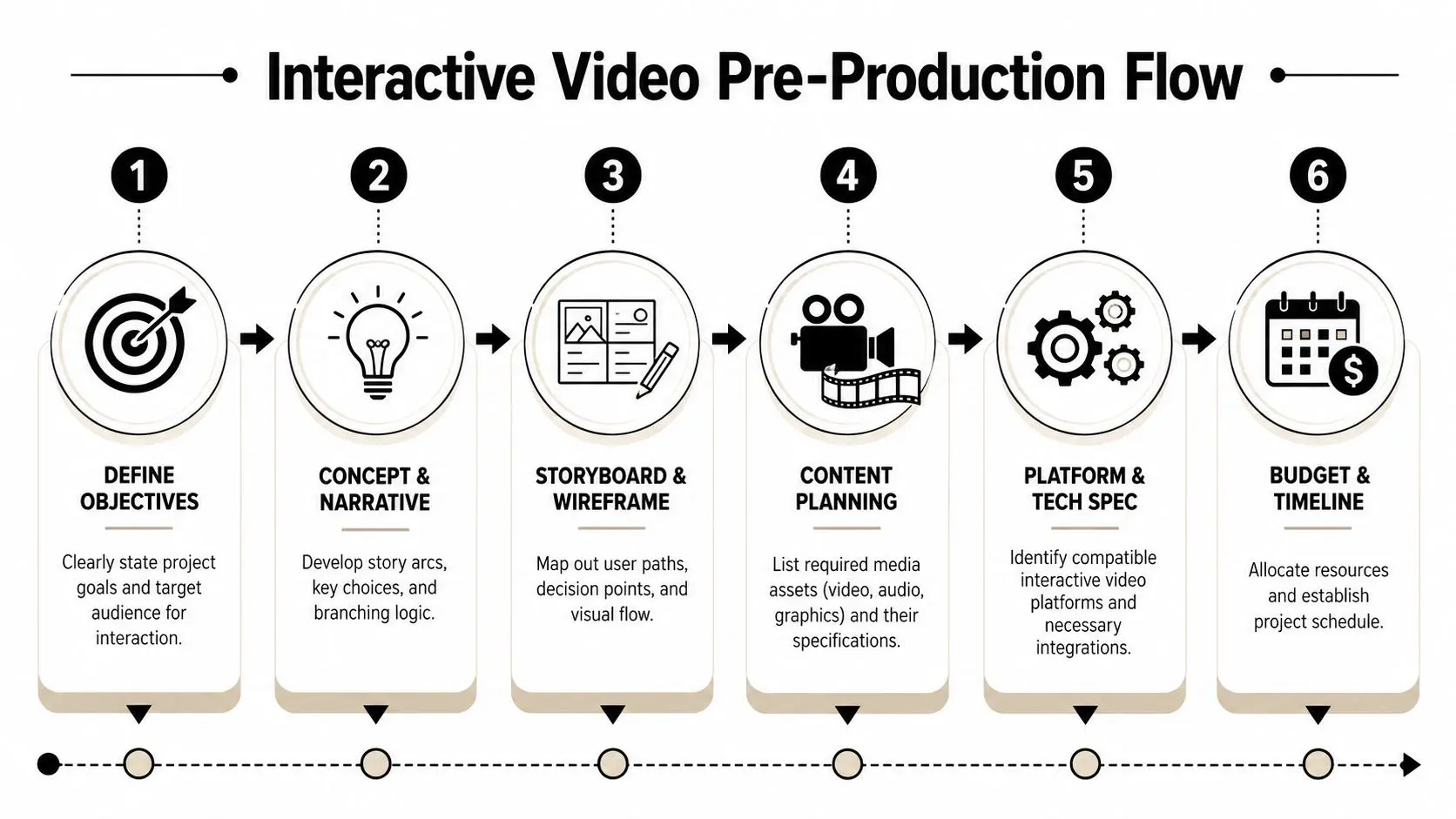
Pre-Production Planning for Interaction
Planning interactive video after the shoot is how budgets drift and user journeys become incoherent. The safest workflow is to design the interaction model before the edit, and ideally before production starts at all. Guidance for UK teams creating interactive video consistently points to a modular method: define one learning or conversion objective, map each decision point or quiz to that goal, then produce base footage in short segments so interactions land at natural pause points, as described in D-ID's interactive video tutorial.
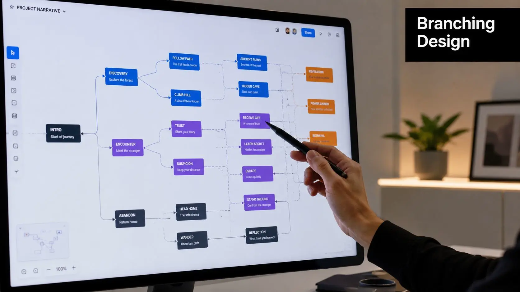
Map the decision logic before you script dialogue
Writers used to linear film often draft the scene first and add interactions later. That usually produces awkward pauses and arbitrary prompts. In interactive work, the decision map comes first. For a customer service training scenario, a clean planning model looks like this:
- Opening context. A customer presents a problem.
- First decision. The trainee chooses an initial response.
- Immediate consequence. The customer reacts differently based on tone or accuracy.
- Second checkpoint. The trainee either resolves, escalates, or mismanages the case.
- Feedback loop. The system explains why the choice helped or harmed the outcome.
- Path convergence. Different routes return to the same learning objective, but not with identical meaning.
Build modular assets, not one long timeline
Interactive projects work best when production packages footage as short, intentional segments. Each segment should have a clear start, a beat where the viewer can act, and a logical continuation. That modular approach helps in several ways:- •Editing stays manageable because you aren't ripping apart a long master timeline.
- •Analytics become readable because each segment corresponds to a known user action.
- •Versioning gets easier when legal, product, or learning teams request changes.
- •Platform migration is less painful if the interaction layer changes later.
Keep interactions where the speaker asks a question, completes a step, or pauses at a real decision moment. Those beats feel earned. Random interruption points feel bolted on.
Pre-production decisions that save pain later
Before production starts, lock these items:
- •Choice architecture. Decide whether you're building branch-and-return, scenario progression, or exploratory hotspot navigation.
- •Path limits. Keep the branch count under control. Too many branches create script sprawl and continuity problems.
- •Measurement plan. Define what success looks like before anyone opens the camera package.
- •Integration requirements. If the video needs to report to an LMS or CRM, the event model should be agreed in advance.
- •Approval workflow. Branching videos create more assets and more review points. Someone has to own sign-off.
The amateur mistake is thinking interactivity adds flexibility. In reality, it adds dependencies. That's why a disciplined pre-production map is the part that most often separates usable work from expensive confusion.
Designing and Storyboarding Branching Narratives
A branching narrative only works if the viewer can read it instantly. Confusion kills interaction. The audience shouldn't have to decode the interface, guess what each option means, or wonder whether a click will interrupt the flow.
Three branching models and where they fit
Not every interactive film needs a sprawling decision tree. Most business use cases benefit from one of three patterns.
| Model | How it works | Best for | Main trade-off |
|---|---|---|---|
| Branch and bottleneck | Viewer choices split briefly, then return to a shared core path | Training, onboarding, product demos | Efficient to produce, but can feel shallow if overused |
| Gauntlet | Viewer passes through a series of required checkpoints | Compliance, assessment, guided procedures | Strong control, less sense of freedom |
| Explorable model | Viewer chooses what to inspect and in what order | Technical explainers, exhibits, product features | High user agency, but weaker narrative momentum |
For most corporate and educational projects, branch and bottleneck is the practical sweet spot. It creates enough consequence to feel interactive without exploding the number of scenes.
Storyboards need both drama and interface logic
In linear production, the storyboard tracks framing, movement, transitions, and tone. In interactive production, it also needs to show:
- •Where choices appear
- •How long the prompt remains on screen
- •What the default behaviour is if no action is taken
- •Whether audio continues under the UI
- •How the next clip starts after selection
That means the storyboard often becomes a hybrid between a film board and a UX wireframe. For complex subject matter, the same clarity discipline used in storyboarding explainer videos for complex tech applies here too. The viewer needs visual logic as much as narrative logic.
If the choice labels are vague, the branch will feel arbitrary even when the underlying script is strong.
Platform choice changes the narrative possibilities
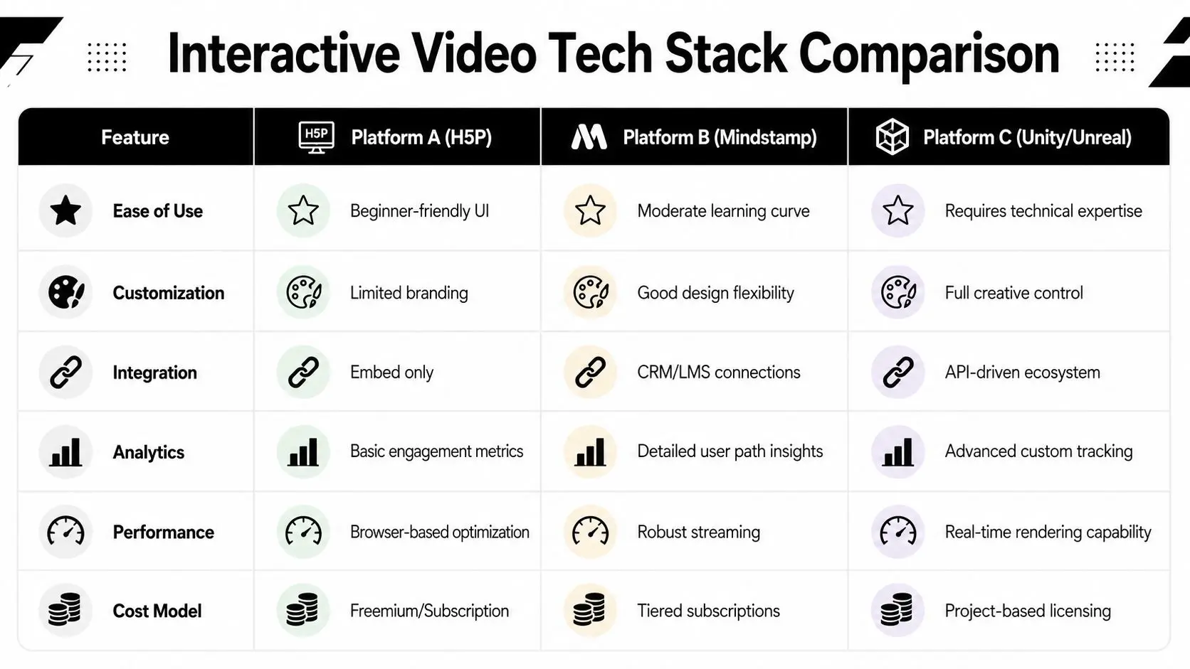
The interaction design should respond to the stack, not fight it. In practice, there are three broad routes. All-in-one platforms suit teams who want a managed environment with ready-made interaction tools. They're fast to prototype and easier for non-technical authors, but they can limit visual treatment, data flexibility, or custom behaviour. Plugin-based ecosystems work well for learning and web publishing. H5P is the obvious example in many education settings. This route is often sensible when quizzes, completion rules, and LMS compatibility matter more than cinematic presentation. Custom development is the right choice when the experience needs bespoke player behaviour, unusual UI, or deep business-system integration. It offers the most creative control and the most engineering overhead. A common mistake is choosing the stack on feature lists alone. The better question is whether the platform supports the kind of story you're trying to tell, the reporting you need, and the maintenance burden your team can realistically handle.
Choosing Your Tech Stack Platforms and Integration
Tech decisions shape the edit long before anyone exports a final file. I have seen projects approve a platform because the demo looked polished, then lose weeks in implementation because the player could not pass completion data to the LMS, the interaction layer broke inside the client portal, or mobile tap targets failed basic usability.
The right stack supports the production model, the distribution environment, and the reporting requirement at the same time. If one of those is out of step, the project becomes expensive in quiet ways. Editorial revisions take longer. QA expands. Internal teams start relying on workarounds instead of a stable workflow. A simple training scenario shows the problem. A presenter asks, “Would you like to handle this complaint yourself, or escalate it now?” That single choice affects clip timing, overlay behavior, branch logic, analytics events, mobile touch areas, accessibility labels, and in many training deployments, whether the LMS records progress properly. Platform selection has to be tested against that real chain of events. TechSmith's guidance on interactive training video production makes two practical points that hold up in client work. Shorter modules are easier to complete, and browser compatibility still needs active planning. Their interactive training video guidance recommends supplying an alternative format such as WebM alongside MP4 for broader playback support.
Choose for constraints, not marketing copy
Three routes cover most interactive video builds, but they serve very different priorities.
- •All-in-one platforms are useful when speed matters, the interaction model is fairly standard, and internal teams need a controlled authoring environment. They reduce setup time. They also tend to limit custom UI, event handling, and data export options.
- •Plugin ecosystems fit education and publishing teams that care about quizzes, completion rules, and easier LMS adoption. This route is often operationally sensible, even if the visual experience is less polished than a custom player.
- •Custom development makes sense when the video needs bespoke interface behavior, deeper analytics, account-level authentication, CRM or LMS integration, or a branded experience that cannot look templated. It gives the creative team more control and gives the engineering team more responsibility.
The mistake is treating those options as a style choice. They are an operating model. For teams reviewing wider architecture decisions, the same logic in advice on tech stacks for modernizing ecosystems applies here. Judge the stack by maintenance load, integration complexity, and how well it fits the systems you already run.
Integration questions that change the build
Clients often ask about hotspots, branching, and analytics dashboards first. The harder questions usually sit behind procurement, IT review, and long-term ownership.
| Requirement | Why it matters |
|---|---|
| LMS reporting | Determines whether completions, quiz states, and learner records pass correctly into the training system |
| CRM handoff | Lets sales or service teams use viewer choices as intent signals or segmentation data |
| Authentication | Controls access for internal communications, partner training, or paid content |
| Embed context | A player can behave differently inside a CMS page, intranet, app webview, or learning portal |
| Front-end ownership | Someone has to maintain the interaction layer, test browser changes, and update dependencies after launch |
This work often overlaps with product engineering more than video production. Teams planning a custom player or app-based deployment should account for front-end architecture, device behavior, and QA across browsers and viewports. That is standard web and mobile development for creative production, even when the visible output is still “just a video.” One rule separates professional builds from improvised ones. Decide early who owns the player, who owns the data, and who fixes the experience six months after launch. If nobody can answer that clearly, the stack is not chosen yet.
Production and Post-Production Best Practices
Interactive shoots punish casual coverage. In a linear edit, a slightly soft pause or an awkward eyeline can sometimes be hidden. In an interactive edit, those moments often become the exact points where the experience asks the viewer to act.
Direct for choice points, not just performance
When talent delivers lines that lead into an interaction, they need to leave space for the interface without feeling wooden. The pause has to feel motivated. A useful directing pattern is:
- •Land the setup line clearly
- •Hold a natural reaction beat
- •Leave visual headroom for UI if needed
- •Maintain eyeline consistency into each continuation
If the presenter rushes the final phrase or moves through the pause, the interaction overlay will feel like an interruption rather than part of the scene.
Editorial discipline matters more than effects
In post-production, the most important job is continuity across branches. That includes motion continuity, tone, room sound, graphics, and pacing. Fancy transitions won't rescue a broken branch. Editors should treat every branch as part of a system:
- •Name clips by path and function so assets don't get confused during implementation.
- •Use clean in and out points around interaction moments.
- •Keep music beds controllable so transitions between branches don't sound abrupt.
- •Export systematically with consistent codecs, dimensions, and audio specs.
- •Test branch starts in context rather than judging clips in isolation.
The cleanest interactive edit is usually less flashy than the client first imagined. Seamlessness beats spectacle.
Analyse behaviour against the original objective
The actual work starts after a soft launch. Review where users drop off, which prompts they ignore, which branches they repeat, and where quiz responses suggest confusion rather than mastery. Timing often turns out to be the issue. A prompt appears too early, the wording is unclear, or the viewer hasn't yet been given enough context to answer confidently. Useful questions in review include:
- Where do viewers hesitate? Long decision times can indicate ambiguity.
- Which branches are underused? That may mean the label is weak, not that the path lacks value.
- Do wrong answers cluster around one concept? If so, the teaching segment probably needs revision.
- Are users abandoning at the same timestamp? That often points to pacing or mobile usability rather than content quality.
Deployment Accessibility and Meaningful Analytics
Most interactive video failures don't happen in the storyboard. They happen at launch. A project works in an internal review, then users open it on a phone, miss the tap targets, can't use the controls with a keyboard, or lose the thread because captions don't account for branch-specific dialogue.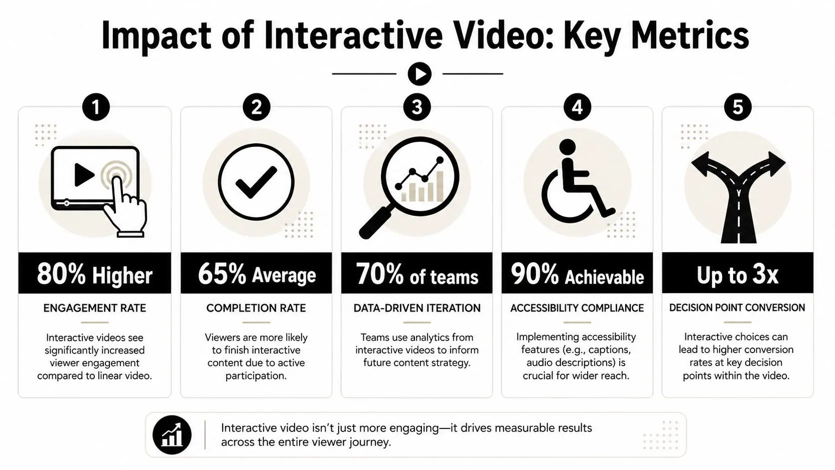
Accessibility is part of the interaction design
In this area, many mainstream tutorials are thin. They explain how to add clickable layers, but not how to make them usable. That gap matters in the UK because Ofcom reports that around 93% of UK adults use smartphones, and 97% of UK households have internet access, which means interactive video has to function reliably in mobile contexts. UK public-sector accessibility guidance also makes clear that video content should include captions and accessible alternatives, as discussed in this overview of mobile-first accessibility considerations. A practical accessibility checklist should include:- •Captions for every branch. Not just the main path.
- •Keyboard operability. Interactive controls must be reachable and visible in focus order.
- •Touch-friendly targets. Small desktop-style buttons won't survive mobile use.
- •Readable prompt timing. Users need time to process the instruction before the choice disappears.
- •Accessible fallback content. Some users will need a non-interactive alternative path.
Measure decisions, not vanity metrics
A view count doesn't tell you much. Interactive video earns its keep when you can measure how users moved through it and what those choices mean. Track things such as:
| Metric | Why it matters |
|---|---|
| Branch selection | Shows intent, preference, or understanding |
| Prompt completion | Reveals whether interaction timing is working |
| Quiz responses | Useful for diagnosing misunderstanding |
| Drop-off points | Helps identify friction in pacing or usability |
| Completion of required paths | Essential for training and compliance use cases |
A meaningful dashboard answers operational questions. Which branch creates better-qualified leads. Which scenario causes learner confusion. Which device context produces abandonment.
Launch softly, then tune
The best deployment pattern is a controlled release. Start with a defined audience, inspect the event data, and revise. Prompt wording, timing windows, button placement, and branch order often need adjustment after real users touch the piece. Captions and transcripts are part of that deployment package, not an optional afterthought. If you need a production-ready reference point for multilingual access and transcript workflows, Translators USA's transcription solutions are a useful example of the kind of support teams bring in when accuracy and distribution matter.
Frequently Asked Questions
Can you add interactivity to an existing linear video
Yes, but only if the original footage contains natural decision points. If the presenter never pauses, if there's no clean place to branch, or if the content was written as one uninterrupted argument, retrofitting usually feels clumsy. The most successful retrofit jobs use overlays, chapter-based exploration, or lightweight knowledge checks. True branching works better when it's planned before the shoot.
How long should an interactive video be
Think in modules, not total runtime. A long experience can still work if it's broken into clear decision-led segments. The more complex the viewer task, the more important segmentation becomes. If the project feels like one long video with occasional clicks, it probably needs restructuring.
What usually drives cost
Scope expands fastest in four places:
- •Branch count because every meaningful path needs script, shoot, edit, and QA time
- •Integration because LMS, CRM, or app connections add technical coordination
- •Revision rounds because more branches create more approval complexity
- •Accessibility requirements because captions, testing, and alternate experiences need real production effort
Clients often underestimate the QA burden. Interactive content has many more failure points than linear media.
Is custom development always better than a platform
No. It's only better when the project needs custom behaviour, custom analytics, or system integration. Otherwise, the engineering overhead can outweigh the benefit. A platform is often the smarter choice when the content team needs to publish repeatedly without developer involvement.
Where does AI help, and where does it get in the way
AI helps with scripting drafts, transcript handling, metadata generation, rough previsualisation, and some forms of synthetic performance. It doesn't remove the need for strong interaction design. The weak use of AI in interactive video is using it to generate more content than the user journey can support. The useful use is reducing production friction while keeping the decision design human-led.
What analytics should stakeholders ask for
Ask for reporting that connects viewer behaviour to the business objective. That might mean branch choices, assessment results, completion of required journeys, or signals of sales interest. If your team wants a broader primer on behaviour-led optimisation, guidance on boosting product growth with analytics is a helpful companion to video-specific reporting.
What separates professional interactive video from amateur work
Usually three things. First, the choices are purposeful. Second, the production is modular. Third, the analytics and accessibility model are planned from the start rather than patched in at the end. That's why the question isn't just how to create interactive video. It's how to create interactive video that still works when real users touch it, on real devices, inside real systems.
If you're planning an interactive film, training module, or decision-led content experience, Studio Liddell can help scope the workflow from narrative design through production, integration, and deployment. A good first step is a short discovery conversation focused on objective, audience, platform constraints, and how much branching the project needs.