The Ultimate Guide to Character Design Fundamentals
Character design is far more than just learning to draw well. It’s the art of breathing life into an idea, using the core principles of silhouette, shape, colour, and story to forge a personality that an audience can genuinely connect with, whether for a blockbuster film, an indie game, or a brand mascot.
Why Strong Character Design Matters
Think of character design as the engine that drives a story forward. Whether you’re creating for an animated series, a video game, or even a brand mascot, that character is the audience's guide. They communicate emotion, intention, and personality long before a single word is spoken. This immediate visual connection is what makes a world feel truly inhabited and alive. Without a solid grasp of these fundamentals, characters can easily end up feeling generic, confusing, or just plain forgettable. The real goal is to turn a concept into a persona that's not only visually interesting but also functional. Every single choice, from the curve of a smile to the scuff on a shoe, has to add up to a cohesive and purposeful whole. These principles have a huge real-world impact. Just look at the UK's animation sector. It’s a thriving industry built on the back of compelling, character-led content, employing over 12,000 people as of 2022 with a median salary of £40,000. That success is built on the ability to create characters that truly captivate people. You can find out more about the industry's scale from these statistics on vidico.com. Ultimately, a really strong design achieves a few key things:
- •Instant Readability: The audience should get the gist of a character’s personality at a single glance.
- •Emotional Connection: The design needs to make the character relatable and spark empathy.
- •Narrative Function: It must clearly signal the character's role in the story.
- •Memorability: The character has to be distinct enough to stick in the audience's mind long after the credits roll.
A truly great design is a visual biography. It doesn't just show you what a character looks like; it tells you who they are, where they've been, and what they might do next.
Getting to grips with these foundational concepts is the first step. It’s how you start creating characters that don't just look good, but actually matter.
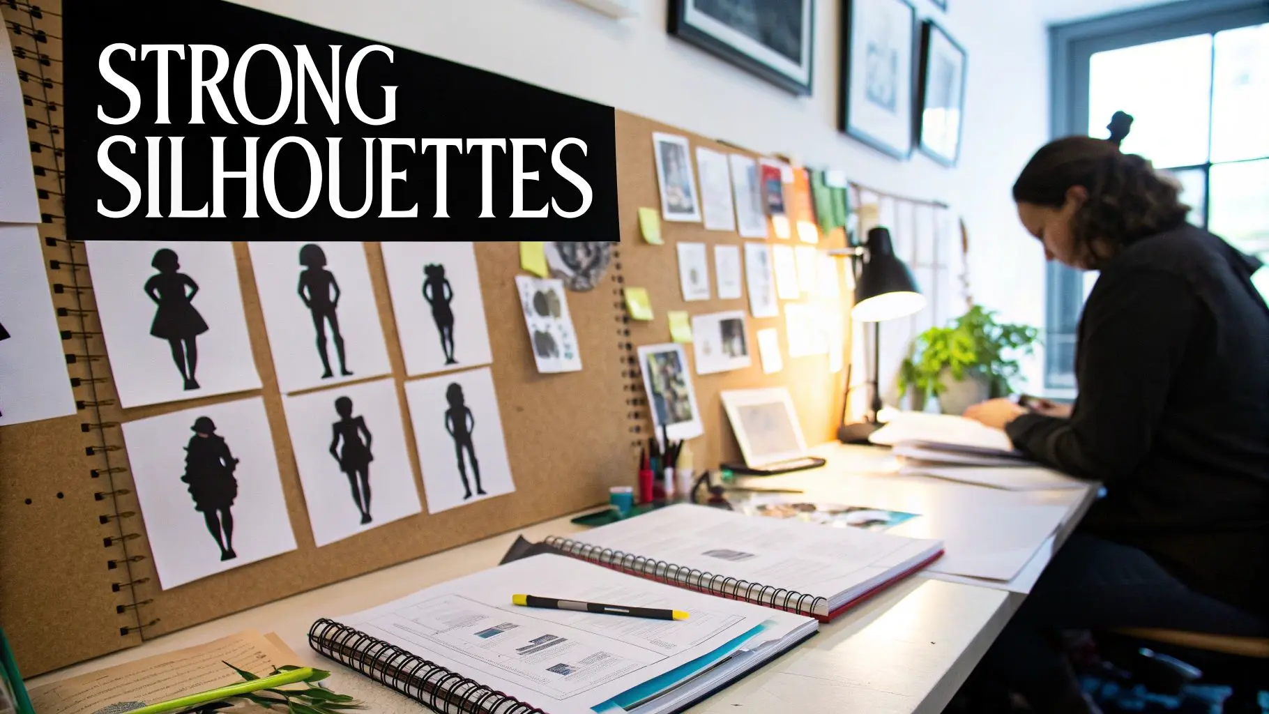
The Power of Silhouette and Shape Language
If you can tell who a character is just from their shadow, the designer has nailed it. That’s the power of the silhouette in a nutshell, and it's arguably the most critical part of good character design. It's the very first impression your audience gets, instantly telling them about a character's identity and story role before a single detail comes into focus. A strong, distinctive outline is everything. This works because our brains are wired to identify shapes at lightning speed. A clean silhouette cuts through all the visual noise, making a character instantly readable, whether they’re front and centre or lost in a crowd. This kind of immediate recognition is vital for everything from fast-paced animation to chaotic game environments.
The Psychology of Shape Language
Beyond just having a clear outline, the types of shapes you use to build that silhouette carry serious psychological weight. We call this shape language, a core concept where you use basic geometric forms to subconsciously signal personality traits to the audience. By tapping into the psychology behind shapes, designers can build characters that just feel right from the get-go. The three primary shapes are the building blocks for this visual conversation:
- •Circles and Ovals: With no sharp corners, these shapes feel soft, safe, and friendly. They’re perfect for communicating innocence, kindness, youth, or a general lack of threat. Think of cuddly sidekicks or gentle, good-natured heroes.
- •Squares and Rectangles: Their straight lines and hard corners scream stability, strength, and reliability. On the flip side, they can also suggest stubbornness or rigidity. This is your go-to shape for dependable heroes, stoic guardians, or immovable forces.
- •Triangles and Sharp Angles: Pointed shapes are an immediate signal for something dynamic, aggressive, or dangerous. They’re visually sharp and direct the eye, making them a classic choice for villains, cunning tricksters, or super-fast, energetic heroes. Even the direction a triangle points matters, it can imply stability if it’s resting on its base, or instability if it’s balanced on a point.
Shape language is the unspoken dialogue between the character and the audience. It’s a visual shorthand that lets people grasp a character’s essence in a split second, laying the groundwork for a much deeper connection.
Of course, the best designs are a clever mix of these fundamental forms. A hero might have a square, reliable torso but tapered, triangular limbs to hint at speed and a capacity for action. Take the phenomenally successful game Fall Guys, for example. The artists masterfully used soft, rounded shapes to create characters that are inherently charming and completely non-threatening. You can see how this simple but incredibly effective shape language adds to the game's massive appeal in our work with the Fall Guys team. By consciously blending these shapes, you can build nuanced and complex personalities that are still instantly understood. Getting a handle on shape language and silhouette is the first real step you take from just drawing a character to truly designing one.
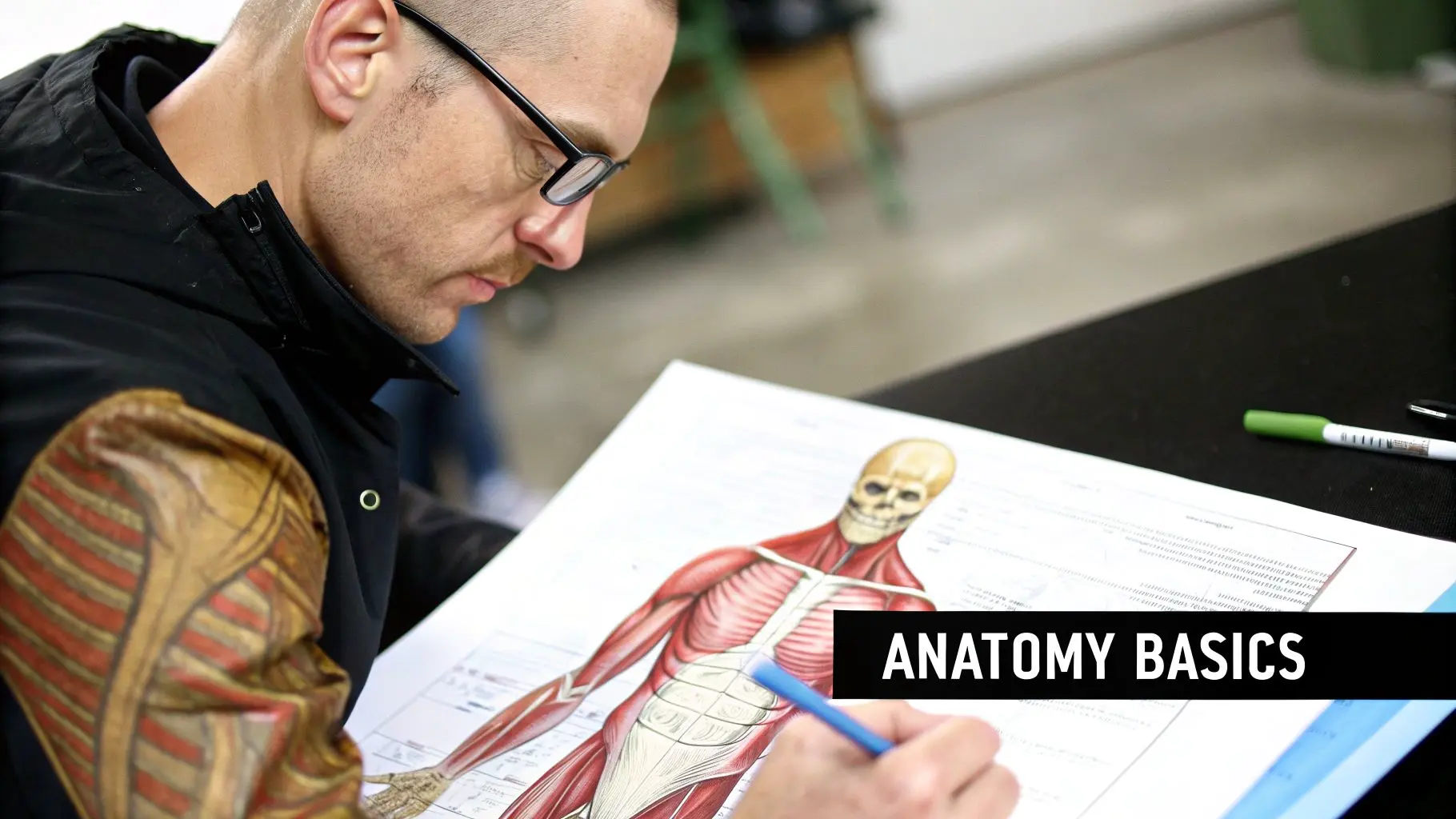
Building Believable Anatomy and Form
A killer silhouette gives a character an identity you can spot from a mile off, but believable anatomy is what gives them life. This isn't about memorising every bone in the human body, thankfully. It’s about getting a feel for the core principles of construction, balance, and weight that make a character look like they belong in their world. Whether you’re designing a hyper-realistic hero or a bizarre, tentacled alien, your audience has to believe, even just for a moment, that it could actually exist and move. The trick is to think more like a sculptor than a surgeon. Before you even think about muscles or clothing, start by breaking the character down into simple, 3D forms. Think spheres, cylinders, and cubes. These are your building blocks, helping you establish a real sense of volume and structure. This approach helps you visualise how the character actually occupies space.
Constructing a Solid Foundation
Every single great character design, no matter how weird or stylised, is built on a logical foundation. A simplified skeleton, even if it's just a glorified stick figure, is your secret weapon. It’s what helps you nail the proportions, figure out where the joints should go, and establish a solid centre of gravity. Get this right, and your character will feel balanced and capable of convincing movement. Here’s what to focus on:
- •Line of Action: This is a single, expressive curve that dictates the character’s entire pose and attitude. It’s the invisible spine of the drawing, giving it a dynamic flow and stopping it from feeling stiff and lifeless.
- •Weight Distribution: Your character has to look like they’re subject to gravity. If they lean one way, something else has to shift to counterbalance that weight. Nailing this is what makes a design feel tangible and solid.
- •Joints and Articulation: It sounds obvious, but understanding where a body can and cannot bend is essential. Placing joints correctly allows for natural movement and keeps your characters from looking like awkward, broken puppets.
The Power of Exaggeration
Here’s the fun part. Once you have a solid grasp of these fundamentals, you earn the right to break the rules. After you understand how a realistic body is put together, you can start to push, pull, and distort those proportions to create something truly unique and expressive. This is where stylisation really comes alive.
Knowing the rules of anatomy allows you to bend them with purpose. Exaggeration isn't about ignoring reality; it's about amplifying it to communicate personality and story more effectively.
For instance, you could give a brutish character a massive, top-heavy torso and tiny legs to really sell their raw power. On the flip side, a nimble, quick-witted character might have long, elegant limbs and a compact core. These creative choices only land because they’re built on a believable (albeit exaggerated) anatomical base. Without that foundation, the design just falls apart. It looks less like a deliberate artistic choice and more like a mistake. This is one of the most important character design fundamentals to master; by understanding construction and form, you gain the power to create characters that feel truly alive.
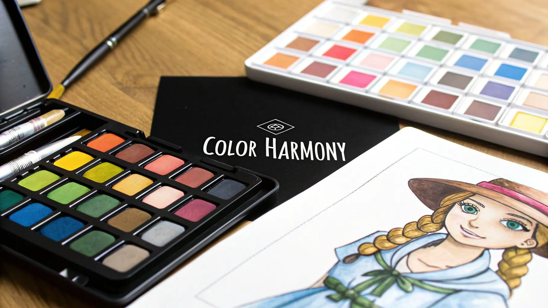
Using Colour and Light to Define Personality
If there's one storytelling tool that hits harder than any other, it's colour. It does so much more than just make a character look good; every colour choice is a strategic move that broadcasts personality, sets a mood, and tells the audience exactly who this person is in the story. Getting a handle on colour is absolutely fundamental to great character design. But this isn't about memorising some dry, academic colour wheel. It’s about getting a feel for three simple components and then using them with intent.
- •Hue: This is just the pure colour itself, your reds, blues, greens, and so on.
- •Saturation: Think of this as the colour's intensity. Super-saturated colours feel electric and energetic. Desaturated, muted tones can feel serious, grim, or just plain tired.
- •Value: This is simply how light or dark a colour is. Pushing the contrast in value is a classic trick to grab the viewer's eye and create drama. Low contrast, on the other hand, creates a much softer, more harmonious feeling.
Building Impactful Colour Schemes
Once you’ve got those three elements in your back pocket, you can start building palettes that do the emotional heavy lifting for you. Schemes with harmonious, analogous colours (ones that sit next to each other on the colour wheel) create a real sense of calm and unity. Flip that around and use a complementary scheme (colours from opposite sides of the wheel), and you instantly generate tension and visual pop. Getting this right is becoming more and more important. The UK's artistic creation industry is on a steady rise, with forecasts pointing to significant revenue growth by 2025. This shows just how much value is being placed on sophisticated creative skills. A well-considered palette helps your character stand out in this increasingly crowded visual world. You can actually dig into some of the numbers on this growing market on Statista.com. To help you get started, here's a quick look at how basic colours can immediately signal specific character traits.
| Basic Color Psychology in Character Design | ||
|---|---|---|
| Color | Common Associations | Character Archetype Examples |
| Red | Passion, danger, anger, strength, love | Fiery hero, enraged villain, romantic lead |
| Blue | Calm, sadness, wisdom, stability, trust | Wise old mentor, melancholic artist, dependable ally |
| Green | Nature, envy, healing, ambition, poison | Nature spirit, jealous rival, ambitious upstart |
| Yellow | Joy, cowardice, energy, intellect, warning | Cheerful sidekick, cautious scout, brilliant inventor |
| Purple | Royalty, mystery, magic, luxury, creativity | Regal monarch, enigmatic sorcerer, eccentric genius |
| Black | Power, death, elegance, evil, sophistication | Formidable antagonist, sleek spy, brooding anti-hero |
This table is just a starting point, of course, but it shows how quickly a single colour can set audience expectations.
Colour is psychology in pigment form. A splash of red can signal passion or danger, while a cool blue can suggest calmness or sorrow. Your palette is a direct line to the audience's subconscious.
When in doubt, remember that simplicity is often your best friend. A limited palette, maybe one dominant colour supported by a couple of accents, is almost always more powerful than a chaotic jumble. It helps to 'brand' your character, making them instantly recognisable and far more memorable.
Sculpting with Light and Shadow
Light and shadow are what finally breathe life into your coloured shapes. Lighting isn't just there to show off the form; it's there to crank up the emotion. Think about harsh, dramatic lighting with deep, inky shadows (a technique called chiaroscuro). This can make a character feel mysterious, dangerous, or downright menacing. Now, picture the opposite: soft, diffused light. This can give a character an almost angelic or gentle presence. Basically, light is a spotlight for your story. It tells the viewer where to look and amplifies the emotional beat of the scene. When you combine intentional colour choices with deliberate lighting, you stop just making pretty pictures. You start creating designs that are visually stunning and absolutely dripping with narrative meaning.
Infusing Your Design with Story and Personality
Technical skill will get you a well-drawn figure, but it’s the story that breathes life into a character. This is the point where all the fundamentals we’ve covered, silhouette, anatomy, and colour, converge to build a visual biography. Every line, accessory, and expression should be a deliberate choice, revealing who your character is and the journey they’ve been on. A truly great design answers questions before the audience even thinks to ask them. Why are their clothes torn in that specific way? What’s the story behind the scar on their eyebrow? This kind of narrative detail is what transforms a simple drawing into a person with a history. The whole process kicks off by translating abstract personality traits into tangible design elements. A character described as ‘cunning’ might have sharp, triangular features and a coiled, ready-to-pounce posture. In contrast, a ‘naive’ character could have wide, rounded eyes and more open, relaxed body language.
Translating Traits into Visuals
Solid research is the bridge between a vague idea and a believable design. Before you even start sketching, gather references that tell a story. Don't just look at photos of jackets; find images of worn-out leather jackets that scream a life of adventure. Consider these practical ways to embed a story:
- •Posture and Pose: A character’s default stance speaks volumes. A hero might stand tall with their chest out, projecting confidence, while a timid character could be hunched over, protecting their personal space.
- •Facial Expression: Go beyond just happy or sad. Subtle expressions hint at a character’s default mood. Are their eyes slightly narrowed in suspicion, or are their eyebrows perpetually raised in curiosity?
- •Clothing and Accessories: Every single item a character wears is a conscious choice. A pristine uniform suggests discipline and order, whereas patched-up clothing could imply resourcefulness or poverty. A hairstyle, a piece of jewellery, or a scuff on a boot, they're all storytelling opportunities. Our work on the Little Charley Bear app, for example, demanded a design that was instantly friendly and approachable for a very young audience.
A character’s design is really just a collection of clues. The audience pieces them together to understand the personality within, forging a much deeper and more rewarding connection.
Adding Depth Through Detail
This focus on character-led illustration is becoming a pretty big deal. In the UK, for instance, designers are steering away from the overly simplistic corporate styles and embracing characters with more life and nuance. This shift towards designs with dynamic movement and richer expression shows a clear demand for stronger emotional connection in storytelling. You can read more about this evolving approach on creativebloq.com. Ultimately, every detail should serve the character's narrative. By infusing your designs with this level of thought, you create more than just something to look at. You create someone the audience can believe in, root for, and remember long after the story is over.
Your Character Design Workflow From Idea to Final Polish
So, how do we pull all these fundamentals together? A great character doesn't just appear in a single flash of inspiration. It’s the result of a deliberate, step-by-step process, an organised journey that transforms a rough idea into something polished and memorable. Thinking about it this way takes the mystery out of the magic and makes incredible design feel achievable. This journey doesn't actually start with a pencil or a stylus. It starts with thinking. Before you even consider drawing, you have to get a handle on the character’s purpose. What’s their backstory? What makes them tick? What role do they play in the bigger picture? Jotting down a simple brief solidifies these core ideas, giving you a clear direction and a North Star to guide your design choices.
From Broad Strokes to Fine Details
With a clear brief in hand, you can finally start the visual exploration. This is the fun part, where you churn out ideas fast and try not to get too attached to any single one. The name of the game here is quantity over quality, you want to cast a wide net and explore as many possibilities as you can before you start whittling them down. A solid workflow usually moves through a few key stages:
- •Research and Reference Gathering: Start by building a visual library. Pull together images, historical details, and cultural touchstones that feel right for your character's story. This mood board will be your best friend.
- •Thumbnail Sketching: Now it’s time to draw. Create dozens of tiny, loose sketches focusing only on the silhouette and basic shapes. This is the quickest way to test whether your core ideas are readable and have any real impact.
- •Concept Refinement: Pick out the strongest thumbnails and start fleshing them out. This is where you'll add some basic anatomy, play with different poses, and begin defining the character's major forms.
- •Final Polish and Turnaround: Once you've locked in the design, it's time to finalise the linework, apply your carefully chosen colour palette, and create a character turnaround. Showing the character from the front, side, and back ensures the design holds up from every angle.
This infographic breaks down that sequence, showing how you move from that initial spark of an idea to a fully refined asset.
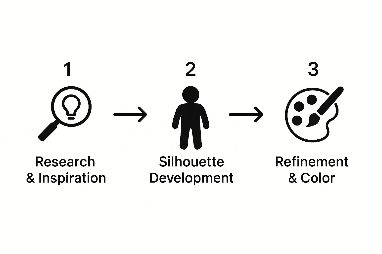
You can see how each step logically builds on the last, creating a solid foundation before you get lost in the finer details. It doesn't matter if the end goal is 2D or 3D; this iterative process is what makes great design work. In fact, our guide comparing 2D vs 3D animation delves deeper into how these foundational choices ripple through the entire production pipeline.
Frequently Asked Questions About Character Design
Even after you've got the fundamentals down, a few practical questions always seem to pop up during the creative whirlwind. Let's tackle some of the common hurdles artists hit when they're deep in the character design process.
How Many Variations Should I Sketch?
There's no magic number here, but you'll find most professional artists churn out 20 to 50 (or even more) rough thumbnail sketches before they even think about settling on a direction. The whole point of this early stage is exploration, not perfection. You have to focus on quantity to push past the obvious ideas and stumble upon those really unique solutions for your character's silhouette and form.
What If I Get Stuck on an Idea?
Creative blocks happen. It's totally normal. When you feel like you've hit a wall, the best thing you can do is step away from the project and hunt for fresh inspiration. Go create a new mood board, study the work of artists you admire, or even just read a book. Sometimes, the best solution is simply to shift your focus for a bit and come back with a new perspective.
The most common mistake is falling in love with your first idea. Great character design is an iterative process; you must be willing to discard good ideas in the search for a truly great one.
How Do I Know When a Design Is Finished?
A design is done when it clearly communicates the character's personality and serves its purpose in the story, all without any unnecessary clutter. Ask yourself this: does every single element on this character tell part of their story? If you can remove a detail without losing any personality or function, the design will probably be stronger without it. Clarity and purpose are your final checkpoints. At Studio Liddell, we build worlds and the unforgettable characters that live in them. Ready to bring your vision to life? Let's talk about your project.Article created using Outrank