Marketing for an App: The Definitive Playbook
You've finished the build. The onboarding flow works, the product team has sweated every interaction, and the app solves a real problem. Then launch week arrives and almost nothing happens. A few installs come through, usage is patchy, and the channels that looked promising in planning suddenly look expensive, noisy, or both. That's normal. It's also fixable. Marketing for an app breaks down when teams treat it as a last-mile task. They build first, then try to “add marketing” with a few paid ads, a generic landing page, and recycled screenshots. In the UK, that approach is especially weak because people already live in a pervasively mobile environment. Ofcom reports that UK adults spent 4 hours 20 minutes online per day in 2024, and 91% of that online time was on smartphones according to this UK mobile app marketing analysis. If attention is mobile-first, your go-to-market has to be mobile-first too. That changes the standard operating model. Creative has to communicate value in seconds. Store assets need to sell the product before a user taps install. Measurement has to connect ad spend to actual in-app value, not cheap traffic. Retention has to be designed before launch, not patched in afterwards. Good app marketing is less about finding a magic channel and more about building a system. Research sharpens the message. Store optimisation turns attention into installs. Strong visual assets improve every touchpoint. Launch sequencing creates momentum. Retention and measurement decide whether the whole thing becomes sustainable.
Your App is Built Now What
A common first mistake is assuming launch is the starting line. It isn't. By the time your app goes live, the market has already decided what kind of category you're entering, what users expect from similar products, and how expensive it will be to earn attention. That's why marketing for an app starts before launch and extends well beyond install. If your acquisition plan, creative system, store page, onboarding, and retention model aren't joined up, you'll end up paying to attract people who never reach the value moment.
Start with the reality of mobile attention
A UK app launch sits inside a smartphone-first market. People discover products in feeds, watch short-form creative on mobile, tap through from ads in moments of low attention, and make install decisions quickly. That affects everything from your first ad concept to your app store screenshots. What tends to work:
- •Short, fast creative that makes the problem and payoff obvious
- •Install paths with minimal friction, including clean mobile landing pages where relevant
- •Visual storytelling built for vertical viewing, not desktop layouts squeezed into mobile formats
- •Early retention planning, so the promise made in ads matches the first in-app experience
What tends not to work:
- •Desktop-style brand campaigns repurposed for app acquisition
- •Feature-heavy messaging that never lands on the user's actual pain point
- •Store pages filled with generic screenshots
- •Optimising purely for installs without checking whether those users activate or return
Practical rule: If the value of your app isn't obvious without sound and within a few seconds of viewing, the market will punish you for it.
Build your playbook before you scale spend
Teams new to app growth usually need frameworks more than hacks. A good place to pressure-test your thinking is a library of practical Capgo growth resources that focus on release management, iteration, and the operational side of shipping improvements quickly. That matters because app marketing is never just promotion. It's the feedback loop between user behaviour, creative, product changes, and distribution. Treat the launch as one phase in a longer system:
- Find your position in the market.
- Turn that position into sharp messaging and assets.
- Make your store page do conversion work.
- Launch in coordinated bursts, not isolated tactics.
- Retain and learn faster than competitors.
Lay Your Pre-Launch Foundations
Pre-launch work decides whether your marketing has a spine or whether it collapses into channel-chasing. Founders often want to move straight to media plans and creative production. The stronger move is to lock the commercial logic first.
Study competitors for gaps, not imitation
Competitor research isn't about making a spreadsheet of features and copying the winners. It's about spotting what they promise, what they show visually, where their onboarding appears weak, and which audience they seem to prioritise. Review the obvious competitors, then look one layer wider. A meditation app may compete with other meditation products, but it also competes with podcasts, YouTube routines, note-taking tools, and habit trackers. Your user doesn't care about category purity. They care about solving a problem with the least friction. Useful things to audit before launch:- •Store positioning: What keywords, screenshots, icons, and preview videos keep appearing?
- •Creative patterns: Are rivals leaning on static UGC-style ads, polished motion design, or demonstration-led video?
- •Promise versus product: Does the ad claim speed, learning, entertainment, savings, or convenience?
- •Onboarding logic: What happens in the first session? Is value shown quickly or buried?
Build personas from behaviour, not stereotypes
Age and gender alone won't get you very far. Effective app strategy uses a richer view of user behaviour. App marketing guidance recommends segmentation based on demographics, behaviour, recency, frequency, transaction value, and geography, then tailoring messaging to high-engagement, low-engagement, and churn-risk audiences, as outlined in this segmentation-focused app marketing guide. For a UK launch, that usually means you shouldn't treat the market as one homogenous audience. A student using a learning app before exams, a parent using it with a child, and a professional using it for upskilling may all need different hooks, different proof points, and different onboarding emphasis. A simple working model is often enough at this stage:
| Audience type | What they care about | What your creative should show |
|---|---|---|
| Time-poor users | Speed, simplicity, instant payoff | Fast demo, clean interface, one clear benefit |
| Cautious evaluators | Trust, proof, ease of use | Product walkthrough, testimonials if available, clearer UI states |
| High-intent niche users | Specific functionality | Feature depth, category language, stronger specificity |
Write a value proposition you can actually visualise
If your proposition can't be shown, it will be difficult to sell in ads. “Manage your finances better” is vague. “See every subscription in one place and cancel unwanted payments quickly” is much more usable because a designer can build screenshots and motion around it. App marketing gets easier when the message naturally turns into scenes, UI flows, and contrast. For extra perspective on turning strategy into channel-ready planning, this practical app marketing guide is useful because it forces the question many teams avoid: how will this positioning survive contact with real acquisition channels?
The strongest pre-launch positioning usually sounds narrower than the founder first wants. That's a good sign, not a bad one.
Optimise Your Digital Shop Front
A user taps through from an ad, a press mention, or a recommendation, and your store page has seconds to justify the install. That moment decides whether the budget you spent on awareness turns into users or drop-off.
Treat ASO as conversion design
ASO starts with search visibility, but it only pays off when the page persuades. Teams that focus on titles, keywords, and category placement while neglecting the visual story usually get traffic without enough installs to make acquisition efficient. Your store listing has two jobs:
- Help the right users find the app
- Help them decide quickly that it is worth downloading
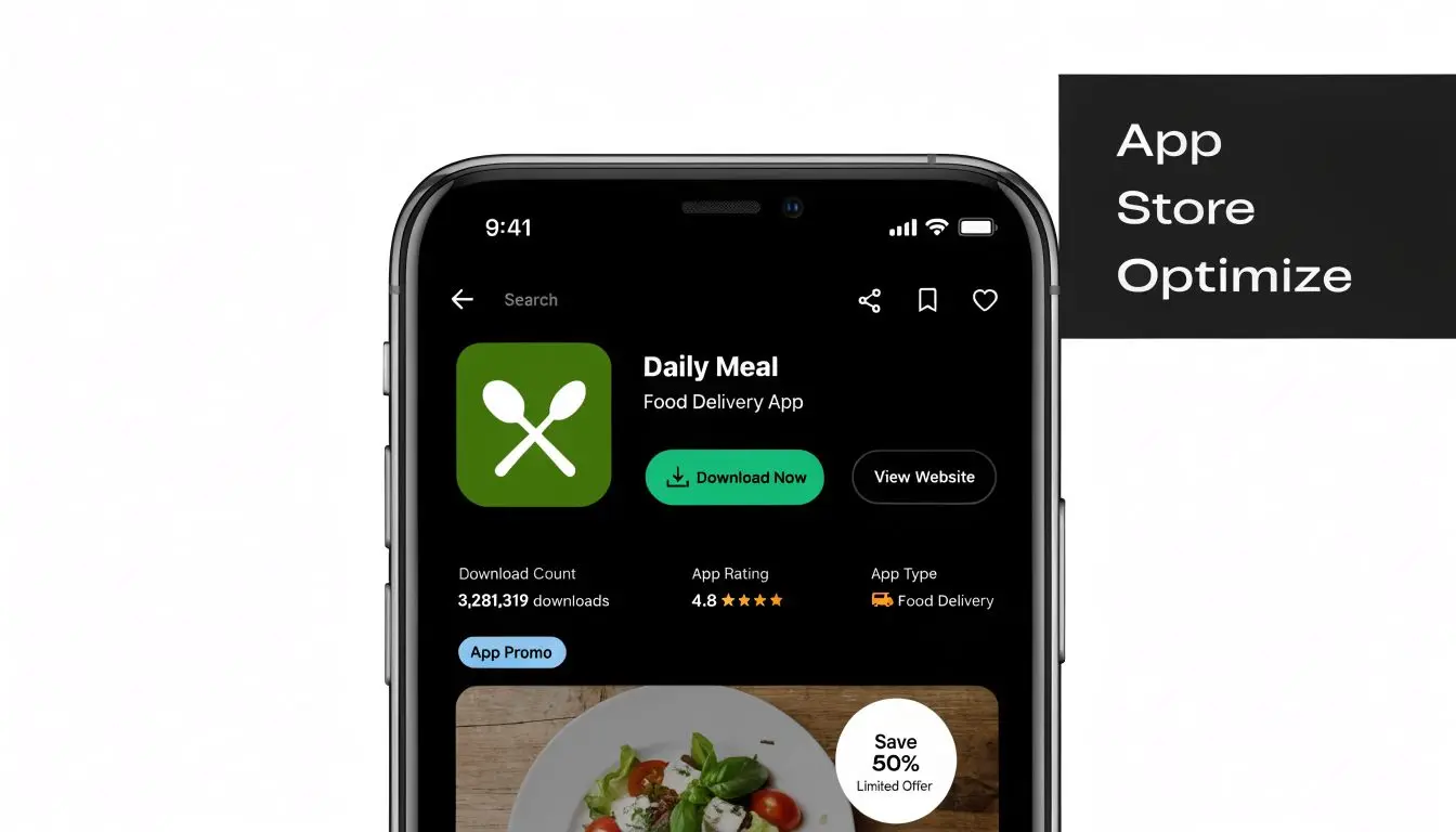
Build the screenshot sequence like a sales flow
Static screenshots can work, but only if they are structured with intent. A gallery full of unlabeled UI screens rarely converts well because users have to do the interpretation work themselves. A stronger sequence is simple. Start with the payoff. Follow with the core interaction. Then reduce doubt with proof of usability, depth, or relevance to the user's situation. For example, a budgeting app should not open on a dense dashboard with ten widgets. It should open on the outcome, such as seeing subscriptions in one place or spotting wasted spend quickly. A learning app should show progress, not just lesson menus. An XR app should show the experience clearly enough that users understand what happens after install.Use motion where the product needs explanation
Some apps are easy to grasp from stills. Others are not. If the value depends on gestures, transitions, personalisation, 3D interaction, or a multi-step workflow, preview video and motion-led assets usually do a better job of closing the gap between curiosity and intent. That is a creative decision as much as a marketing one. Poor assets make good products look harder than they are. Strong visuals, clear editing, considered captions, and polished animation reduce perceived effort before the user ever reaches onboarding. In crowded categories, that perception matters because buyers often compare several listings in quick succession and make quality judgments from the asset standard alone. Useful principles:- •Lead with the benefit, not the home screen
- •Write captions that add context, rather than restating the interface
- •Show motion where interaction is part of the promise
- •Keep visual consistency across icon, screenshots, ads, and landing pages
- •Design for fast scanning, because users will not read every frame in order
Studio Liddell's guide to app store optimisation is a practical reference for shaping names, keywords, icons, screenshots, and summaries into a listing that supports conversion.
Make the page feel like the product
The best store pages create alignment between promise and experience. If your ads present the app as calm and premium, the listing needs restrained typography, clean framing, and screenshots that support that tone. If your product wins on speed, the page should feel immediate and easy to understand. Mismatch is expensive. A polished acquisition campaign that sends users to a weak listing lowers install rate, distorts channel performance, and gives teams the wrong diagnosis. They often blame targeting or budget before fixing the assets that are suppressing conversion.
Many store page problems start as creative clarity problems, then show up later as conversion problems.
Develop High-Impact Creative Assets
A common launch scenario looks like this. The product works, media budget is approved, targeting is in place, but the campaign still struggles because the assets do not explain the app fast enough or make it feel credible enough to install. Creative sets the standard for the whole funnel. It influences whether someone stops on an ad, understands the value, trusts the product, and arrives at onboarding with the right expectation. In a crowded app market, that chain matters more than teams usually admit.
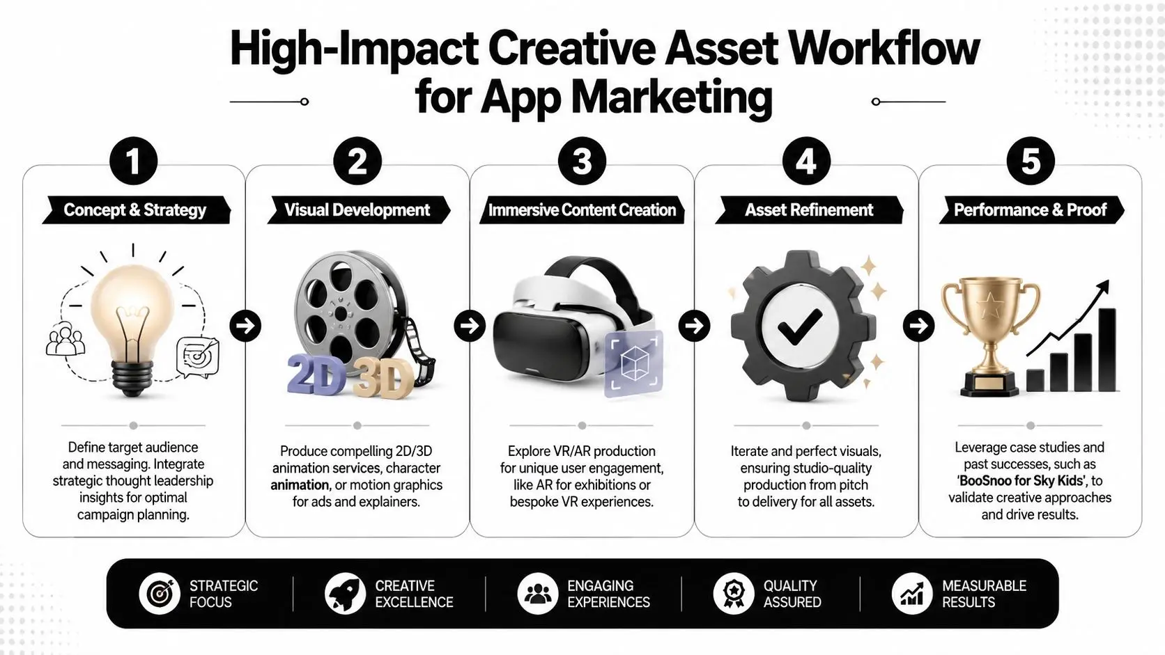
Match the asset to the funnel stage
Different stages need different proof. Early-stage creative has one job. Make the audience care enough to give you another second. That usually means a clear visual hook, a recognisable problem, and a frame that makes the product feel relevant. Mid-funnel creative needs to explain how the app works in practice. Bottom-funnel assets need to reduce hesitation with sharper product proof, clearer UX cues, and a direct path to install. A practical asset stack often includes:
- •Awareness assets: Short animated explainers, motion-led brand films, vertical social edits, category-framing visuals
- •Consideration assets: UI demos, testimonial-led cuts, side-by-side comparisons, narrative walkthroughs with clearer sequencing
- •Conversion assets: App preview videos, paid social install ads, landing page motion graphics, onboarding previews
- •Retention-supporting assets: In-app education clips, feature release videos, referral creatives, lifecycle email visuals
The trade-off is usually speed versus finish. Early tests do not need cinema-level production, but they do need a strong concept, disciplined editing, and visual consistency. If the creative looks cheap, users often assume the product quality is cheap too. For a broader framework, Studio Liddell's guide to mobile app promotion in the UK covers how creative, channel choice, and store conversion work together.
Build for the channel, not just the message
Each channel rewards different creative behaviour. Short-form social needs pace and immediate clarity. Search-led placements need tighter relevance to intent. Creator content needs a believable use case and enough freedom to match the creator's natural style. Display and landing pages need stronger hierarchy because the user is usually evaluating rather than casually browsing. Motion earns its keep. Animation, video, and interactive visuals help explain product logic, show before-and-after outcomes, and demonstrate flows that static screenshots cannot carry on their own. That is especially important for apps with layered functionality, new interaction models, or a benefit that only becomes clear once the product is in motion. One strong production model is to treat creative as a system. Start with the core message and visual language. Turn that into master assets. Then cut channel-specific versions, test openings, edit lengths, captions, and calls to action, and feed the results back into the next round. Studio Liddell can support that process across animation, apps, games, and XR production when a campaign needs more than static design.
Quality affects performance after the click
Creative quality affects more than click-through rate. It shapes who installs, what they expect, and how quickly they understand value once they open the app.
Field note: If the ad promises one experience and the product delivers another, acquisition costs rise and retention quality drops.
That problem shows up often in categories that need demonstration. Education apps, games, entertainment products, complex utility tools, and XR experiences usually need stronger art direction, clearer sequencing, and better motion work because the product experience is part of the sale. High-quality assets are not a finishing touch in those categories. They are part of the go-to-market model.
Execute Your Launch Campaign
A launch works best when channels support each other instead of operating in isolation. Paid social can create reach, search can capture active intent, creators can add social proof, and PR can give the product a story outside ad inventory. If one channel is doing all the lifting, the launch usually feels more fragile than it should.
Choose channels by app type and user intent
Different channels solve different problems. The mistake is asking each one to do everything.
| Channel | Strongest use | Watch-out |
|---|---|---|
| Paid social | Fast creative testing and broad reach | Weak creative gets exposed quickly |
| Search-led app campaigns | Capturing active demand | Needs strong store conversion to work well |
| Creator partnerships | Trust and demonstration | Poor creator fit can make the app feel forced |
| Digital PR | Narrative and credibility | Harder to control timing and message precision |
| Owned channels | Warm traffic and launch momentum | Needs pre-launch audience building |
Segmentation matters from day one. UK app growth guidance recommends using demographics, behaviour, and geography to create actionable segments, then A/B testing ad creatives and onboarding flows to improve conversion and reduce wasted spend, as noted in the earlier segmentation source. In practice, that means you should build separate launch audiences instead of pooling everyone into one broad campaign.
Sequence activity so momentum builds
Launching without a strong initial push and hoping the algorithm catches up is rarely a serious plan. Better launches create anticipation, then compress activity into a window where signals reinforce each other. Here's a simple operating timeline.
| Week | Focus Area | Key Activities |
|---|---|---|
| 1 | Research lock | Finalise audience segments, messaging, competitor review |
| 2 | Asset production | Produce paid social variants, store assets, landing page visuals |
| 3 | Tracking and QA | Check event instrumentation, links, attribution, store readiness |
| 4 | Soft launch | Test creative with limited audiences, review onboarding friction |
| 5 | Pre-launch buzz | Warm email list, brief creators, line up PR angles, gather feedback |
| 6 | Launch week | Increase paid activity, publish creator content, push PR and owned channels |
| 7 | Early optimisation | Pause weak creatives, refine audiences, update store assets if needed |
| 8 | Scale or reset | Increase spend behind quality cohorts or revisit message and product fit |
Organic and paid should share the same story
The message in your paid ad shouldn't be dramatically different from the one in your creator brief or press angle. Consistency builds trust. It also makes performance analysis easier because you're testing variables more cleanly. If you want a broader UK-specific reference point for channel selection and promotion tactics, this complete guide to mobile app promotion in the UK is a useful companion read.
Don't judge launch success by volume alone. Judge it by whether the users you acquired behave like people who may stay.
Drive Retention and Build Growth Loops
Acquisition gets attention. Retention decides whether the business works. The common failure pattern is easy to spot. A team spends heavily to acquire installs, then sends every user through the same onboarding, the same push cadence, and the same in-app prompts. Some users activate despite that. Many don't.
Retention starts with the first value moment
Users stay when the app proves its usefulness quickly and clearly. That sounds obvious, but many products still delay the payoff. They ask for too much information, show too many options, or push permissions before trust has been earned. A stronger approach is to identify the earliest meaningful action in your app and optimise towards it. For one product that might be completing a first task. For another it might be watching a first piece of content, creating something shareable, or inviting a collaborator. Retention systems usually need three layers working together:
- •In-app guidance that helps users reach value without confusion
- •Lifecycle messaging through push, email, or in-app prompts tied to behaviour
- •Re-entry incentives that give people a concrete reason to return
Personalisation beats generic reminders
Broad push notifications often become background noise. Behaviour-triggered messaging is more useful because it responds to what the person did or didn't do. Examples of smarter retention thinking:
- •A dormant learner gets a reminder tied to unfinished progress, not a generic “come back”.
- •A creative tool user receives a prompt showing a template relevant to their previous activity.
- •A commerce or rewards app highlights something saved, viewed, or started earlier.
That same segmentation mindset should carry into churn prevention. High-intent users who stalled near activation need different messaging from casual users who bounced in the first session.
Growth loops work when they help the user first
Referral mechanics, shareable outputs, collaborative features, and community behaviours can all create compounding growth. The weak version is bolting on a referral banner and expecting magic. The strong version builds sharing into the product's natural use. A few durable loop patterns:
- •Referral loops: Best when the invited user gets immediate relevance, not just a code
- •Content loops: Users create or save things worth sharing externally
- •Collaboration loops: One active user naturally pulls another into the workflow
- •Status loops: Progress, streaks, collections, or achievements give people a reason to return and share
Retention improves when marketing, product, and lifecycle messaging all describe the same value in the same language.
Measure What Matters
A launch can look healthy on paper and still be heading in the wrong direction. Install volume rises, click-through rates look decent, and creative wins praise internally, yet the users from one channel stall before activation and never return. Good measurement catches that early, before budget gets wasted and weak assets keep scaling a weak story.
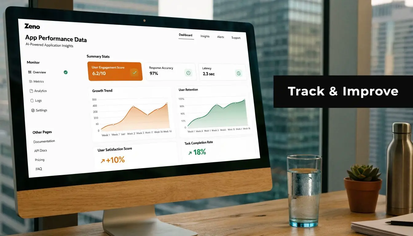
Build measurement around user quality
The job is simple to state and harder to do well. Track where users came from, what they did first, whether they reached the value moment, and whether that source keeps producing people worth paying for again. That requires joined-up measurement across acquisition, product, and lifecycle activity. Teams need pre-install source data, well-defined in-app events, cohort reporting by channel and campaign, and attribution that connects spend to post-install behaviour rather than install counts alone. The specific tools matter less than the discipline behind them. Four questions should stay in view:
- Which source brought this user in?
- Did they reach activation quickly?
- Did they retain after the first sessions?
- Should you invest in that source again?
Read metrics in combination
Single metrics create false confidence. CAC can look efficient while retention is poor. DAU/MAU can improve because a small core audience is highly active while broader cohort quality is weakening. Funnel conversion can collapse because the onboarding sequence is unclear, even though the media targeting was sound.| Metric | What it tells you | Common mistake |
|---|---|---|
| CAC | Cost to acquire a customer or valuable user | Treating all acquired users as equal |
| LTV | Revenue or value generated over time | Estimating too early without enough behavioural evidence |
| Retention rate | Whether users come back | Reviewing it without segment context |
| DAU/MAU | Habit and engagement shape | Using it as a growth score instead of a behaviour signal |
| Funnel conversion | Where people drop | Blaming channels for product friction |
Test creative with intent
A/B testing works when the test is tied to a meaningful behaviour change. Good experiments examine message clarity, onboarding sequence, store-page promise, paywall framing, and which visual treatment gets the right user to act. Random cosmetic tests rarely help much. This guide to A/B testing best practices is a useful reference for keeping tests focused, measurable, and tied to decisions. For app teams, the most useful creative tests usually answer questions like these:- •Does motion explain the product better than static imagery for this audience?
- •Does a benefit-led screenshot sequence improve install-to-activation quality?
- •Does UGC-style ad creative attract lower-intent users than polished demo-led creative?
- •Does a revised onboarding animation reduce drop-off at the first key action?
Those answers affect more than conversion rate. They influence user quality, retention shape, and how often the brand needs to refresh assets to protect performance.
Privacy limits visibility, so design for decision-making
Measurement will never be perfect. Consent settings, platform restrictions, and partial attribution all reduce visibility. Strong teams plan for that from the start. The response is not to wait for cleaner data. It is to build a tracking setup that gives enough signal to make sound decisions. Prioritise first-party events, define activation clearly, capture owned audience data where appropriate, and keep lifecycle messaging tied to behaviour you can observe directly. Studio Liddell's guide to mobile apps tracking covers the operational side in more detail. The same principle applies to creative review. Judge assets by the quality of users they attract and retain, not just by front-end engagement. High-quality creative is expensive to produce and expensive to ignore. In a crowded app category, it often decides whether your measurement stack surfaces real growth or just reports costly noise.
Frequently Asked Questions
| Question | Answer |
|---|---|
| When should marketing for an app start? | It should start before launch, ideally while the product proposition is still being shaped. Early market research, audience definition, store planning, and asset development prevent expensive rework later. |
| What's the biggest launch mistake? | Chasing installs before checking whether the app reaches a clear value moment quickly. If onboarding is weak or the store page is unclear, more spend just scales the problem. |
| Should I prioritise paid or organic channels first? | Usually both, but with different jobs. Paid channels are useful for testing message and audience fit quickly. Organic channels help build trust, search presence, and reusable momentum. |
| How important is creative quality really? | Very important. Creative affects whether people notice the app, understand it, trust it, and install it. In crowded categories, weak assets can make a decent product look second-rate. |
| Do I need a preview video for the app store? | Not every app needs the same format, but apps with more complex workflows or a strong experiential element often benefit from motion-led explanation rather than static screenshots alone. |
| What should I measure first after launch? | Start with activation, early retention, and channel-level cohort quality. Installs matter, but they're only useful if the users go on to do something valuable in the app. |
| How often should I refresh creative? | Refresh when performance flattens, audiences fatigue, positioning changes, or product updates create a better story to tell. Build a repeatable asset pipeline rather than relying on one hero concept. |
| What if attribution is messy? | Expect that it will be. Focus on first-party data, clear in-app event tracking, channel comparisons, and owned audience development so you're not relying on a perfect read of every click. |
If you need support turning app strategy into production-ready assets, Studio Liddell can help with the visual side of the funnel, from motion graphics and animation to XR-led content and app-focused creative systems that are designed to explain products clearly.