Craft Engaging Interactive Learning Experiences
You're probably dealing with one of two situations. Either you've got a training programme that people complete but don't remember, or you've got a curriculum team asking for something “interactive” without a clear definition of what that should mean in practice. In both cases, the risk is the same. You spend time and budget turning slides into a shinier format, then discover that learners still click through, guess the quiz, and move on unchanged. That's why interactive learning experiences matter. Not because they look modern, but because they can change what the learner does during the session. When the learner has to decide, respond, test, fail safely, and try again, the content stops being presentation and starts becoming practice. From a production standpoint, that distinction affects everything: scope, platform choice, analytics, accessibility, and how you judge success after launch.
Beyond the Slideshow
A lot of training still fails in a familiar way. The subject matter is sound. The slides are tidy. The voiceover is clear. Completion rates may even look acceptable. But the learner's role is passive. Click next. Watch. Confirm. Exit. That model breaks down fast when the goal is behaviour change, decision-making, or applied knowledge. It's especially weak when people are tired, distracted, or splitting attention between learning and day-to-day work. In schools and workplace training alike, passive delivery often creates the appearance of learning without much evidence of transfer.
Where passive formats fall short
A standard deck works for orientation, reference material, and simple information delivery. It doesn't work as well when learners need to:
- •Judge a situation: choose between plausible actions, not just recall a definition
- •Apply a process: perform steps in sequence and see the consequence of mistakes
- •Build confidence: practise before doing the task live
- •Receive feedback quickly: correct errors before they harden into habits
That's why many teams now compare B2B PowerPoint alternatives when they realise presentation software isn't the same thing as a learning environment. The UK shift towards interactive delivery wasn't just a design trend. It became operationally necessary. A major turning point came with the Department for Education's EdTech Demonstrator Programme, launched in April 2020. By the close of the programme, it had supported more than 22,000 schools and colleges across England, showing that interactive and digital teaching had moved into mainstream delivery rather than remaining a specialist experiment, as noted in this EdTech Demonstrator Programme summary.
Practical rule: If the learning objective involves judgement, timing, or consequences, a slide deck is usually the wrong primary format.
What buyers often get wrong
The most common procurement mistake is asking for “something engaging” before defining what the learner must be able to do differently at the end. Interactivity isn't a visual treatment. It's a response system. That means a useful brief starts with verbs, not media. Diagnose. Prioritise. Escalate. Spot the hazard. Handle the objection. Follow the protocol. Once those verbs are clear, the format becomes easier to specify. If the brief starts with “we want a game” or “we want VR”, the project often drifts into novelty. If it starts with “our managers mishandle these three recurring scenarios”, you can design something measurable.
What Makes Learning Truly Interactive
The term gets stretched too far. A clickable PDF isn't interactive learning. Neither is a video with a multiple-choice question tacked on at the end. Real interactivity creates a loop between learner action and system response. The easiest analogy is cooking. Reading a recipe is passive. Following a cook-along video is more active. Working through a simulator that reacts when you overheat the pan, miss an ingredient, or choose the wrong sequence is interactive. Your decisions shape what happens next.
The five things that matter
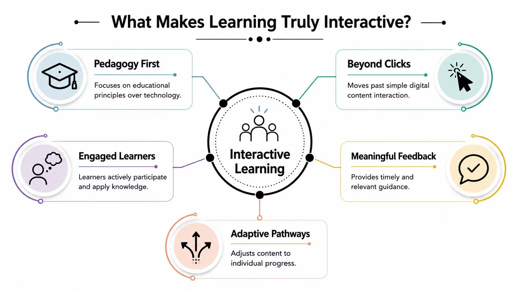
An effective interactive learning experience usually includes these elements:
- A clear learner action
- A meaningful consequence
- Fast feedback
- A reason to continue
- A pedagogical structure
Beyond clicks and novelty
Many projects go off track because teams often confuse interactivity with motion, hotspots, or gamified chrome. Those can help, but they don't guarantee learning. A well-designed branching scenario with restrained visuals can outperform a visually rich build that has no real decisions inside it. For practical inspiration, it's worth looking at both educational and adjacent engagement formats. Studio teams working on learning can borrow useful patterns from event gamification insights when they need to think about momentum, audience attention, and live participation. The same principle appears in Studio Liddell's own thinking on gamification in education and learning engagement, where the useful question isn't “is it game-like?” but “does the mechanic reinforce the skill?”Interactivity starts when learner input changes the experience in a way that matters.
A quick test for buyers
Before approving a concept, ask three questions:| Question | Weak answer | Strong answer |
|---|---|---|
| What does the learner do? | Click through screens | Makes decisions, practises steps, solves problems |
| What changes after each action? | A new slide appears | Feedback, branching, score logic, or changed context |
| What can facilitators learn from it? | Completion only | Patterns of error, confidence gaps, decision quality |
The Measurable Impact of Interactive Methods
Interactive learning gets approved too often on the promise of “engagement”. That's not enough. A buyer needs a stronger case than “people might like this more”. Value sits in how interactivity changes cognition during the session. When learners retrieve information, commit to a decision, see a consequence, and correct an error, they're doing mental work that supports stronger recall and better application. Passive viewing rarely creates the same depth of processing.Why it works
UK education research shows that interactive mini-lessons, simulations, and branching scenarios improve engagement and retention because they reduce passive viewing and increase retrieval practice. The same research notes that well-designed interactive content consistently outperforms linear video for knowledge checks and decision-making practice, as discussed in this research on interactive content design and learner response. That matters in corporate learning as much as formal education. If your learner needs to make a judgement call under pressure, linear content can explain the principle but won't test whether they can use it. Interactive formats create small moments of decision and correction before the live version arrives.What that means for business value
The benefit isn't just that learners stay awake. It's that you can build training around performance signals rather than assumptions. A good interactive module can help you observe:- •Where decisions break down: which branch choices repeatedly cause trouble
- •Whether knowledge transfers: not just recall, but application in context
- •How feedback changes behaviour: whether the second or third attempt improves
- •Which cohorts need support: role, team, location, or experience-level patterns
That's much closer to operational value than a completion certificate.
Buyer check: If your only KPI is completion, you're measuring attendance, not learning.
What works and what doesn't
A few patterns tend to work well:
- •Short interactive sequences: mini-lessons followed by response and feedback
- •Branching decision paths: useful for management, safety, compliance, and customer-facing roles
- •Simulations with contained scope: one task, one environment, one decision family
- •Frequent retrieval points: low friction but high cognitive involvement
And a few patterns tend not to:
- •Long passive lead-ins: too much exposition before the learner does anything
- •Game mechanics without instructional purpose: points with no meaningful progression
- •Overwritten scenarios: excessive reading can flatten urgency and reduce clarity
- •One-shot assessments only: they test the end state without helping learners improve on the way
The strongest projects usually feel less like content consumption and more like rehearsal.
The Technology and Design Toolkit
Choosing the right format starts with the task. If the learner needs spatial awareness, physical procedure, or hazard recognition, immersive media may earn its cost. If the objective is decision quality, a branching scenario or interactive video may do the job with less overhead. That's the core production judgement. Match the medium to the learning behaviour, not the other way round.
A practical comparison
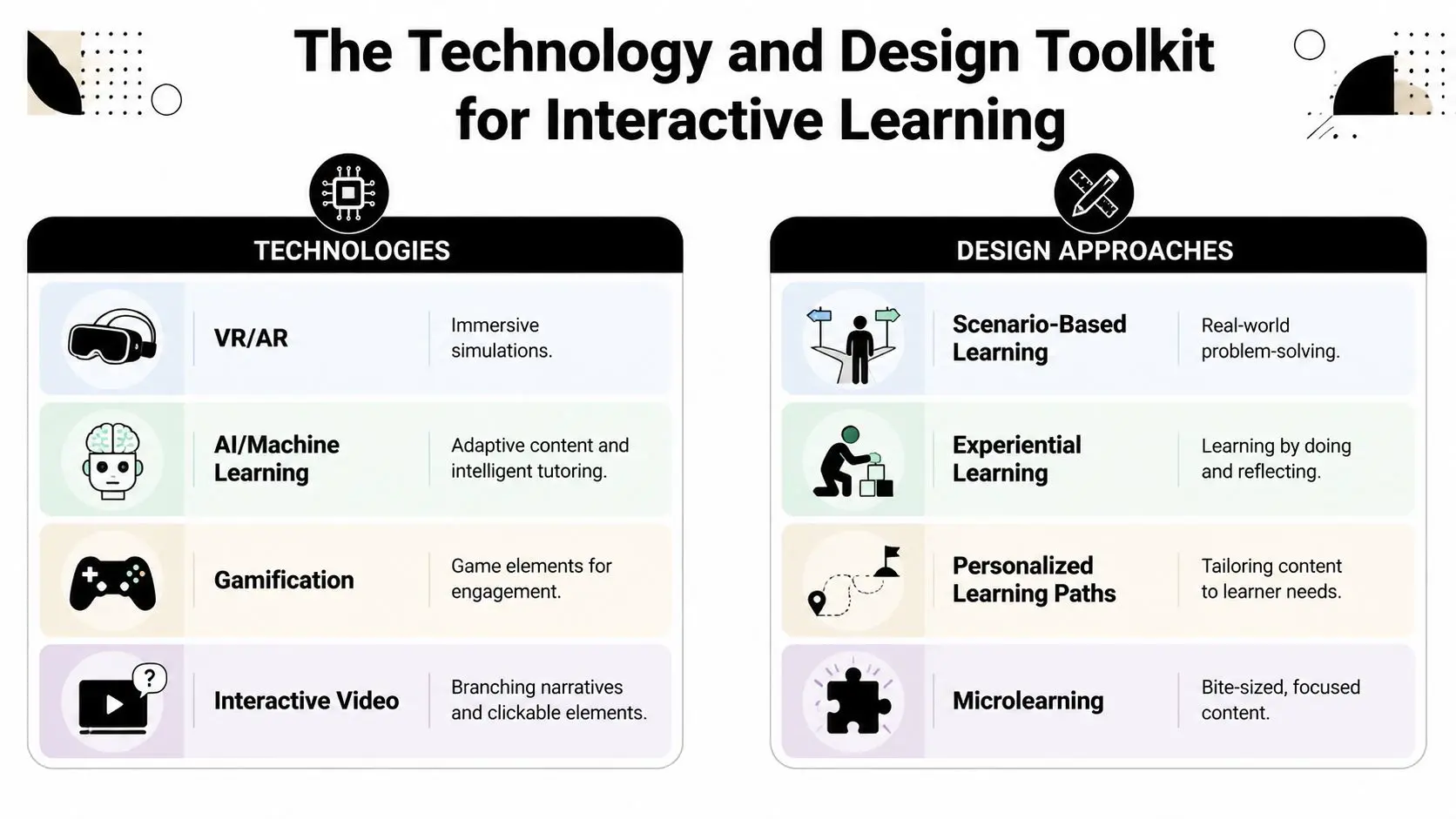
| Approach | Best for | Strengths | Trade-offs |
|---|---|---|---|
| Interactive video | Decision practice, onboarding, product knowledge | Familiar format, efficient production, clear branching | Limited physical simulation |
| Scenario-based modules | Compliance, leadership, customer service | Strong cause-and-effect learning, easier to update | Needs disciplined writing |
| Gamified quizzes and microlearning | Reinforcement, spaced review, campaign-style learning | Fast to deploy, low friction, good for repeat use | Can feel superficial if overused |
| VR training | Procedural tasks, spatial learning, high-risk rehearsal | Safe practice, immersion, embodied learning | Hardware, testing, support, and comfort issues |
| AR experiences | Guided exploration, exhibitions, contextual overlays | Good for place-based learning and physical context | Device compatibility and environmental constraints |
| Adaptive systems | Mixed-ability cohorts, personalised progression | Better fit to learner state | Requires stronger analytics design |
Analytics isn't an add-on
The most effective interactive learning products in UK contexts are designed with event-level analytics and item-level scoring, because real-time digital assessment loops let facilitators branch learners into remediation or extension within the same session. That recommendation aligns with the Department for Education's digital strategy work, as discussed in this guidance on digital tools for real-time data collection. In production terms, this means you shouldn't just ask for a dashboard. You should define what the product captures at interaction level:
- •Decision events: which branch was chosen and when
- •Item performance: what was right, wrong, skipped, or changed
- •Feedback state: what support the learner received
- •Session pattern: hesitation, retries, exits, and successful completion path
Without that, the experience may still look polished, but it won't tell facilitators what to do next.
Matching tools to budget and rollout reality
A common mistake is jumping to XR because it feels substantial. Sometimes that's correct. For safety rehearsal, complex equipment familiarisation, or museum-style spatial storytelling, immersive formats can be the right call. In other cases, an interactive web app is the smarter route because it removes hardware friction and broadens access. One practical reference point is an online learning platform app, which sits in the middle ground between static e-learning and full immersive build. That kind of format can support branching, assessment loops, and reusable content architecture without requiring every learner to adopt specialist hardware.
Design choices that usually hold up
When reviewing concepts, these principles tend to survive contact with real users:
- •Keep interactions low-latency: if response is sluggish, attention drops
- •Use concise feedback: long corrective text often goes unread
- •Limit mechanic switching: too many interaction types can confuse rather than engage
- •Design for recoverable mistakes: learners need safe failure, not dead ends
- •Respect the device context: mouse, touchscreen, headset, and classroom display all change what feels natural
The technology matters. The sequencing matters more.
Production Workflow from Concept to Classroom
Clients often see the finished experience and underestimate the production discipline behind it. A reliable interactive learning project doesn't start with visuals. It starts with alignment. What must change for the learner, what evidence will show that change, and what constraints will shape the build? Once those points are fixed, the workflow becomes much easier to manage.
The studio process in practice
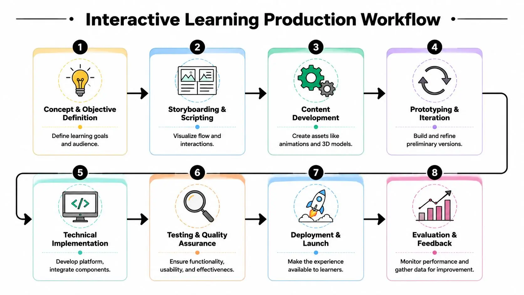
A typical production path looks like this:
- Discovery and brief definition
- Instructional architecture
- Storyboarding and prototype logic
Build the smallest version that proves the learning mechanic. Don't spend heavily on assets before that.
- Asset creation
- Technical development
- Testing and iteration
What changes timelines and costs
There's no honest way to discuss budgets without saying “it depends”, but the dependency isn't mysterious. These factors drive effort:| Scope factor | Lower complexity | Higher complexity |
|---|---|---|
| Content structure | Linear pathway | Multiple branch states |
| Visual production | Template-led UI | Custom animation or 3D worlds |
| Platform | Browser-based | XR, offline support, app store deployment |
| Assessment | End-point quiz | Event tracking and adaptive logic |
| Stakeholders | One approver group | Multiple SMEs, compliance, IT, accessibility review |
Where projects usually slip
The biggest schedule risks are rarely in coding alone. They tend to come from unclear approvals, late content rewrites, and under-scoped QA. Accessibility can also be left too late, which is expensive to fix once interactions are built. A stronger process keeps each milestone answerable:- •Has the learning flow been approved, not just the look and feel?
- •Are branching rules signed off before development expands them?
- •Has pilot testing happened with real users, not only internal reviewers?
- •Is analytics instrumentation defined before launch prep begins?
If those answers are vague, the project is likely to drift.
Real-World Examples and Performance Indicators
Abstract talk about interactivity only gets you so far. Buyers need to know what success looks like in actual use. A safety simulation, for example, should not be judged by whether learners enjoyed the interface. It should be judged by whether they recognise risk cues, follow the right sequence, and recover from mistakes inside the scenario. A museum AR experience should be judged by whether visitors explore and understand the content, not just whether they opened the app.

Three common project types
Consider these practical formats:
- •XR technical training
Useful when learners need procedural accuracy, environmental awareness, or safe repetition. A relevant reference point is this work on medical training simulations in XR, accuracy, assessment, and compliance, where assessment quality matters as much as immersion.
- •Interactive exhibition or heritage content
Better suited to discovery, place-based interpretation, and layered storytelling. Here, pacing and clarity matter more than challenge scoring.
- •Gamified onboarding or policy training
Effective when the organisation needs repeated engagement over time. The best versions keep the mechanics light and the scenario relevance high.
KPIs that actually matter
Completion rate still has a role, but it's a weak primary measure on its own. Stronger indicators include:
- •Decision quality: are learners choosing better options as they progress?
- •Error pattern visibility: which misconceptions appear most often?
- •Time to confident completion: where do learners hesitate or restart?
- •Feedback effectiveness: does performance improve after corrective input?
- •Facilitator actionability: can tutors or managers intervene based on the data?
For public-facing and educational work, accessibility must sit alongside these. A critical gap in measuring success is accessibility. 34% of disabled learners in the UK report online degree programmes as inaccessible due to poor universal design, so a key KPI for any interactive learning experience should be whether it remains usable and effective across diverse user groups, rather than creating a participation gap through poor design.
If some learners can't comfortably perceive, navigate, or complete the experience, interactivity hasn't improved learning. It has narrowed access.
What inclusive measurement looks like
Accessibility shouldn't be treated as a final compliance check. It should be visible in performance review from the start:
- •Track usability across different learner groups
- •Review device assumptions and input demands
- •Test low-stimulus versions where screen fatigue is likely
- •Check whether support content is available outside the primary interactive layer
That's especially important when clients are commissioning visually ambitious work. Visual richness can support learning. It can also overload it.
Integrating and Scaling Your Experience
The hardest part of interactive learning often starts after launch. Plenty of projects are well designed and still underperform because the organisation assumes the experience can carry the rollout on its own. It can't. Facilitators need confidence. IT needs a realistic deployment plan. Managers need to know where the learning fits inside existing training, not beside it.
The uncomfortable implementation truth
Mainstream discussion often skips over the adoption lag. In the UK, teachers report a 6-month learning curve when implementing new interactive pedagogies, and 40% of early implementations fail due to lack of teacher readiness rather than student inability. That matters far beyond schools. In workplace learning, the equivalent issue is manager or trainer readiness. If the people delivering, supporting, or interpreting the experience aren't prepared, the product won't realise its value.
How to scale without breaking the rollout
A practical rollout usually includes:
- •Phased deployment: start with one cohort, one use case, or one business unit
- •Facilitator onboarding: train the people who will frame the experience and respond to the data
- •Technical fallback paths: plan for variable devices, network quality, and access constraints
- •Operational integration: connect the experience to induction, refresher training, classroom sessions, or coaching
If your programme also depends on scheduling, learner records, or centre-level administration, it helps to look at how platforms for tutoring centre operations structure attendance, communication, and day-to-day management. The operational layer often decides whether a good learning tool becomes a repeatable system.
Choosing a production partner carefully
Ask blunt questions before commissioning:
- •How will you validate the learning mechanic before full production?
- •What analytics will be captured at interaction level?
- •How is accessibility handled during design, not just after build?
- •What support is expected from our SMEs, trainers, and IT team?
- •What does a pilot look like before wider rollout?
Good partners won't sell interactivity as an instant fix. They'll help you sequence adoption so the product can land properly.
If you're planning an interactive learning experience and need to sense-check the format, scope, or production route, Studio Liddell can be a useful starting point for a practical conversation. Bring the learning objective, the audience, and the delivery constraints. That's enough to work out whether you need a lightweight interactive module, a more robust platform build, or an immersive simulation.